
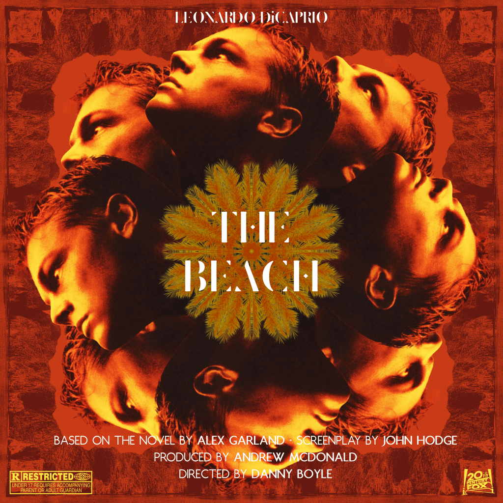
An episode requested by a listener of The Rewind Movie Podcast, but a recording I couldn’t make it to. So I had to base this cover image/poster on my recollections of the film from the one time I saw this back in the early 2000s. As my friends Gali and Matt discussed, this was a tantalisingly compromised product, with some of the more controversial and edgy elements excised at the advice of Leo’s handlers back when his primary audience was the teen girl demographic (the suits foolishly thinking teen girls weren’t, and aren’t, as keen or more so on mayhem as any other demographic).
I took the main image of DiCaprio’s head from the release poster, finding a good quality scan of it on Cinematerial (check them out – well worth dropping some £ for credits to download their full size collection, very reasonably priced per item). I was sort of just feeling my way through – I got the idea to create something vaguely like a mandala, which is not strictly a Thai image, but I could pretty much justify that by claiming that it’s a reference to the lack of cultural insight shown by most tourists to ‘Asia’ as an entire continent. Having two sets of four heads, tilted 45 degrees, made it look a bit like a lotus petal configuration. Something felt right about using images based around the number 4, so I thought of creating a wheel that would sit in the centre of the image with 16 elements (half mirrored). I grabbed an image of a palm tree branch in the sun, and used the eyedropper to colourise to match the original poster.
I wanted a border pattern, but couldn’t find a decorative element that was in good enough quality and would fit around the heads well enough. That’s when I thought to use the cliffs of Maya Beach, the actual, titular beach where they shot the film, on Koh Phi Phi Lei in Thailand. I found an image taken from water level, grabbed a section big enough to cover half of my canvas, and mirrored that so it would match. I snipped a 45 degree angle off, and put the same border across all four sides. It made a nice corner space to accommodate the angled Leo heads. Before I imported it, I had run this through Studio 2am’s Riso filter, and coloured the image to a brown that I again took directly from the available shades on the release poster.
I already had a version of the Deafheaven ‘Sunbather’ font – Delicate, I think it’s called. That felt like it would fit the tone of the film and especially the poster, sort of blissed out. For the credits, I wanted a delicate but distinctive non-serif font that could accompany the title font. Juliette fit the bill, also having a regular and bold version so I could differentiate the names.

