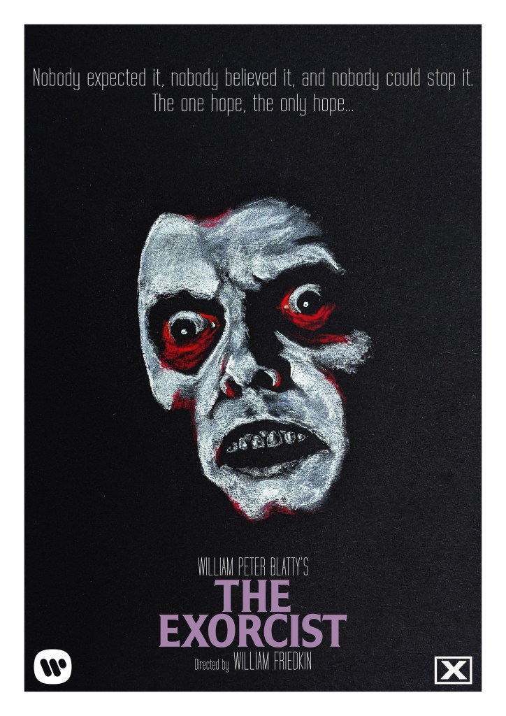
Buy A4 posters of this image over at Teemill.
Buy A4 posters of this image over at Teemill.

Chill out. Dickwad.
Buy stickers of this image over at Teemill.

Buy A4 posters of this sketch over at Teemill.
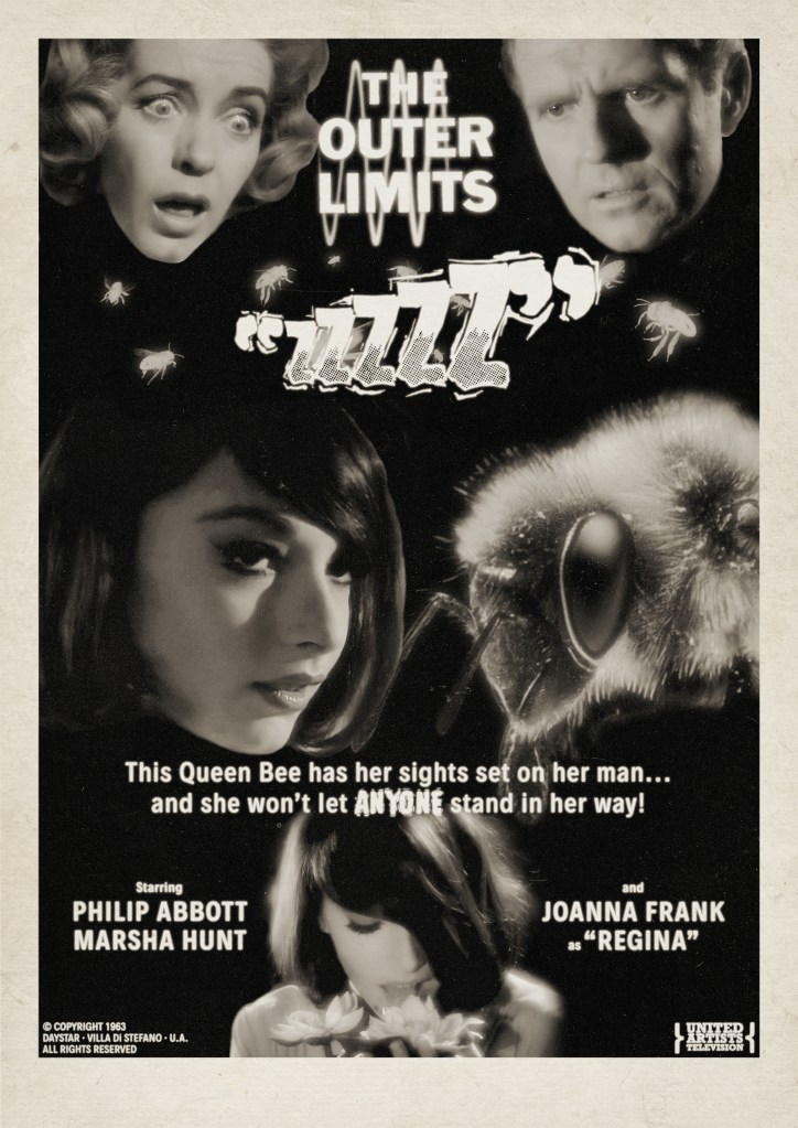
Thanks to the wonderful digital terrestrial channel Talking Pictures TV, I’ve recently become a little fixated on the classic 1960s sci-fi anthology series The Outer Limits. When I was a kid, the 1990s remake series was something that I dimly recall watching, and I think enjoying? Certainly the legendary Control Voice introduction has stuck around in my memory, but not much beyond this. But on a lazy weekday afternoon, searching for something to watch in the background while sketching, I came across an episode from the show’s original series and I was, first and foremost, absolutely floored by the incredible lighting in the episode – so much so I dropped the pencils and watched the full hour. Objects and characters glowed like pearls, within spartan, functional sets that helped to emphasise an almost dreamlike strangeness. It turns out, these wonderful visuals were the work of Conrad Hall, ace cinematographer of Cool Hand Luke, Butch Cassidy and the Sundance Kid, Marathon Man and more. Hall worked on 15 of the original run of 49 episodes, alongside TV veteran John M. Nickolaus Jr. and Kenneth D. Peach, Sr. (who, remarkably, started out on the legendary 1933 King Kong before working with Laurel and Hardy on a number of features), and his episodes, with all respect to those fine technicians, really do stand out.
The 2nd thing that drew me to the episode was the truly hypnotic Joanna Frank as the beautiful Regina – whom the story immediately imparts is a queen bee who has been transformed by some sort of baffling bee science to attempt to seduce a stoic scientist into coupling with her to produce a superhybrid race of Api-Humans. She is, quite simply, one of the most striking actresses I’ve ever seen on TV or film. Her scant list of other appearances only served to highten the mystery of her strange, mannered performance, peering up past a sweep of dark hair that hides half of her face, studying the kindly couple that take her in as a live-in assistant in the lab of Ben, the avuncular husband who is hard at work building a machine that can talk to bees. His wife, Francesca, quickly cottons onto the weirdness, but is perhaps too late in identifying the danger of her young would-be usurper.
I’ve quickly become extremely fond of the series – I adore the sturdy writing that quaintly seeks to stick the landing of its coherent, if sometimes familiar, premises, each episode methodically doling out pertinent information in a recognisable act-structure. So here I present what I hope is an era-appropriate poster homage to this odd little tale. Using some extremely poor resolution screenshots from the show, and a stock photo of a bee’s head, I had to go a little heavy on the texture-making to disguise the pixellation and flaws, but I hope in a way that looks authentic. It’s a little intentionally schlockier than perhaps a genuine ad would have been at the time, but I liked the idea of juxtaposing the conflicted expression of old scientist Ben as he ponders the mysterious Regina, while his wife clocks her for what she really is – a giant usurping bee. Hopefully the similar shapes of the face of Regina and the bee help sell the overall image layout – it was quite a challenge to find a macro photo of a bee that so closely matched the angle of her cheek and jaw.
BUY THIS POSTER as a gallery-grade 12″ x 12″ giclee print at Etsy!
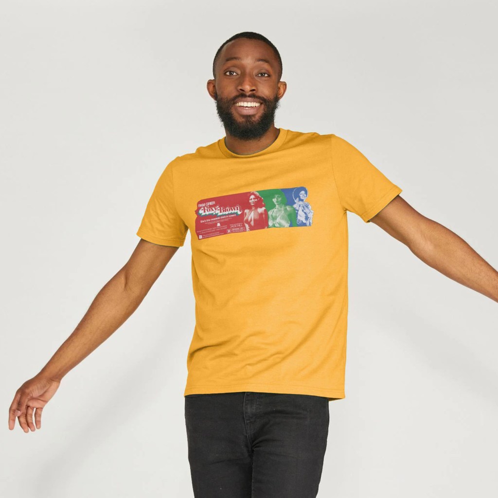
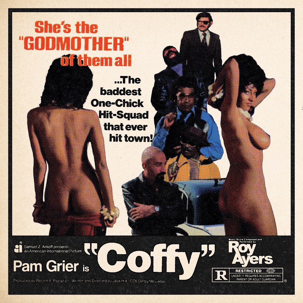
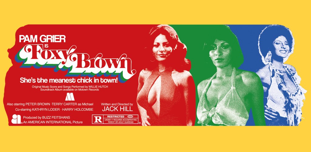
Shameful confession time: I’d never seen any of Pam Grier’s classic 1970s blaxploitation features until only a few weeks before making these pieces. Of course I’d seen Quentin Tarantino’s love letter to her, Jackie Brown, and had enjoyed the Roger Corman saucy Roman smackdown Arena on some cheap DVD I’d picked up, but somehow I’d always left Coffy, Foxy Brown, Friday Foster and the likes on my watchlist. Finally picking up Arrow Video’s typically excellent Blu-ray of Coffy, I was knocked on my, as the Americans say, ass by the full-bore majesty of this incredible actioner. The terrific, efficient direction of Jack Hill offers the perfect stage for Grier’s wonderful performance that runs the gamut from regal self-possession, through radiant sexiness, all the way to ruthless vengeful violence. A clear, vibrant, anti-establishment plot, a colourful cast of supporting characters (most notably Sid Haig as a reptilian gangster), and some magnificently messy scenes of squib-laden gun battles, automotive destruction, and drag-out catfights add up to one of the most satisfying film experiences I’d had in some time.
I was compelled to put together a poster – I wanted something simple, vintage-looking, and, for extremely obvious and undeniably prurient reasons, a design that would seek to honour just how incredible Pam Grier looked in this film. Veering away from the release poster designs which foregrounded Coffy’s powerful, shotgun-toting path of revenge, instead, I wanted to illustrate how the character weaponised her charms in order to lull her opponents into a false sense of security, before dispatching them with righteous fury.
Using simple screenshots from the streaming version of the film, I first identified the scene where Coffy seduces the absurdly-dressed pimp King George and pulled two related shots. I then figured I’d need to fill the remaining space with a selection of the bastards Coffy would spend the 90 minutes or so taking down – I cascaded them in a loose vertical structure, arranging them around the tagline which I had clipped from a hi-res scan of the release poster and simply cropped and dropped in place. The layout of these elements came from simple trial-and-error. I knew I wanted the poster to look almost like one of the newspaper ads rather than a full illustrated poster, so decided to include a thick black border and black bar at the bottom where I would place the title and a small amount of other information. I wanted to include only a few key elements – the production company, the producer and director, Pam Grier, and the MPAA rating. All elements, except for Pam Grier’s name, were cropped and image traced from original elements sourced online. I knew I would be able to keep these less than uniform, as I had planned to use a Photoshop action I’d downloaded from Spoon Graphics which I’d been dying to try on the right project – this created a realistic, black-shifted, aged, messy 4-colour ink process. However, it didn’t process the photographic elements very well – I lost almost all of the nuance in the faces. So, I decided to use this only for the black ink text elements and the black frame – I created a high contrast monotone black-only layer for the ink process, and the colours were created utilising a standard halftone filter in Photoshop on a separate layer of the combined final photographic montage, with all black pixels removed after the fact.
A final pass of textures, including a further aging on the black ink elements, and the addition of a nice paper texture, and we were all done! Well, with this one at least – I just had to do something for Jack Hill’s follow-up feature Foxy Brown.
BUY SHIRTS, HOODIES, TOTE BAGS AND MORE from Teemill!
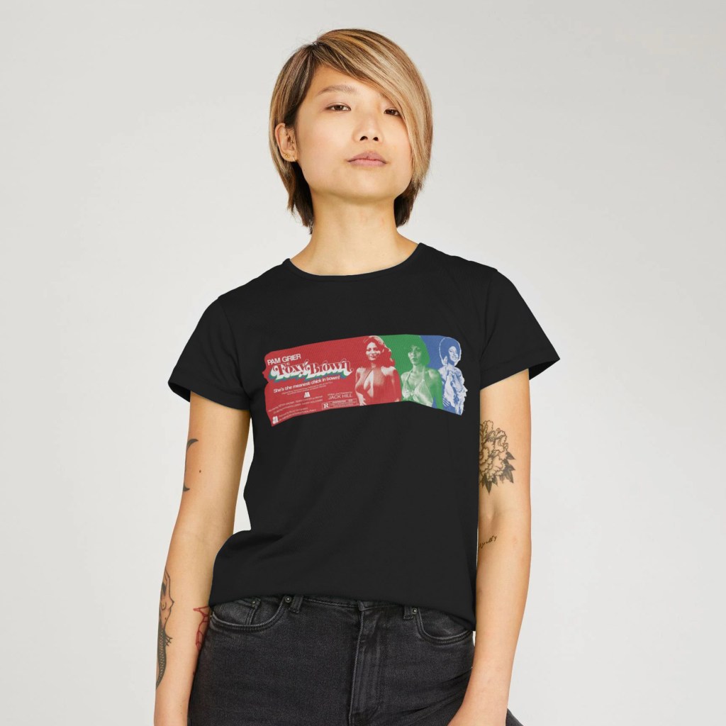
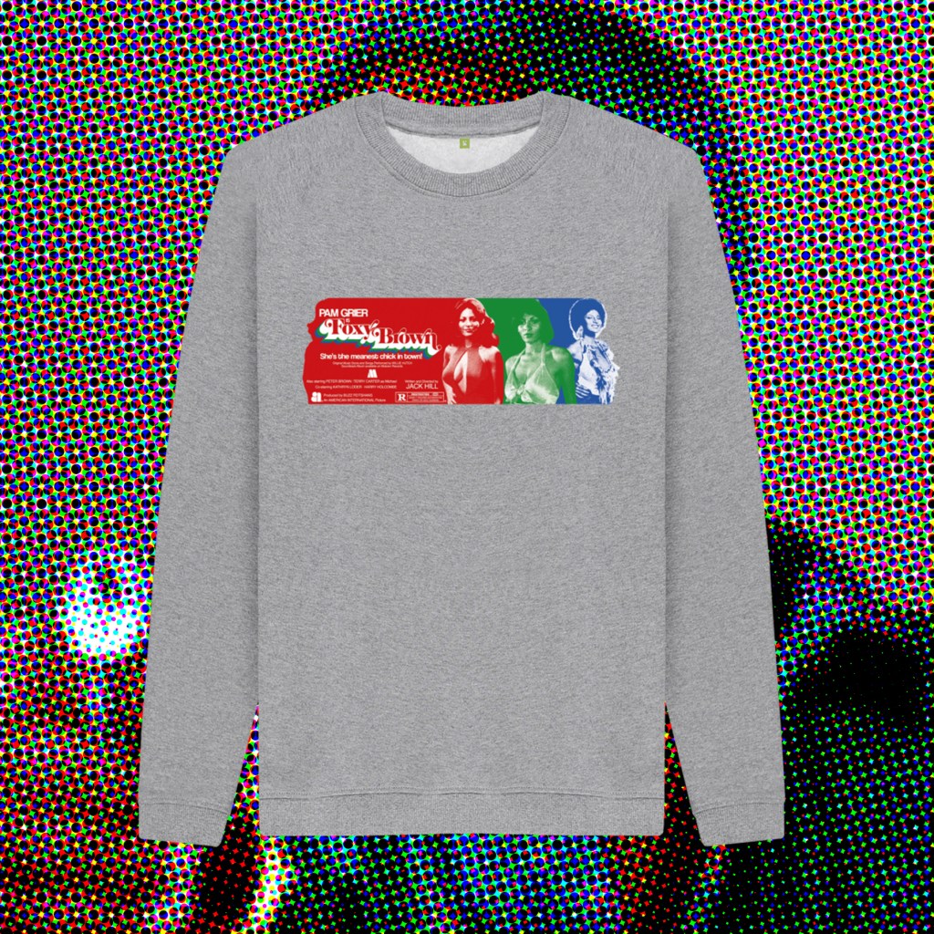
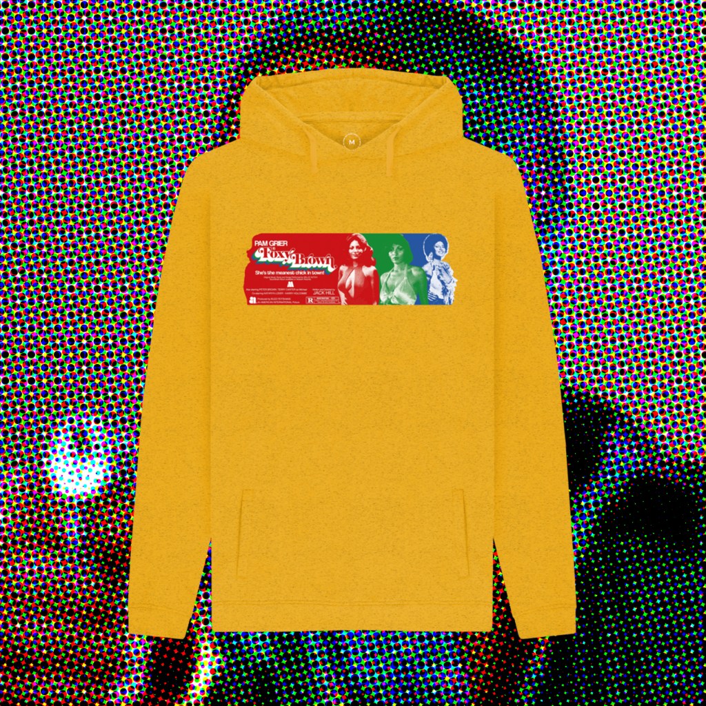
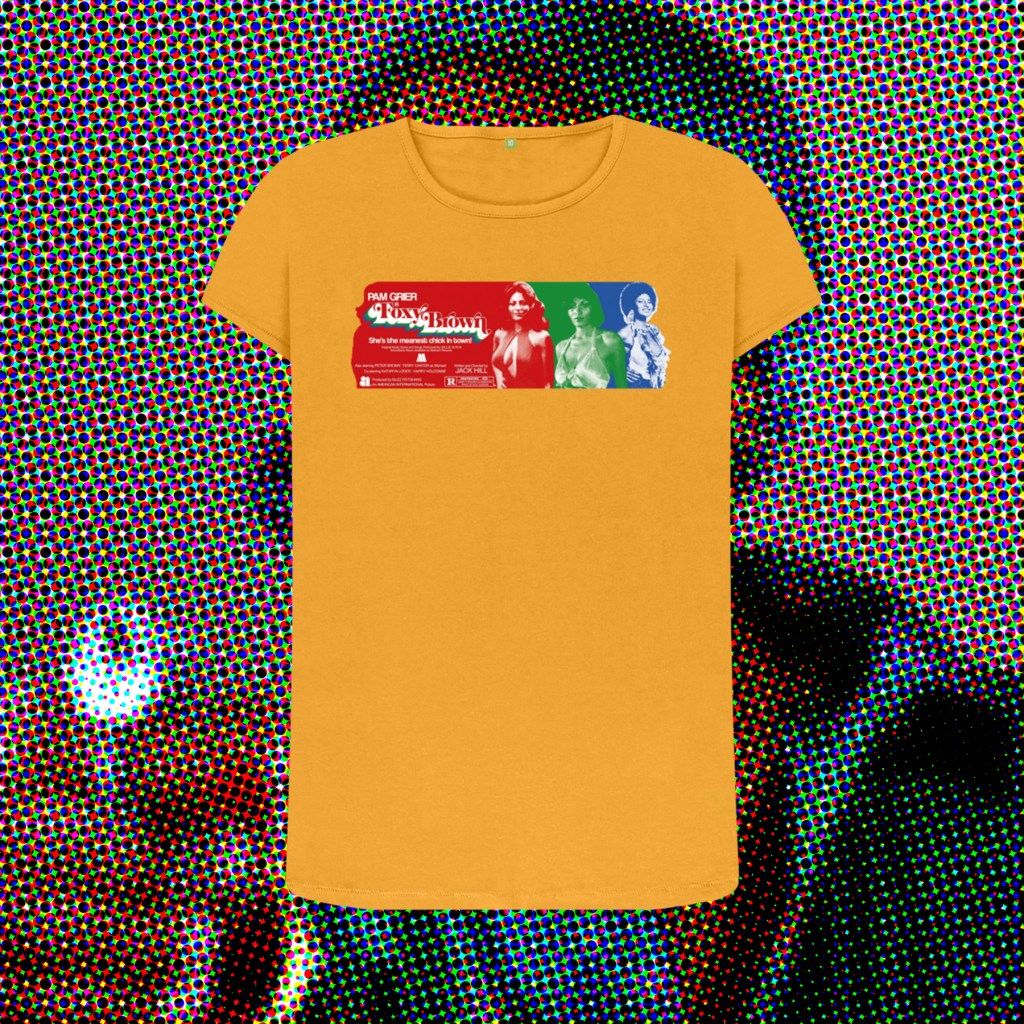
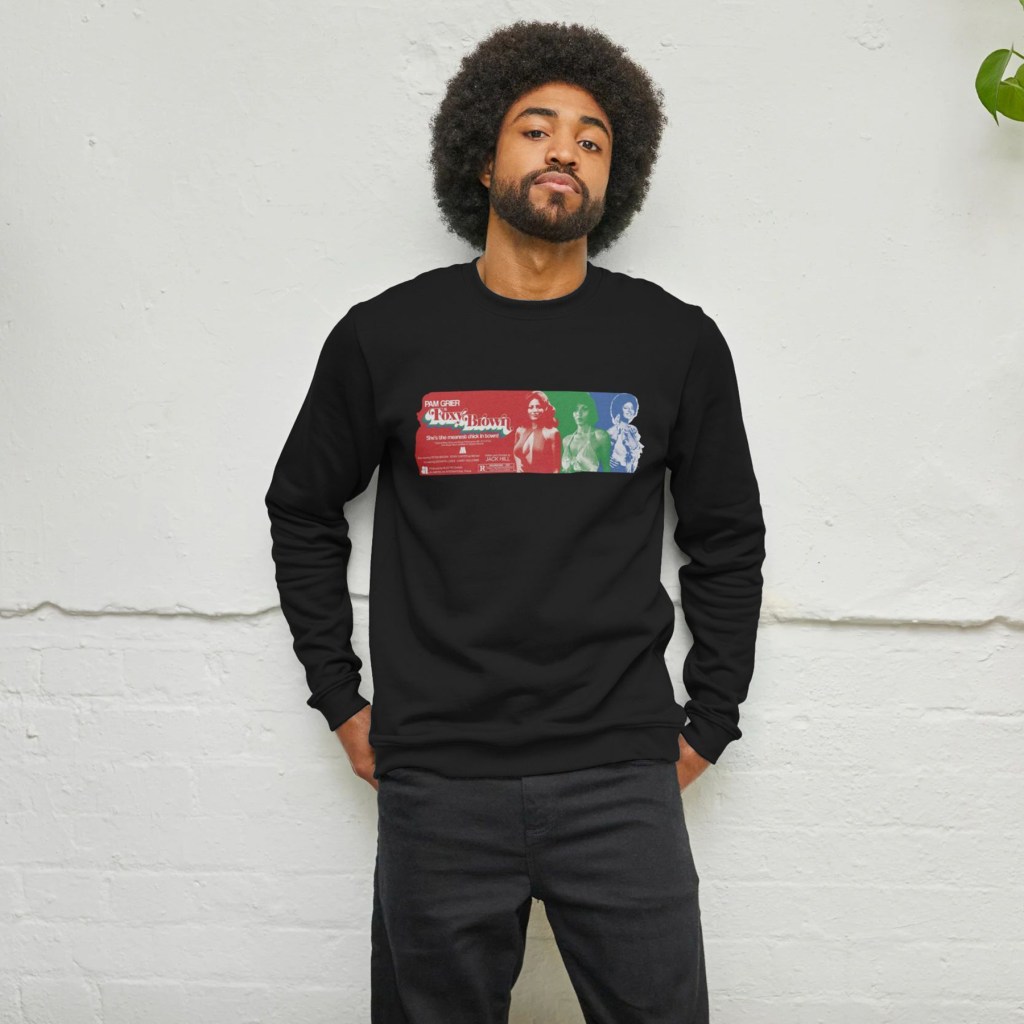
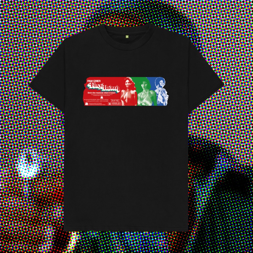
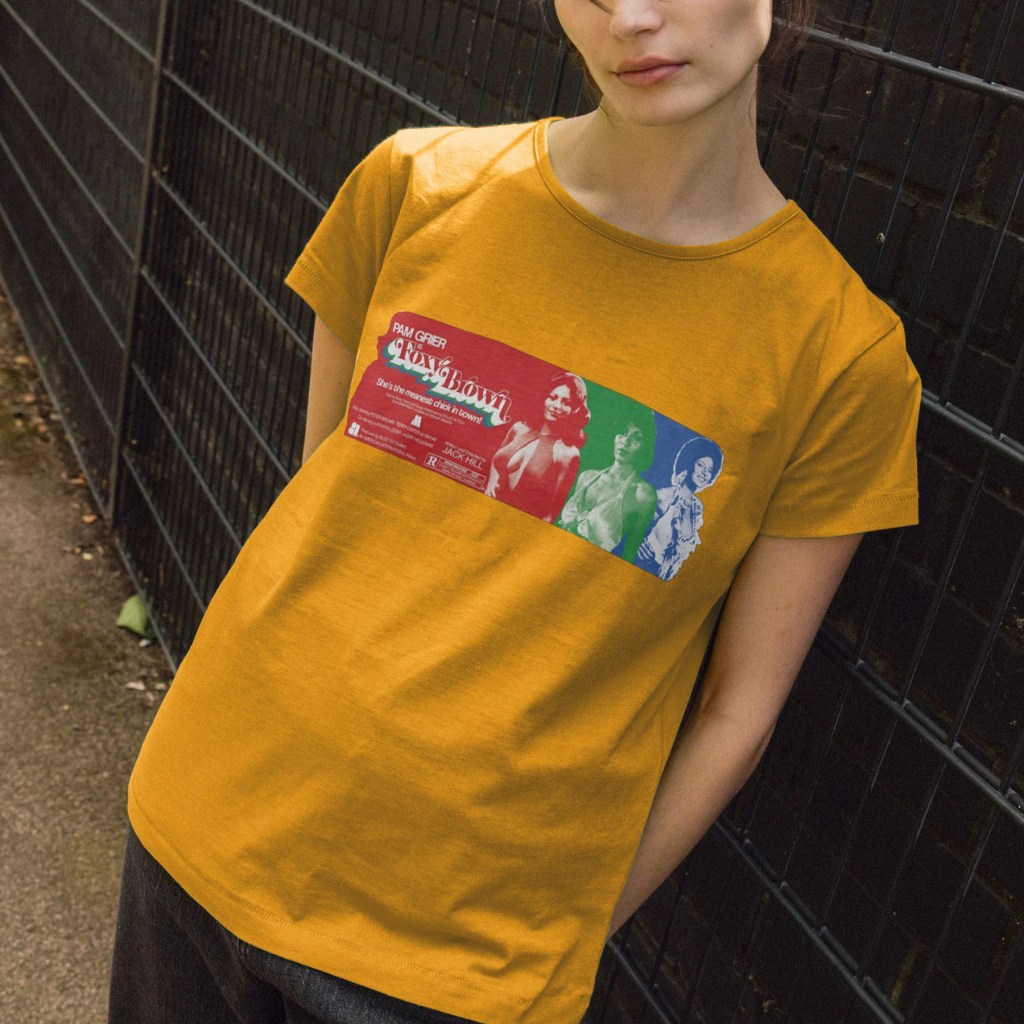
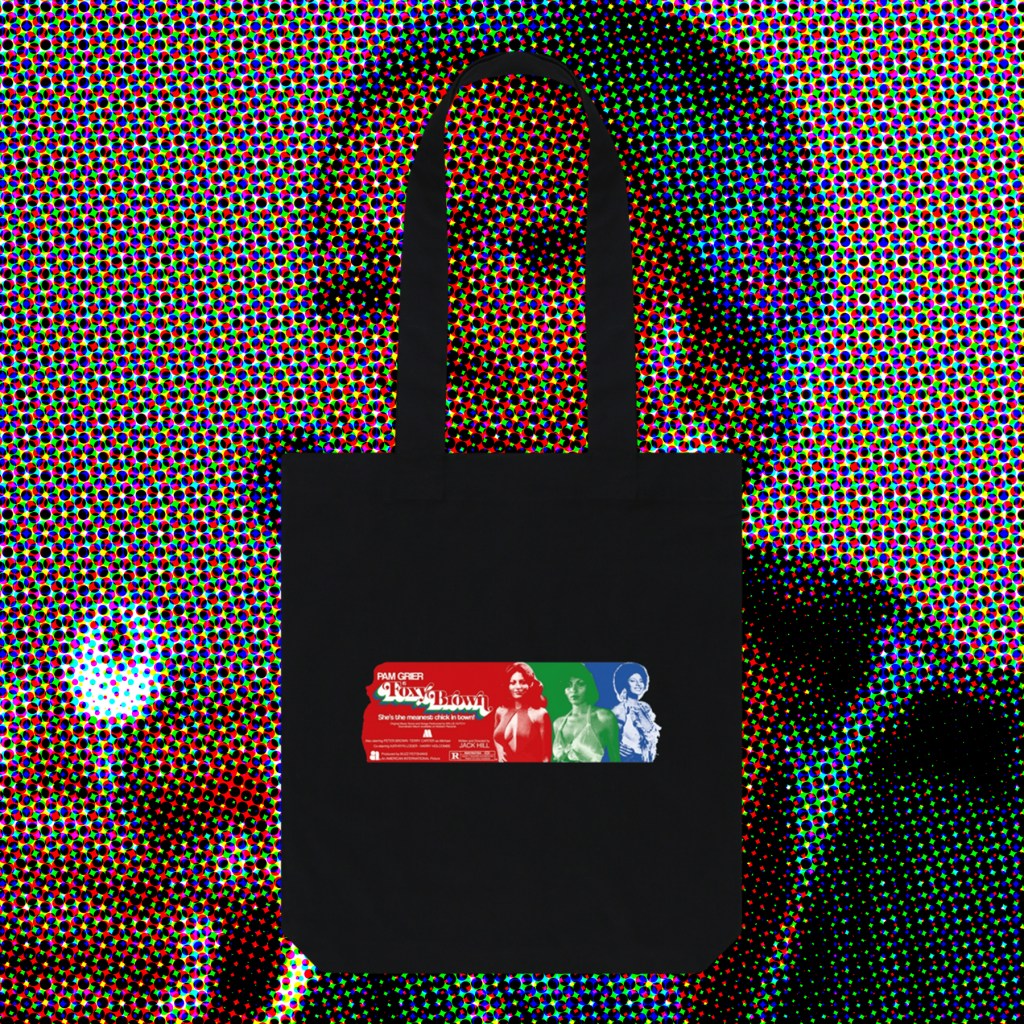
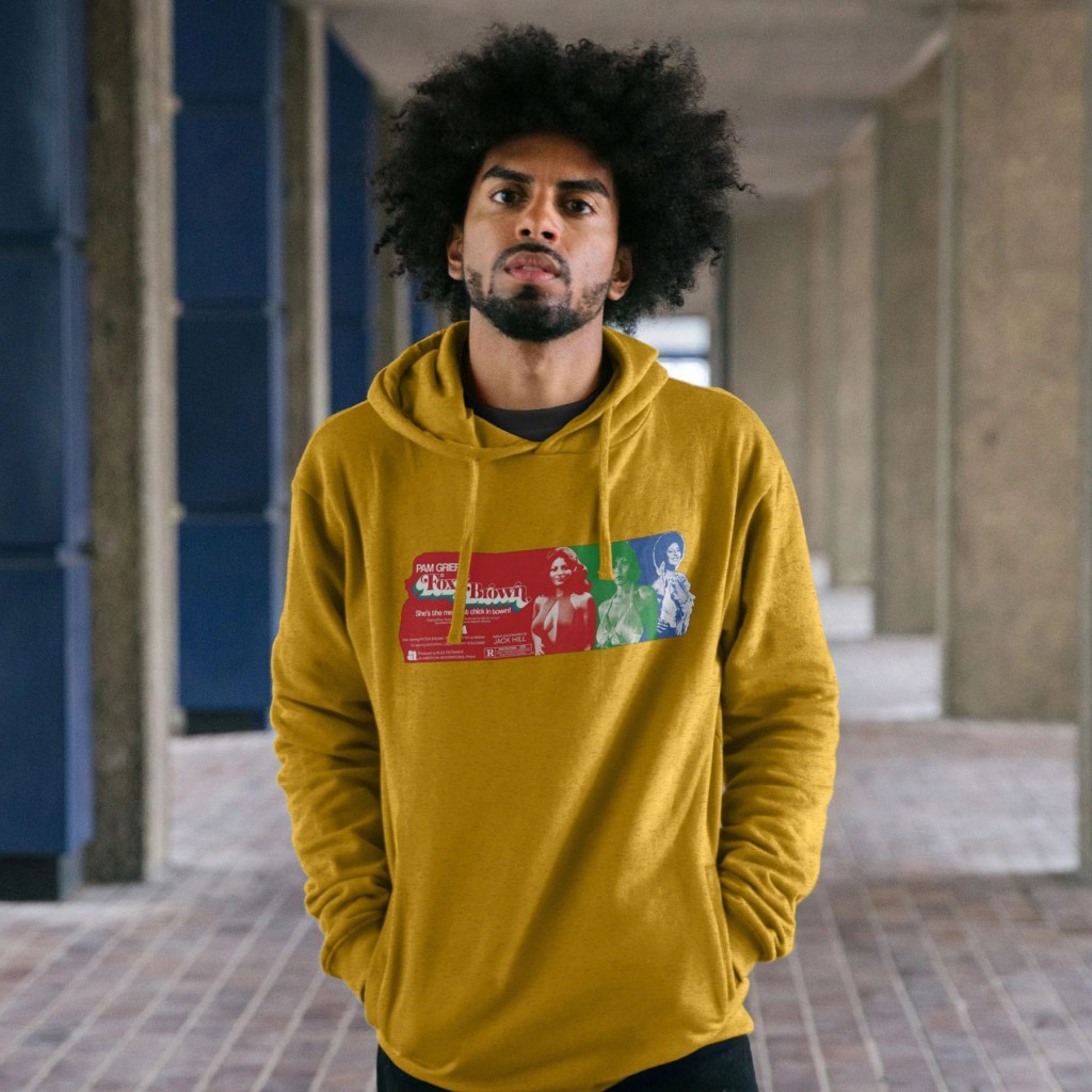
Foxy Brown‘s excellent, psychadelic opening credits inspired this colourful celebration of Pam Grier’s imcredible costumes throughout the film, again going undercover as a sexed-up and powerful woman who delves into the murky world of white drug dealers and pimps to exact brutal revenge.
Once I’d found reference pictures that covered the range of looks she sports throughout the runtime, and discarded those that didn’t meet the minimum requirements for clarity, these three images pretty much picked themselves. I’d originally envisioned full body images, like those scene in the credits dance sequence, but the majority were waist-up portraits, so that dictated the form. I wanted to have overlapping, colour coded stripes that would end with a single-colour image that would create a Grier-shaped end piece, before the next colour stripe took over. The credits scene involved 3 colours, so that’s what I wanted to do too – also, this meant I could play with the classic RGB 3 colour TV look, evoking the era, and using more than 3 images would have eradicated the long horizontal band that I wanted to form at least half, if not more, of the print.
Once I’d created my 3 images, I struggled with keeping the design as horizontal as I wanted. Shrinking the processed photographs meant losing clarity – some of this was intentional, to create a riso print starkness, but I still wanted the images to be legible and distinct. I also wanted the shirt to have a band of colour, rather than the chunkier, more maximalist designs I have created so far, so there was much push-and-pull in deciding how wide vs how tall to make the full shape. When the layout was finalised, I felt I had the balance roughly where I wanted it, but this taller band of red felt like wasted space. So, I pulled elements again from the release poster, bolstered others with typed text (the tagline is in a very nice font called Coolvetica), and used the image of Pam as a layer mask to create that end shape on the left, with the hair flick and insouciant hand-on-hip pose.
Hopefully these will serve as adequate tributes to, truly, one of the coolest screen presences I’ve belatedly discovered.
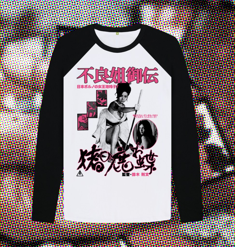
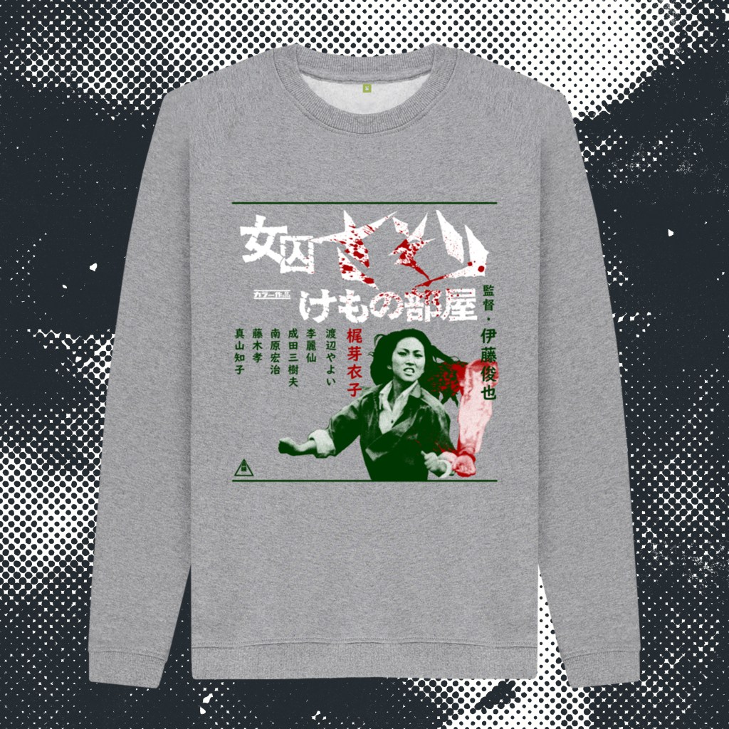
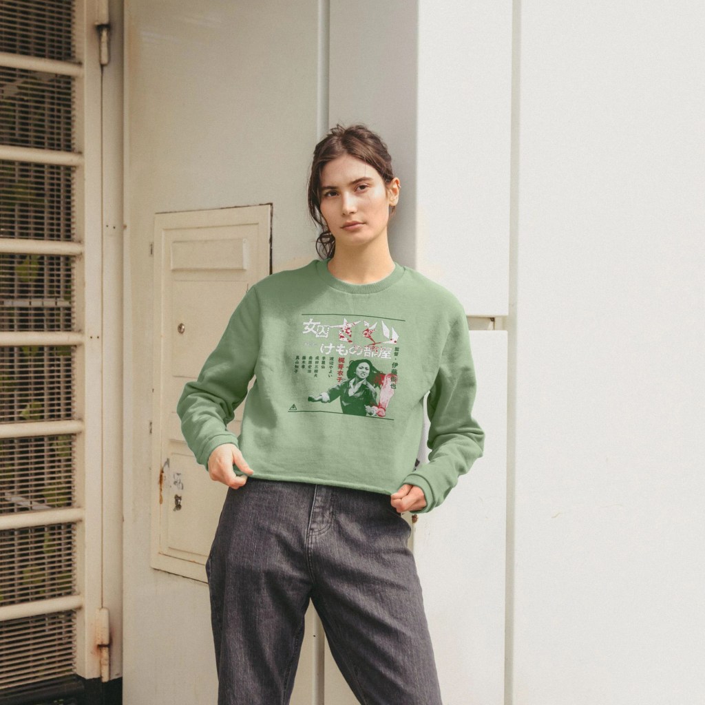
Toei Studios’ reigning queen of Pinky Violence, Reiko Ike, stars in Norifumi Suzuki’s infamous, overheated Jidaigeki classic of gambling, espionage, murder, revenge, and naked swordfighting. In contrast to Shunya Itō’s furious, near-contemporaneous Female Prisoner Scorpion trilogy (and Yasuharu Hasebe’s series capper), the thrills and spills on display here don’t carry quite the same message of righteous female empowerment, falling more into the more prurient end of the pinku spectrum of the era. But, that’s not to diminish the utter badassery and screen presence of the incandescent Ike, who cuts a swathe through the film and the series of miserable baddies that killed her detective father when she was a mere child. Emerging after 2 decades as a skilled gamber, pickpocket, and brawler, she navigates the underbelly of Tokyo with smoky eyes and a sly smile that disappears when it’s time to slaughter a dozen lackeys in the snow without a stitch of clothing. While in a separate subplot, Swedish exploitation star Christina Lindberg struggles gamely with her accent as a British dancer embroiled in a plot by the dastardly British to undermine the emerging Japan’s power, despite her romantic entanglement with a Japanese political activist. The film heads towards a shocking, somewhat blasphemous, bloody and oddly captivating full-throttle conclusion (mostly stolen from Meiko Kaji’s Lady Snowblood). It’s a heady stew of bad taste good times, anchored by one of the most charismatic performers of her era relishing the solo spotlight (Ike was more often paired with the intense Miki Sugimoto during this period).
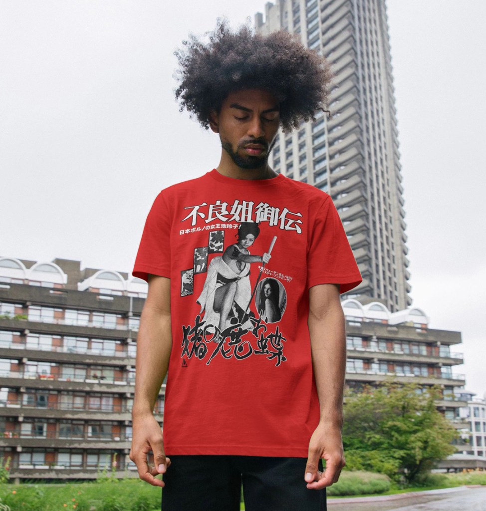
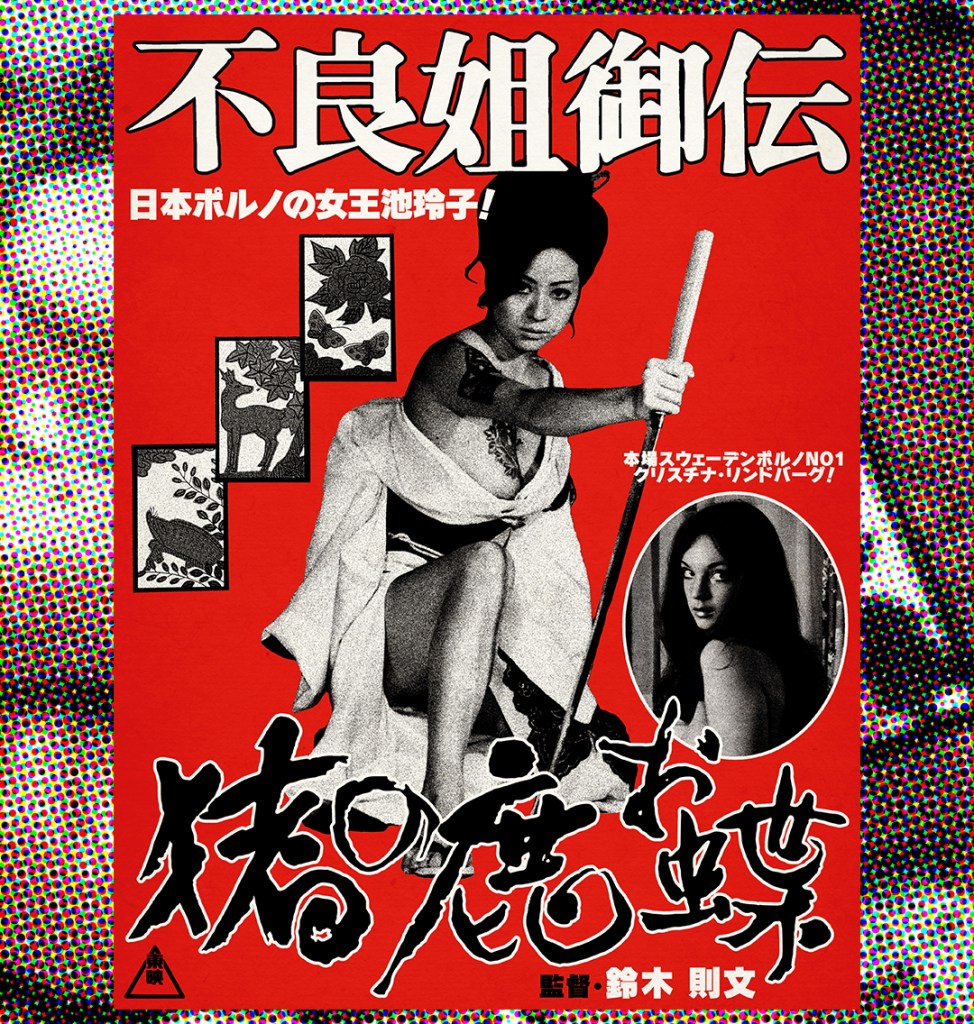
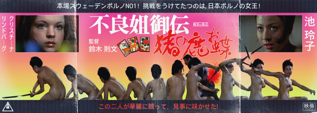
Here are my two designs inspired by the magnificent 不良姐御伝 猪の鹿お蝶 (Furyō anego den: Inoshika o-Chō) a.k.a SEX AND FURY! A large format full-colour poster print, available at Etsy as a gallery grade, 36cm x 87cm giclee print:
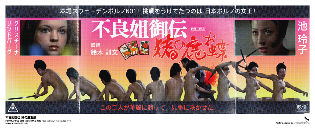
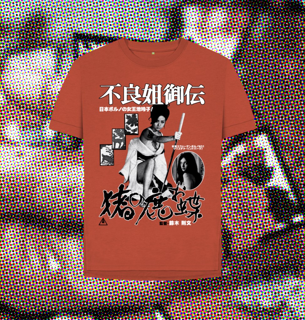
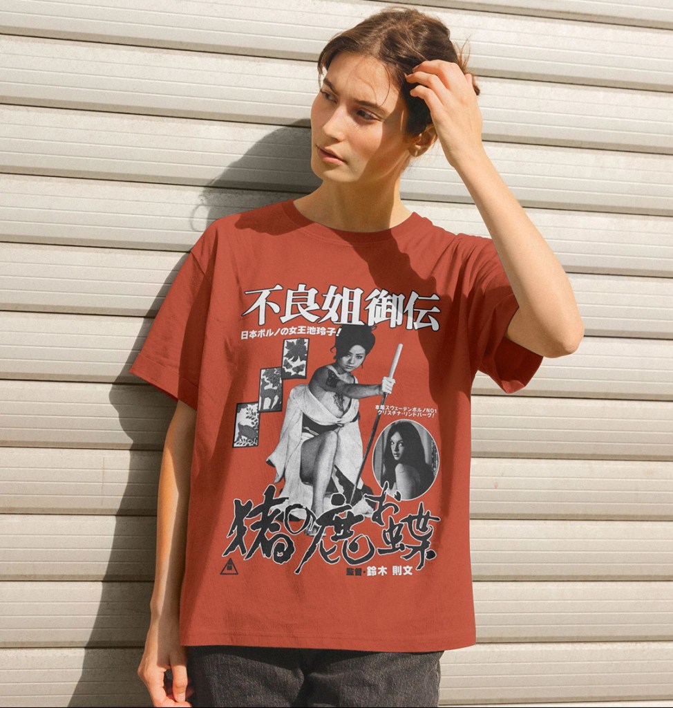
You can also pick up a t-shirt, or A3 poster print, of this alternative black and white design over at Teemill, from another original photomontage layout:
Full Colour Poster Process
For this poster, I knew I wanted to use the infamous naked bath house sword fight as the key image. It’s the most iconic scene in the film, utterly ridiculous, moronically cool, and the perfect hook for the type of poster I wanted to create – as close a rendition as I could manage of the early 1970s Japanese exploitaion movie posters that didn’t hold back on the base-level thrills they used to hook viewers. However, my standard edition DVD is the only source I have available for any images for this film; high resolution digital images seemed scarce and while I believe there may be a Blu-ray release of Teruo Ishii’s sequel Yasagure anego den: Sôkatsu rinchi, a.k.a Female Yakuza Tale: Inquisition and Torture, I couldn’t find one for this. That meant that, no matter if I could pull images, there would be such pixellation that I would have to degrade the picture substantially to avoid this being visible at scale. The first task was screenshotting a section of the fight – the moment Ike jumps from the bath gave the clearest set of images. These were enlarged as best I could within Photoshop, cropped (leaving the unfortunate victim of the katana-slashing intact in one), and the sword replaced in all but one shot due to the motion blur rendering them all but invisible.
Next, these screenshots were laid out together, with the spacing between them planned as best as possible to show the movement. This started to determine the shape of the poster (highly unusual in Japan – most posters of these dimensions would actually be vertical, not horizontal). While I had thought initially that they could run across the bottom of a larger design, the lack of good quality material determined that I preferred to make this the centrepiece. There were a few readjustments before I struck in the idea of a 4-folded sheet of roughly 4 x A4 paper. The size felt right: a 30cm height would be feasible for the print quality. That led to the idea to actually add ‘folds’ to the final design, one of a number of elements that would help hide the deficiencies of the original images. I liked the idea of a ‘widescreen’ poster – this influenced the idea to have a border of some kind to help create a more horizontal look, to allow for the very wide, 10 screenshot montage to not look too out of place. In this new layout (which at this point had only plain black letterbox borders) the images took roughly half of the vertical space remaining. I’d screenshotted a striking close up of Ike’s face that felt to me as the natural choice for her ‘hero’ shot; I wasn’t sure how to use it, but by adding a white layer border it looked more intentional. By this time, I’d added the pink-to-yellow colour blend as a background. The choice was largely organic – I’d seen a similar fade effect in the background of numerous Japanese posters of the era, and the pink represented, simply enough, pinku as a genre. The yellow was both complementary, and allowed for the somewhat clumsy blood splatter to be visible. That red element was tricky. I had taken screenshots of the title screens to the film, snipped them, and run both through Illustrator to create vectors. I knew I wanted the titles in red and white, but the pink background made it difficult to read. Luckily, the solution matched the white border I’d chosen to add to Ike’s closeup. A comparable close up for Christina Lindberg seemed natural – after all, on the original release poster (and subsequent DVD and video releases), she’s actually featured far larger than the film’s actual star.
Basic elements in place, I started adding text. Again, I think the mixture of vertical and horizontal text would actually be highly unusual in a poster of this era. Ike’s name goes first, as vertical text is read right-to-left rather than left-to-right, although this change was made very last minute after I hired a translator from Fiverr to translate the tagline to the film. It, in the very blunt manner you’d expect, refers to ‘Sweden’s No.1 Porno Queen!’, Lindberg, and that ‘Japan’s Porn Queen Reiko Ike!’ answers her challenge. This, then, dictated the order of the main images. The rest of the tagline, which says something like ‘These two will fight elegantly, and gracefully make the flower bloom!’, was added to the lower part of the poster, in red to help with the colour balance.
Those border sections felt like they needed something additional – I downloaded a pattern maker from Adobe Stock and created a simple wave pattern that I felt evoked the period film trappings, and used the exact shade of dark brown of Ike’s hair as the dominant colour to try to ensure that it felt organically connected, and to evoke the narrower colour palettes of older posters with limited inking abilites. The dark blue was added purely to allow it to stand out, and to hopefully make some sense of the blue light flare that was in the best available close up I could source of Lindberg.

The importance of the Hanafuda cards – the gambling cards that carry the images of the deer, the boar, and the butterfly – was something I’d wanted to include. First, via a screenshot of the cards clutched in Ike’s father’s dying hand, but I didn’t think that it fit the layout I had to this point. I managed to find, on a US Embassy website of all places, a clear image of the cards on a plain background. I separated them, and laid them out in a space that had emerged to the left of the film’s title. Adding in the various logos that would somewhat allow this to pass as a genuine period poster, including the Toei logo in the bottom left and the registration mark in the bottom right, I felt the design itself was done.
To get a vintage print style, I first downloaded Studio 2am‘s Zine effect process, as I wasn’t sure where to start with creating a realistically aged print effect. Unfortunately, the dimensions of the standard version were too small. I retrofitted the various layers of filters and processes as best I could, most importantly a color halftone effect that helped to obliterate the pixellation of the source images. Among others, there is a sandstone texture, added noise, gaussian blurs, and finally the halftone effect, set to 4 pixels. This was then exported, and dropped into a new psd.
I stitched together 4 creased paper overlays that I found on Adobe Effects – black screens that contained realistic paper fold damage – and shaped them to cover the image as needed, before using the eraser to avoid contaminating the image too much. I set this as a ‘screen’ layer, and added one more, different paper texture effect to offset the lightening that resulted with some darker paper grain.
Finally it was time to set up the print layout – I’ve ended up with slightly bizarre final dimensions, but was unwilling to affect the specific halftone pixel size by reducing the final exported image to fit a print border/bleed. I decided to add the English text based on a book I have of Japanese cult posters, Tokyo Cinegraphix, and allow for a wider border across the bottom edge. Each poster in that book has a little information block regarding the year of production, Japanese, and English translated titles. The book series is excellent, and highly recommended!

Buy shirts at Teemill and giclee poster prints at Etsy!
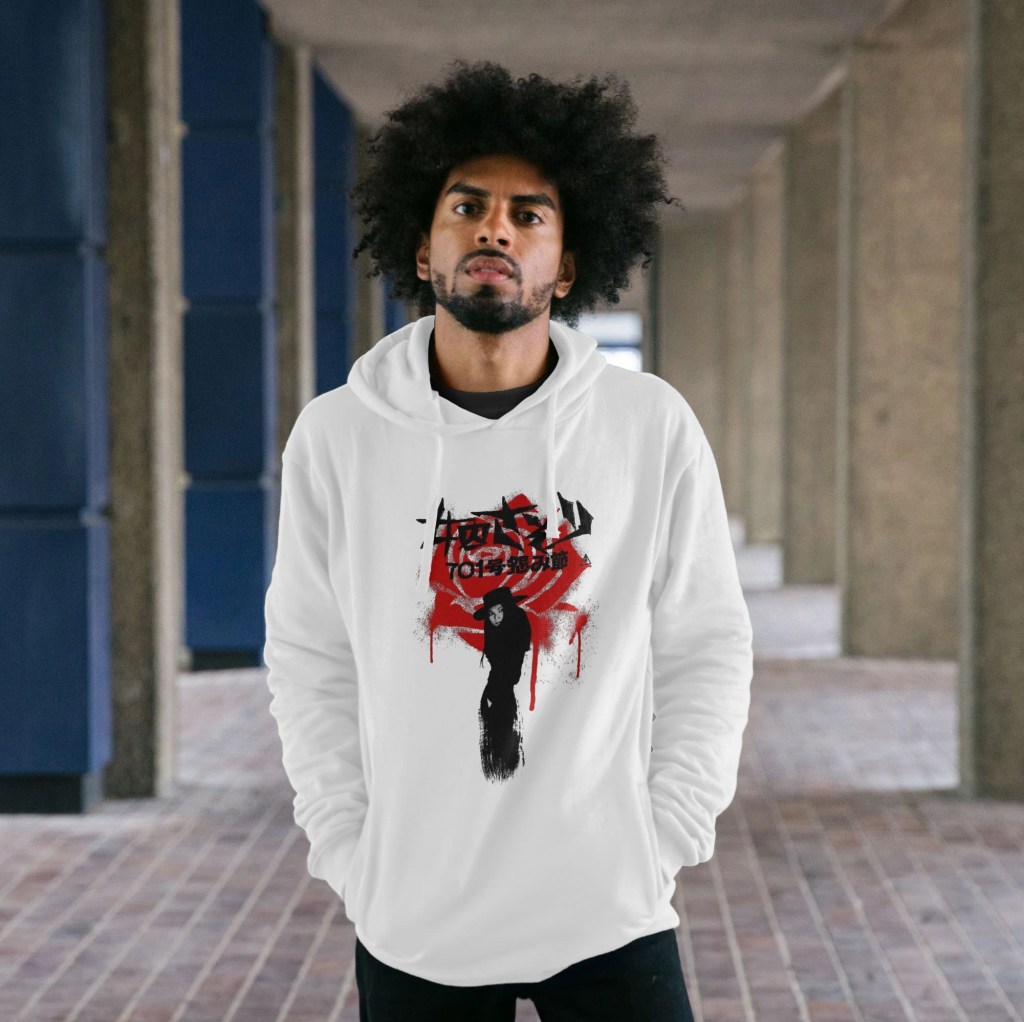
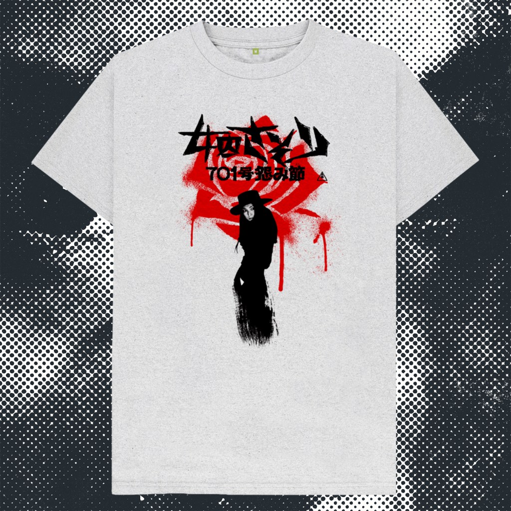
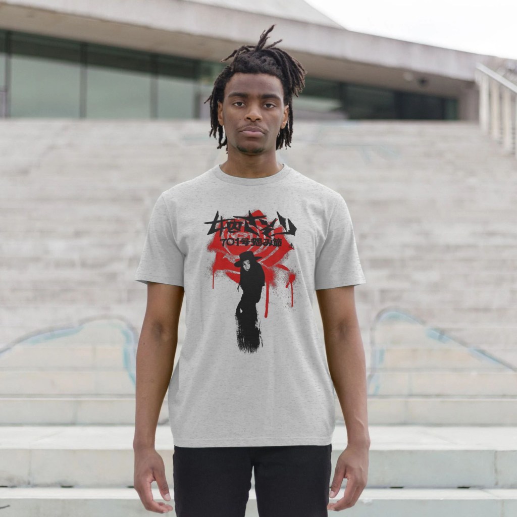
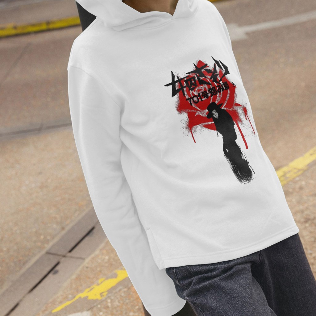
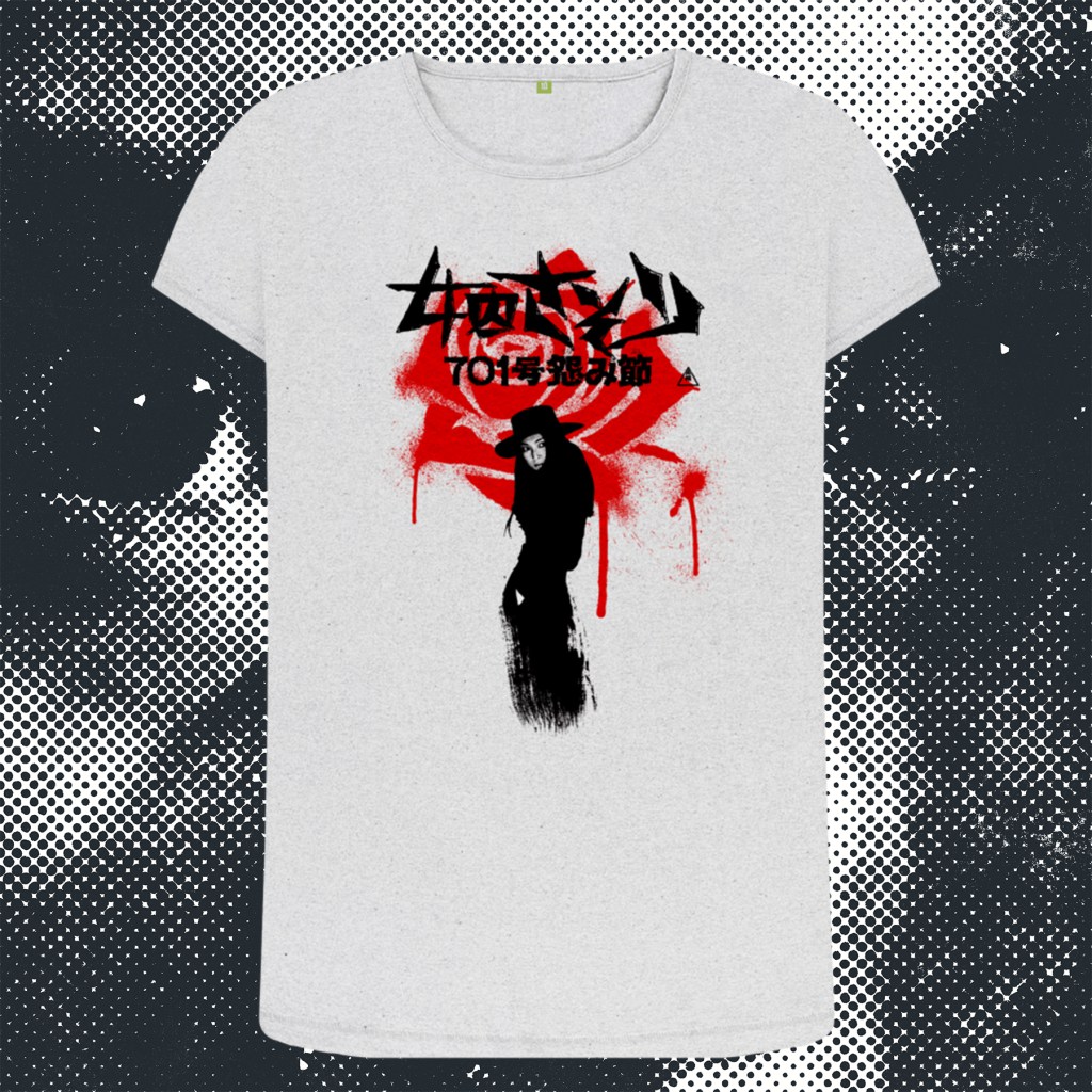
My final poster design in the Female Prisoner Scorpion series is for director Yasuharu Hasebe’s only entry, and Meiko Kaji’s last outing as Nami Matsushima/Sasori/The Scorpion, Grudge Song. While it lacks the wild creativity of Shunya Itō’s incredible trilogy, Hasebe was no slouch – a veteran of Nikkatsu’s ‘borderless action’ yazuka movies of the late 1960s, including his remarkable Retaliation which featured Meiko Kaji in a supporting role, and 3 entries into Kaji’s sukeban series Stray Cat Rock. A sombre and fascinating coda to the wilder Itō pictures, this film allows Kaji to ground her portrayal of Nami more than at any other time in the run – even going so far as to find her a male love interest for the first time since the evil corrupt cop that sent her down the path of cyclical incerceration and revenge. The film even features fascinating visual callbacks to the first film in the cycle that evoke that relationship, deepening the drama and dourness when things inevitably go awry for our stoic heroine.
I’ve tried to capture that pared-back simplicity with a bold and stark design that incorporates a flower-shaped bloodstain – visually representing one of the more memorable kills in the series as Nami eludes capture by driving a flower into a cop’s jugular. The bloodstained fabric refers to that visual callback during Nami’s brief moment of physical intimacy she shares with the damaged anarchist she comes to trust enough to take to bed – a visual motif that in the original film also recalls the hinomaru flag.

Buy shirts at Teemill and giclee poster prints at Etsy!
Shunya Itō’s third and final Female Prisoner Scorpion film opens with a bravura jolt – Nami Matsushima, Sasori, the Scorpion, is out of prison and on the run. As superimposed wanted posters fly past the screen while the camera barrels down a Metro track, we eventually enter the carriage where a glowering, olive green jacket-clad Matsu stares dead ahead while a crew of detectives scour the faces of the passengers. As their eyes lock, she springs violently into action, slashing away at the cops with a knife and escaping as the train pulls up to a platform. Alas, one dogged detective catches her arm and slaps the cuffs on her wrist, and tethers it to his own, just as the doors are closing. Wide-eyed, desperate, she takes a second to assess the situation and then begins hacking away with the blade, eventually severing his arm in a torrent of blood as she swings his severed appendage above her arm. Freeze frame, blood red title card, the first blast of Meiko Kaji’s now familiar theme song enters, as the image becomes aggresively solarised. The stricken cop writhes on the floor, as Matsu takes flight, emerging into the harsh light of the Tokyo streets. She sprints through panicked pedestrians with the bloodied arm flailing in her wake, we know that once again, Itō isn’t going to let his audience settle in to the familiar despite the rapid production schedule of his series.
This vérité approach strips away the grim-yet-operatic visuals of the previous film, coming off more like the street-level gangster movies that preceeded it. The poster has, in tandem with the film’s more toned down, gritty, comparatively stripped-down aesthetic, been created to emphasise fewer elements (and increased violence). Again using the stripes of the iconic prison uniforms as a guide, I wanted to divide the poster into three horizontal strips, and was immediately convinced that the image of Nami dragging the detective’s severed arm would be her hero shot at the bottom – unrestricted by the stripes that would run across the top and middle. With realtively little real estate to work with, choosing the right images for the rest of the poster was a challenge. Originally I had used a screenshot of Katsu and her gang menacing Yuki, but the brutality of the sequence, divorced from the context of the film and the intent and artistry of Itō surrounding it, came across as too extreme and exploitative to use as a standalone image. These posters do have to strike a balance – these films are, after all, ‘exploitation’ films, which the artwork has to reflect, but should never stray too far into the realm of bad taste where they become too unpleasant or triggering. Even when dealing with somewhat extreme material, there are still lines to be drawn. And while the backstory behind the image of Yuki I did end up using is of course horrifying (she is raising a knife to her brother, wondering whether to kill him to spare them both the pain of their desperate situation), visually it seemed to me to be compelling, suitably harsh for the tone of the film, but falling just barely on the right side of acceptability. It was also one of many of Itō’s beautifully composed and lit shots, Yuki’s heavy makeup popping out of the gloomy dark room, the blade poised dangerously across her, the Dutch angle of the camera creating the fantastic diagonal sweep of the room behind her.
The colour scheme, overall, came to me instinctively. Again, the green was inspired by the original release poster, albeit that one was a very dark green, with red, blue and yellow along with a large image of a crow. I used Nami’s jacket as inspiration for a more military green mid-tone, with a pale green background – much in the same way the #701 poster used a solid blue over a pale blue background. And I knew I wanted to have the title text in white – which meant using a less detailed image for the middle strip upon which it would sit. I stumped for a wide shot of the one-armed Detective Kondo walking down a dark, industrial-looking street plastered with wanted posters – this time with all white removed so that the whole image was green-on-green. That was when the idea hit to incorporate red into the image. First, I wanted Kondo’s severed arm to be in red, so that it would be clearer to the viewer what it was (the downside of this film’s use of exterior, almost documentary footage is that both focussing issues and massively increased grain, coupled with a reduction in the kind of contrast you get from studio lighting, meant that the main image of Nami was, and remains, a little soft). A few tweaks were made to the image – painting in more detail on the hand, the cuffs, and most controversially and experimentally, running the face of the image through an AI enhancer. Knowing that the riso filter process would help to smooth over any mismatches in the image quality, I feel that it was important in being able to make the main hero image of the poster stand out, and was happy with the result in the end.
When I had just the arm in red, it felt very disjointed (so to speak). So, I experimented with using a blood splash to link it to Nami at the top and bottom. I felt this looked a lot better, and this inspired the further use of the splash across the text. In turn, that necessitated using red on the top image. At first, I had a horizontal streak running through the middle of the image, but this seemed to imbalance the layout. I experimented next with a splash, which looked more in keeping, but now seemed to be overusing the effect and diminishing its impact. Finally, it hit me to use the diagonal back wall – that a diagonal streak would direct the eye through the image, and would mirror the angle of Nami’s right arm, almost like a chevron, running from the top left, through the right middle, and back to the bottom left, encompassing the whole poster.
Now all that remained was the lettering. Each poster has had very different fonts – chunky and minimal for #701, more traditional and elaborate for Jailhouse 41 – and here, I wanted to use a more functional, appropriately 1970s street signage font. The final decision was to highlight Meiko Kaji’s acting credit in red, in a placement that I felt helped draw the eye in that chevron-esque direction through the composition. All this achieved, I felt that the poster had done all I could hope for. I was disappointed to not be able to include Katsu or her birds, or Kaji’s horror scene where she attempts to grind off her handcuffs while grasping Kondo’s disembodied arm in her teeth in a graveyard, but I feel like, if I saw this poster, I’d go and seek out this film. Which is surely what it’s all about.
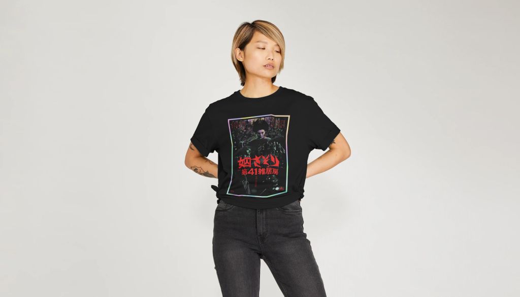
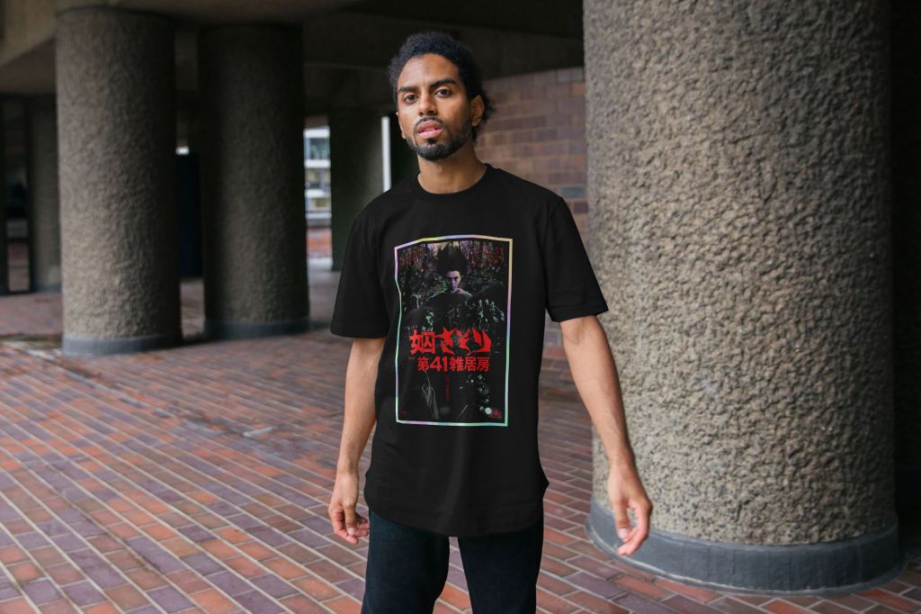
To adapt this into a shirt design, I simplified the design down to just Nami’s daring escape, and kept the blood-spattered title text and the credits. I added the horizontal dark green bars top and bottom just to create some solidity to the layout (it also reminded me of a fantastic Stars of the Lid band shirt I owned many years ago! Head to Teemill for shirts and sweatshirts.
Buy shirts at Teemill and giclee poster prints at Etsy!
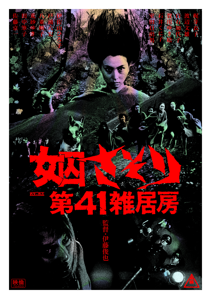
The 2nd film in the series, and one of the most incredibly creative, strange and unsettling of its era. I’ve tried to reflect the evolution of the series within this artwork, which came via a very different process to the first image. The #701 poster was confined to a diamond shape to reflect the story’s containment within the prison, with the dark blue and white colour scheme of the main image used to evoke the uniform colours of the general prison population. The pale blue and yellow were used to offset and compliment this, while referencing the original cinema release poster. With this film, I knew I would want to break out of that restricted shape space, in the same way that the characters break out of the prison. After trialling a few failed attempts to create a ‘breakout’ type of image, I was struck by the stunning split diopter shot early in the film of a bound Matsu on the floor of a dank solitary confinement cell, towered over by the villainous warden and his two lackeys under the glare of a harsh blue light.
I knew immediately that this would be the foundation of my image, right in the bottom 1/3 of the frame, the defiant but temporarily defeated heroine before she leads a ragtag group of prisoners on an impromptu, hallucinogenic jailbreak. It was dark, subterranean, illustrates the odds she will have to overcome. I also knew that the title would have to sit just above this, to divide the poster into the ‘before and after’ chapters representing the imprisoned opening, and the remainder of the film which sees her on the run. That left the top half (approximately) of the poster – and after rewatching the film a couple of times, one of which to gather as many screenshots as I thought might be helpful, I realised that the dominant image could only be the moment where Matsu takes some kind of enchanted dagger from a mysterious old woman in a forest. This shot, where Meiko Kaji looks right down the lens as a mysterious wind whips her hair up vertically, is her iconic hero moment. Free of the bonds of prison, commanding nature, more some kind of legend or spirit than a mere person. This sequence also inspired an idea – to tint the poster beneath a black riso-style, pixellated collage with a holofoilesque colour spill – like petrol and water mixing. The palette was lifted from the film itself – the orange light that gives Kaji’s hair a sort of halo, reflected also in the autumnal leaves which blow across the screen; the acid-y pinks and purples of the forest sequence and the wild fantasy/dreams that punctuate throughout; the pale greens that stand in for sickly moonlight; the harsh light blues of the prison cell. The black of the main image was essential given the gloom of the shacks in which the women lie low while being hunted.
To accompany that image of Matsu with her blade (the hair had to be replaced as the frame cut off the top – I ended up going more stylised that in the film itself as reference material was scarce, and I needed the effect to be very bold), I knew I wanted to see the women escaping, and the stakes if they were caught. Initially this section was far busier, including the prison guards the women kill during their escape, and a burning truck, but in the end I went with a shot of a tracker dog and the pursuing officers. If you’ve seen the film, you’ll know how the dog plays a fairly shocking role in proceedings. I also grabbed a shot of the destroyed town in which the women hide – the sight of a town abandoned to ash and decay cannot help but evoke the devastation of wartime Japan. The mountains behind allowed for a sense of scale to play with (the prison guards are not of course intended to look like they are physically right behind the women – I hoped that the collage nature of the poster would be an evocation, not a believable representation) and the serendipitous placement of a central mountain made for a natural base to the image of Matsu, just off centre to make space for her knife-carrying hand. This was snipped out and adjusted to pop out from behind the horizon line – multiple other fixes were made to the wardens, the women, and the environment to hide any seams, to extend backgrounds or characters where cropped by the frame (all screenshots were taken direct from the movie in regular HD resolution, so the widescreen matting did remove a lot of essential information – see if you can spot the leg that I had to shove into the image from a frantic Google image search). The forest behind Matsu was snipped from a slightly earlier shot as I preferred the way the trees looked, with a wider shot of Matsu removed and covered up. Leaves were added from stock photography, tweaked, as all images, within the Studio 2am ‘Riso Effect’ workspace to ensure that they stood out against the backdrop enough. In all, there are about 22 layers of risoprint-processed assets, plus some brush work to connect them together.
The title was lifted whole from a screenshot of the movie itself, simply cleaned up as an image trace in Illustrator. The red colour comes straight from the film, and I thought made a strong contrast with the already busy design. Logos like the Toei Studios imprint, and the unusual, small symbol that sits next to the title (I still do not know what this means – I think it is something akin to the Eastmancolor, or Technicolor, trademarks?) were lifted from the earlier poster – the former lifted from a logo repository website, the latter actually created in Illustrator from geometric shapes). Shun’ya Itō’s director credit made for a bold split down the lower middle image, and that also dictated the acting credits going in vertically, rather than horizontally. This was also inspired by the original release poster, which listed its credits in this alignment, reading from right to left starting with Meiko Kaji.
In all, the conception of this design took up far more of my headspace than the previous. Working without a sketched layout made getting started very difficult, but in the end the film itself was inspiring, and gathering screenshots led to ideas forming throughout. I had originally intended this series of posters to resemble each other much more closely, but I hope that there is enough connective tissue that they do seem of a piece, while representing the spirit of the differing films.
If you like this poster, please head over to my Etsy shop to pick up a limited edition giclee print! I have mastered this work on A1 size paper, but 2 more sizes are available if you want to pair this with the A3 #701: Scorpion poster. You can order as a standalone A1 giant print – I can confirm, the good people at Atom Printing do amazing work! On the larger scale there is a huge amount of detail which is lost in the digital version above. And you can buy shirts of this design over at Teemill right now! Available in long sleeve, short sleeve and a variety of cuts, as always printed to order on sustainable shirts.