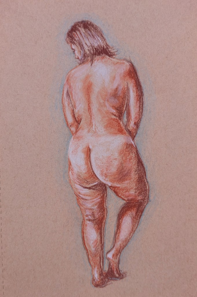
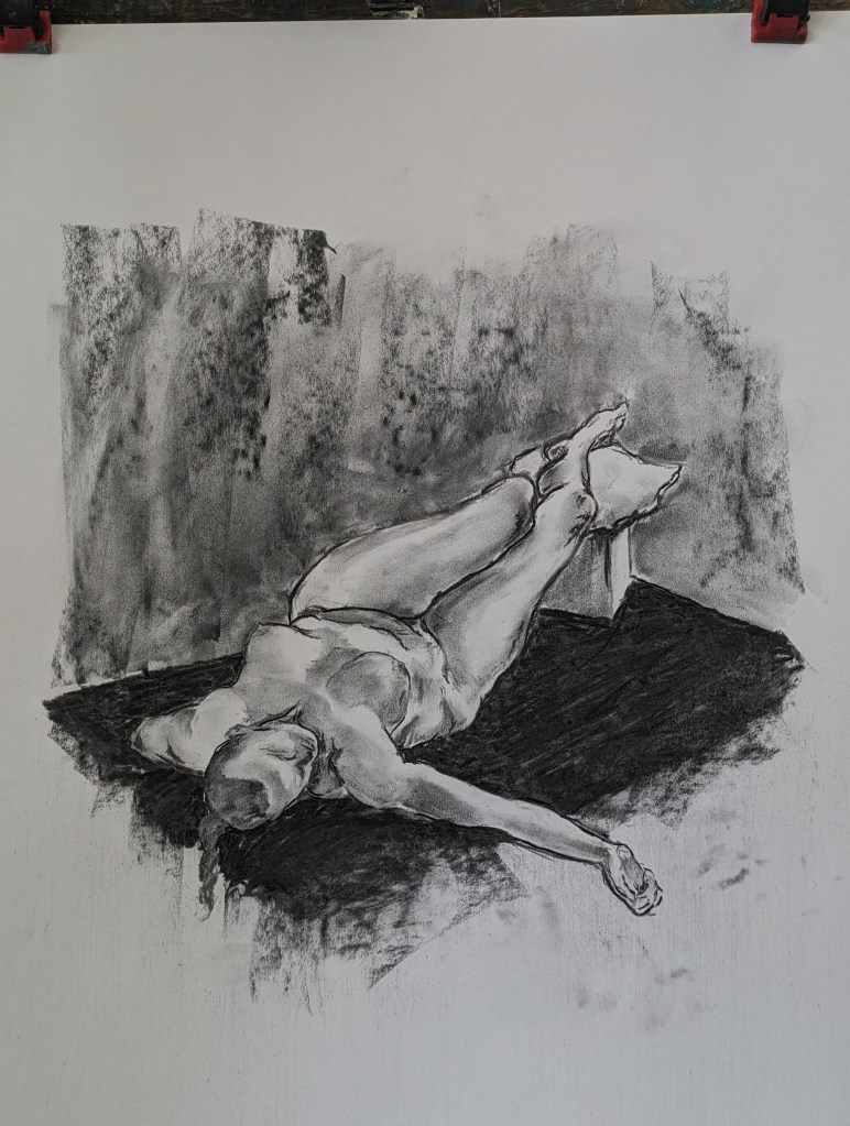
A vine charcoal on newsprint sketch of life model Purdey, chanelling some Henry Fuseli spirit, at Dulwich Art Group’s Halloween life drawing special on 30th October.
A vine charcoal on newsprint sketch of life model Purdey, chanelling some Henry Fuseli spirit, at Dulwich Art Group’s Halloween life drawing special on 30th October.

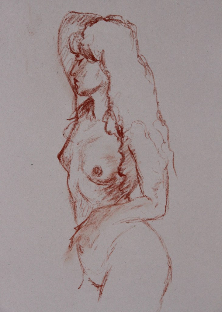


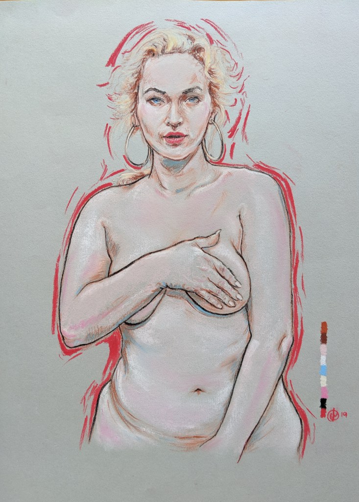


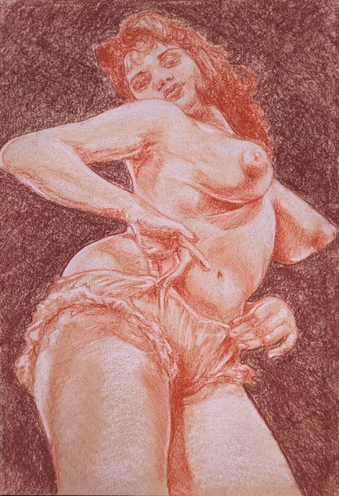
An elusive British model of the late 1950s, in a small practice sketch on toned paper with sanguine chalks.

I would like to claim that I was the only kid in Darlington that had a Wu Wear jersey in 1999. It’s probably not true, but I never saw another. I developed an intense fascination with the Wu-Tang Clan in my later secondary school years. Must have been the undeniable parallels I felt, in my formative years on the Grange Estate in Hurworth-on-Tees, with the Park Hill project in Staten Island that birthed the legendary group. To this day, my brother and I can recite the infamous skit from their debut album that precedes the absolutely phenomenal M.E.T.H.O.D. Man (“I’ll just keep feedin’ you, and FEEDIN’ you…”) word-for-word. And often do.
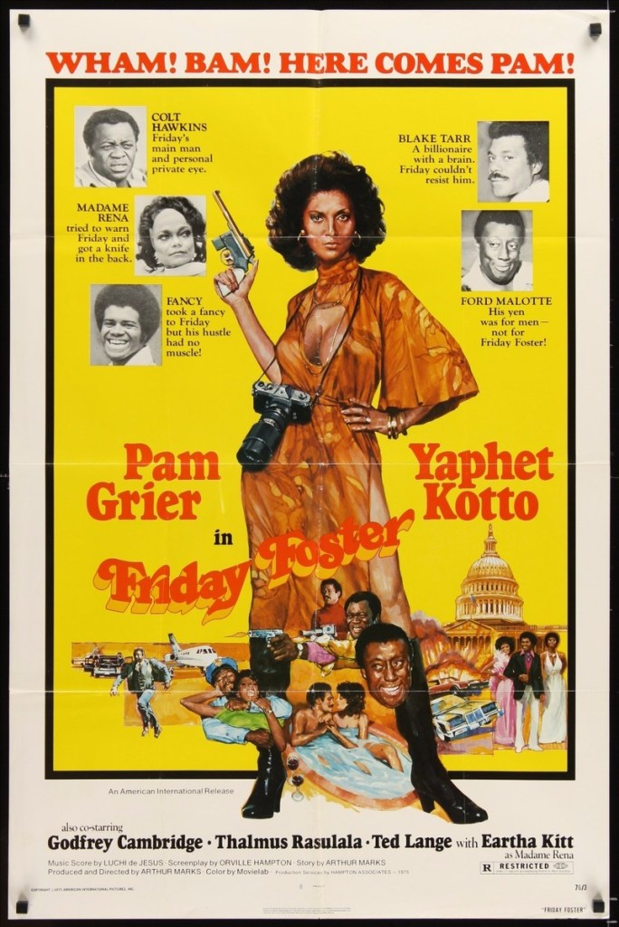
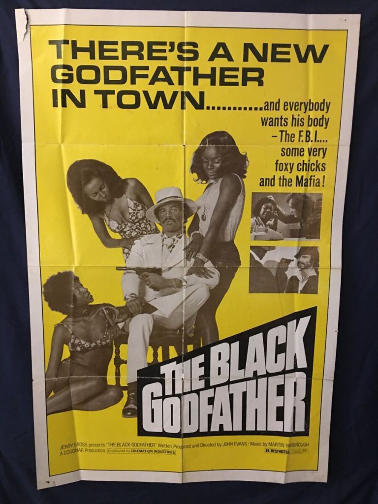
So imagine how nuts I went when I was contacted about the possibility of pitching a cover concept to RZA’s 36 Chambers Record Label for a new album being prepped by long-time group DJ Mathematics. The record was to be themed around Blaxploitation movie scores and tracks, forming the bedrock of each song. I was sent a huge cachet of posters from the era as inspiration, as well as concept art by Mathematics himself – fucking daunting given that he is the man who created the famous W logo. I’d been contacted after posting my Coffy alternative poster. The designs leaned heavily into a busy image of besuited badasses and babes, the draft I saw modelled mostly on 1973’s Black Caesar. Given that this had already been covered, I thought, why not swing for something a bit eye-catching in the same vein? So I cobbled together a direct riff on the brilliant Super Fly poster, a little on the nose of course, but I had a really clear idea of how a white, pink, and purple colour scheme could absolutely jump off the shelves (actual, and digital) in a genre that perhaps shied away from this particular look.
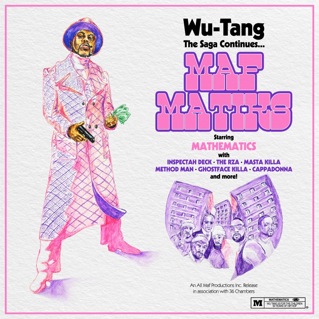
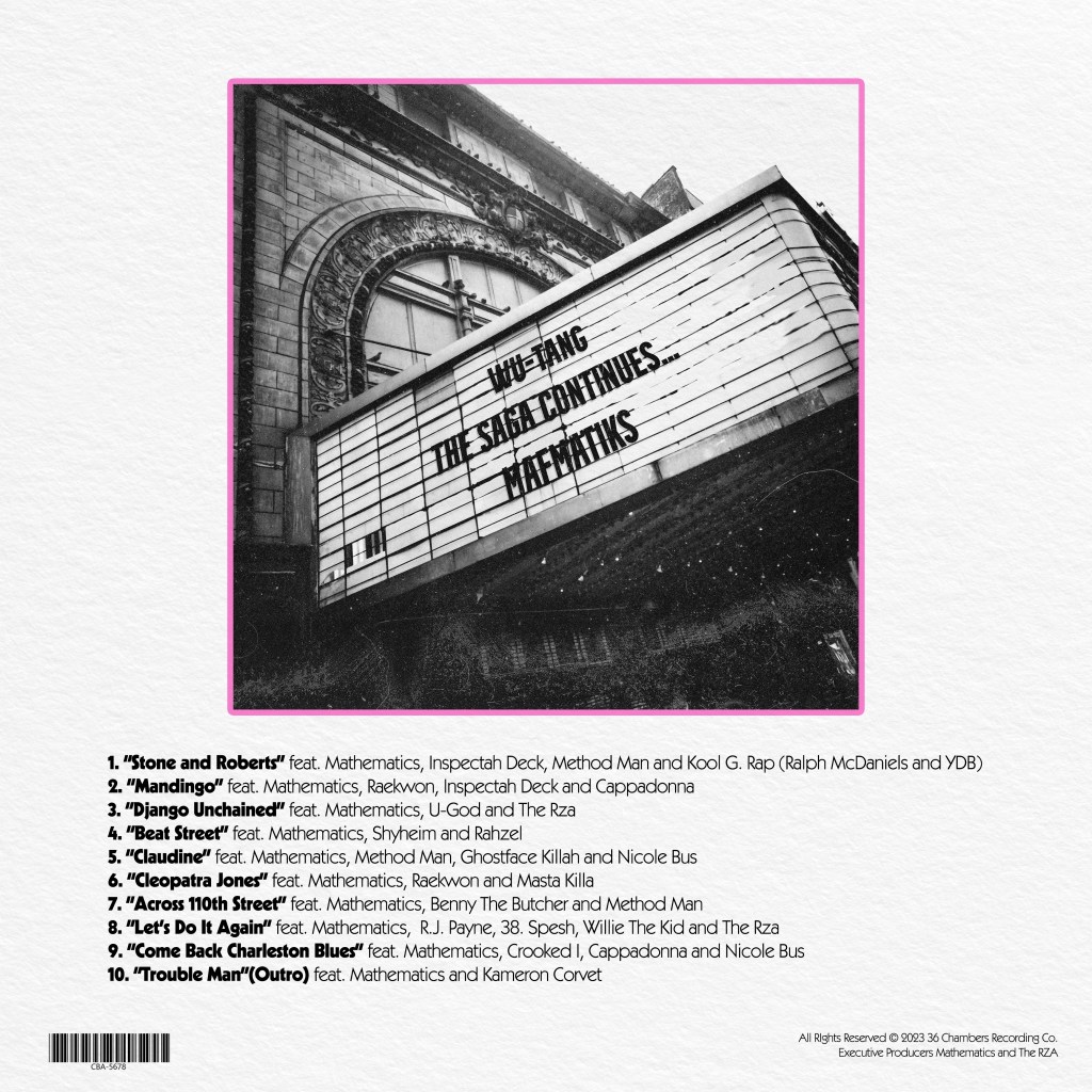
I rushed this placeholder draft out in watercolour pencils, adding a Wu-Tang logo that was hewn out of two tower blocks from that same Park Hill neighbourhood that so fascinated me when I learned how they dubbed the area Shaolin, with the members of the group posed in front of it. On the back cover, I wanted to evoke the nostalgia so many aficionados of cult films feel for the faded fleapits and grindhouses of New York’s 42nd Street. While, for me, this was something I didn’t even know I’d missed until it was long, long gone, the members of the group would have really experienced those cinemas, discovering the Kung Fu gems that so influenced their lexicon.
But, my preferred design sought to reference the brief more tangentially – I saw many posters that used a stark black, yellow, and white colour scheme:

…and figured, what if I could avoid the cliche and the visual overload, while keeping the feel? Many posters include a cityscape, so I grabbed a vintage 1970s photograph of the New York skyline taken from the perspective of the Staten Island ferry as it approaches – figuring, it could evoke the journey the group’s members may have taken into Times Square to see these same, infamous features. I ran a risoprint filter of the image, after isolating the buildings and adding a more highly-contrasted photograph of clouds, to allow for some additional texture.
I ran the filter over the skyline separately, then manually lined up the two images, so that the black and white buildings stood stark against the yellow and white sky.


I used the Wu-Tang W to create a cutout against the buildings, and separately against the sky, and then finally utilised the detailed buildings and bridges to cut off the solid yellow background at the horizon line, leaving the lower third free for ‘credits’ in a font that I felt straddled the line between 1970s-appropriate, with a modern edge. You can see the struts of the bridge at the outer edges if you look close enough.
For the back cover, I repurposed the same image of a broken-down awning, the album name emblazened on it. The work here is extremely rough as it was only intended to be a very indicative, low-res concept pitch, but I thought the overall piece looked like something that brought the right feeling of the 1970s, without seeming too try-hard or tacky. Bold, but not fussy.
Ultimately, of course, this was as far as the job went – I was super happy for the opportunity, a bit bummed out that I didn’t get to contribute to one of my favourite musicians of all time, and fired up to try again.
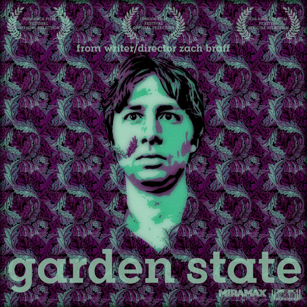
A film I have a complicated relationship with, but made for a really interesting Rewind Movie Podcast episode. I wanted to utilise the very overused, well-known image of Andrew “Large” Largeman sinking into the background as he tries on a shirt made from the same material as the recently renovated bathroom in his childhood home from which he has become so alienated (why was there leftover fabric from a bathroom wall that could be used to make a man’s shirt? I do not know!), but give it a bit more thematic weight.
I sourced the closest analogue I could find of the wallpaper pattern, a William Morris (proud son of Walthamstow!) design called Acanthus. I could only find a small square, so I had to line it up by eye and create a repeatable pattern big enough to fill a Photoshop square. I then eyeballed a purple and green colour-scheme based partly on the screenshots I could source from the movie, and partly one that I thought seemed attractive – aware that I was going to potentially tweak this heavily later.
I used a faux-vectoring technique (I no longer have Illustrator, so have to create a workaround using a YouTube video from TextureLabs that is intended to mimic screenprinting) to create a three colour Braff face, that I matched to the colours in the wallpaper pattern. I manually erased some of his face to allow tendrils of the background plants to show through on his face.
Then, I didn’t like the cartoony boldness – so I ran it through a Studio 2am effect called Indie Dreams, which seemed appropriate in capturing a hazy, early-’00s sensitive colour pallete. There were a number of options, so I used one that shifted more towards a colder green/purple tone. It helped to remove some of the lazy pixellation I’d left in my haste to construct the wallpaper pattern. Finally, I grabbed a font that seemed to match a less familiar release poster I’d found, a blocky serif font called Flamente Cairo. I stuck to the late-Gen-X penchant for all lower case text, and added the same festival laurels that the poster I sourced proclaimed. It felt, again, true to 2004 to trumpet the cachet that came with festival slots in the dog days of the Peak Sundance era.
All available at my Teemill store!
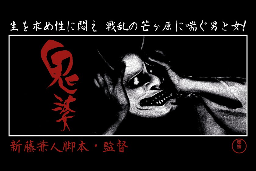
Kaneto Shindō’s bleak and brilliant 1964 masterpiece.
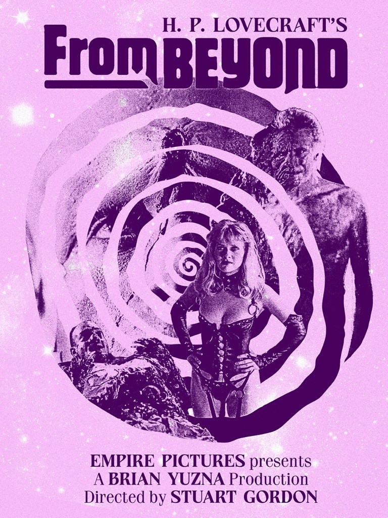
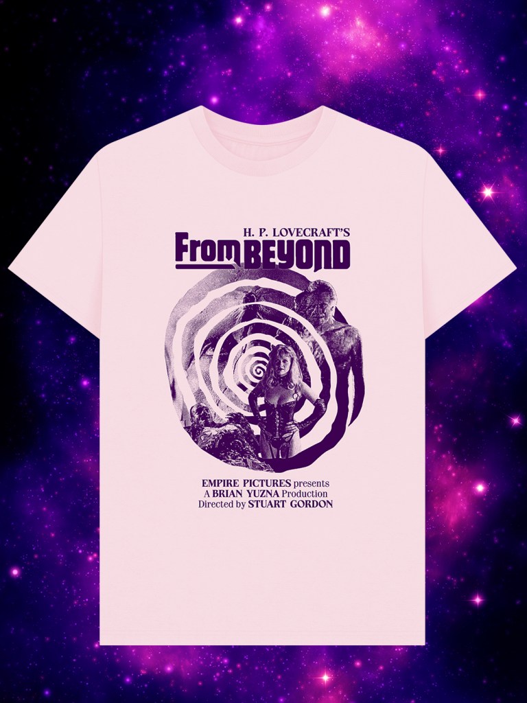
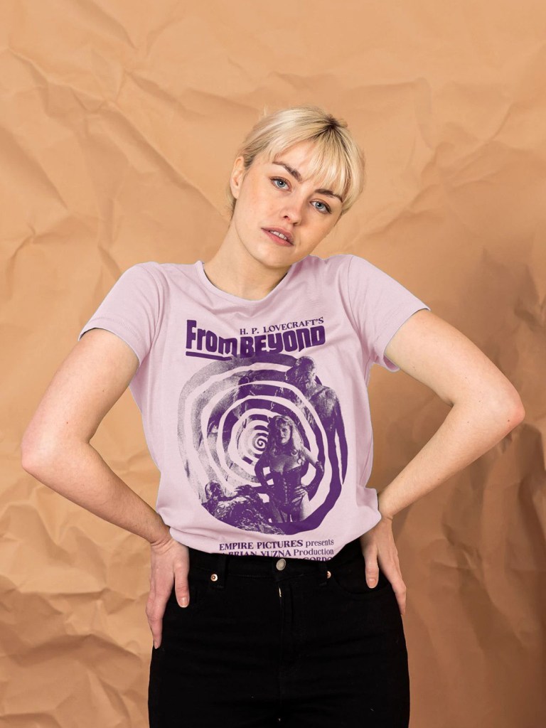
Stuart Gordon’s gleefully grotesque Lovecraftian nightmare.
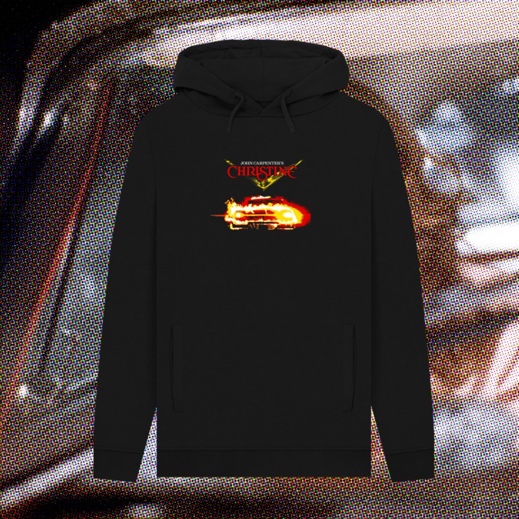
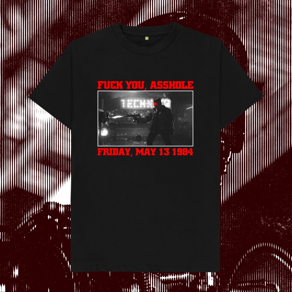
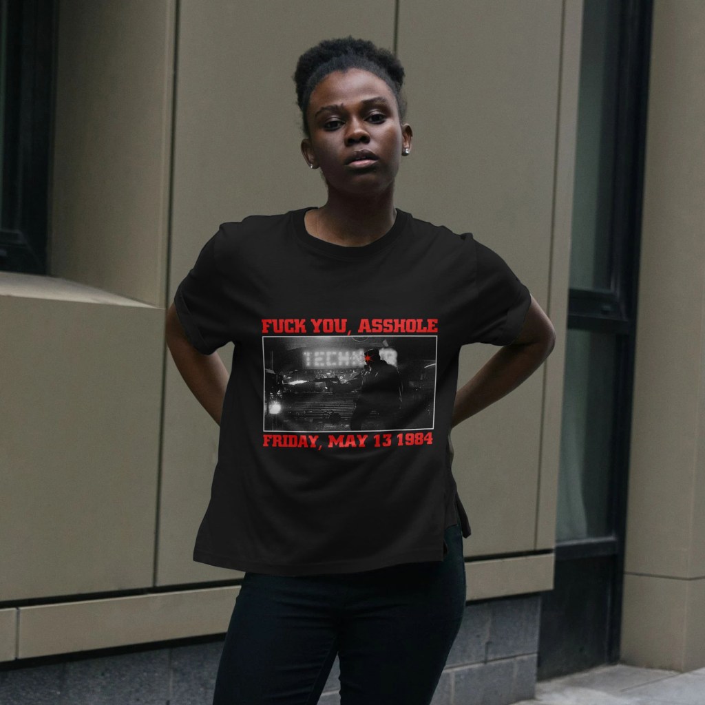
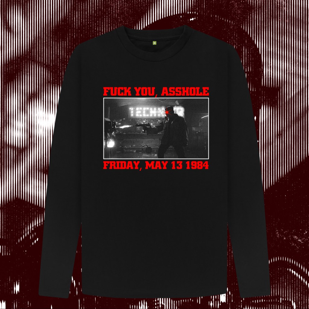
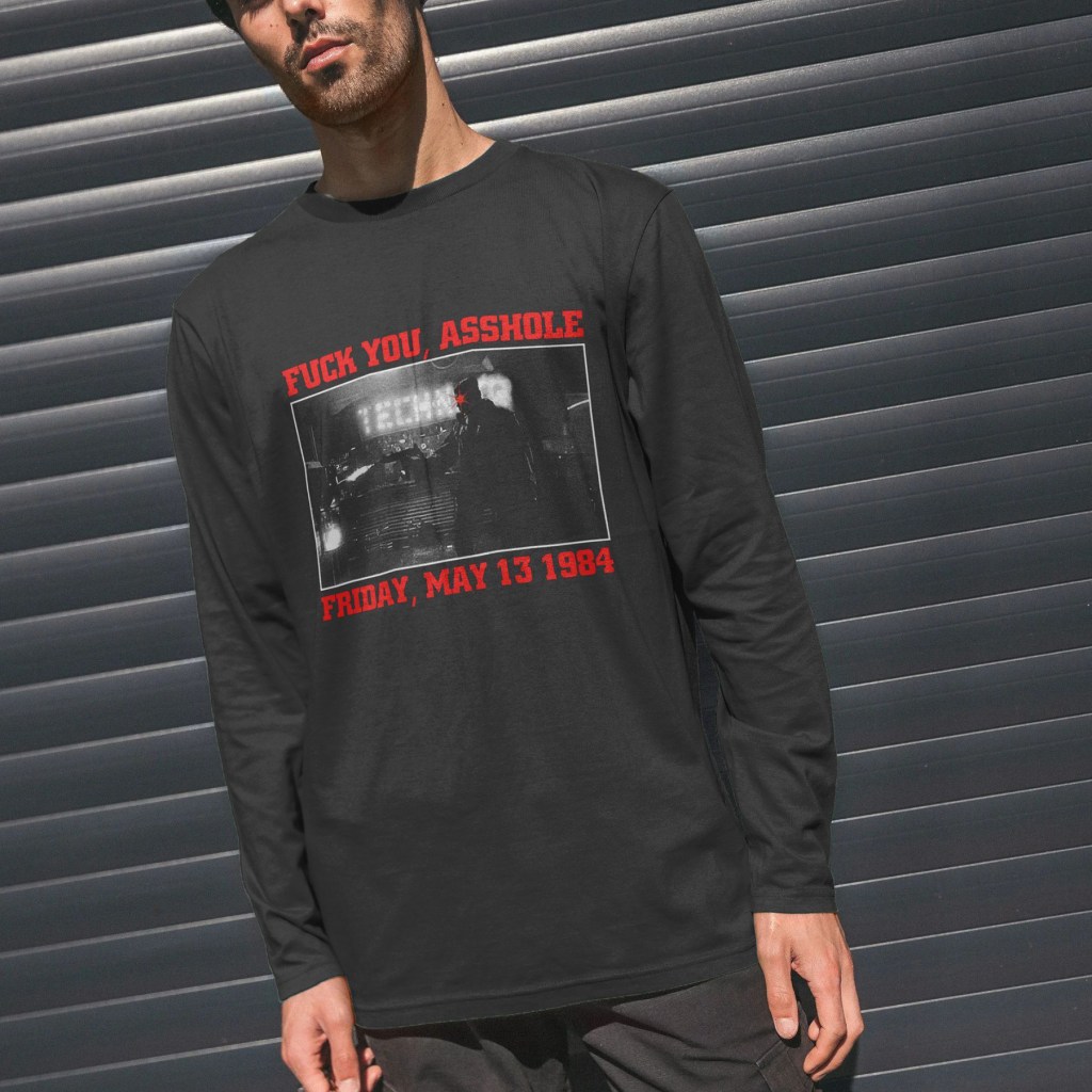
“Come on, big guy. Let’s go for a ride. Let’s cruise.”
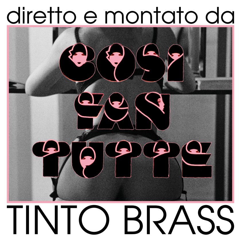
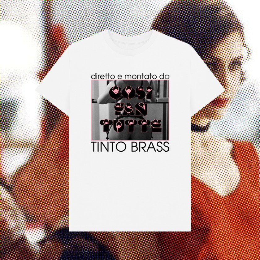
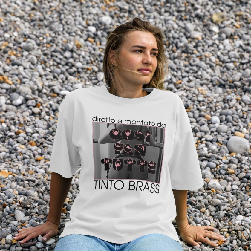
Italy’s premier, posterior-obsessed arthouse provocateur.

An ink sketch, scanned and digitally coloured by my good friend and Rewind co-host Scarious Artists. Available on my Teemill.

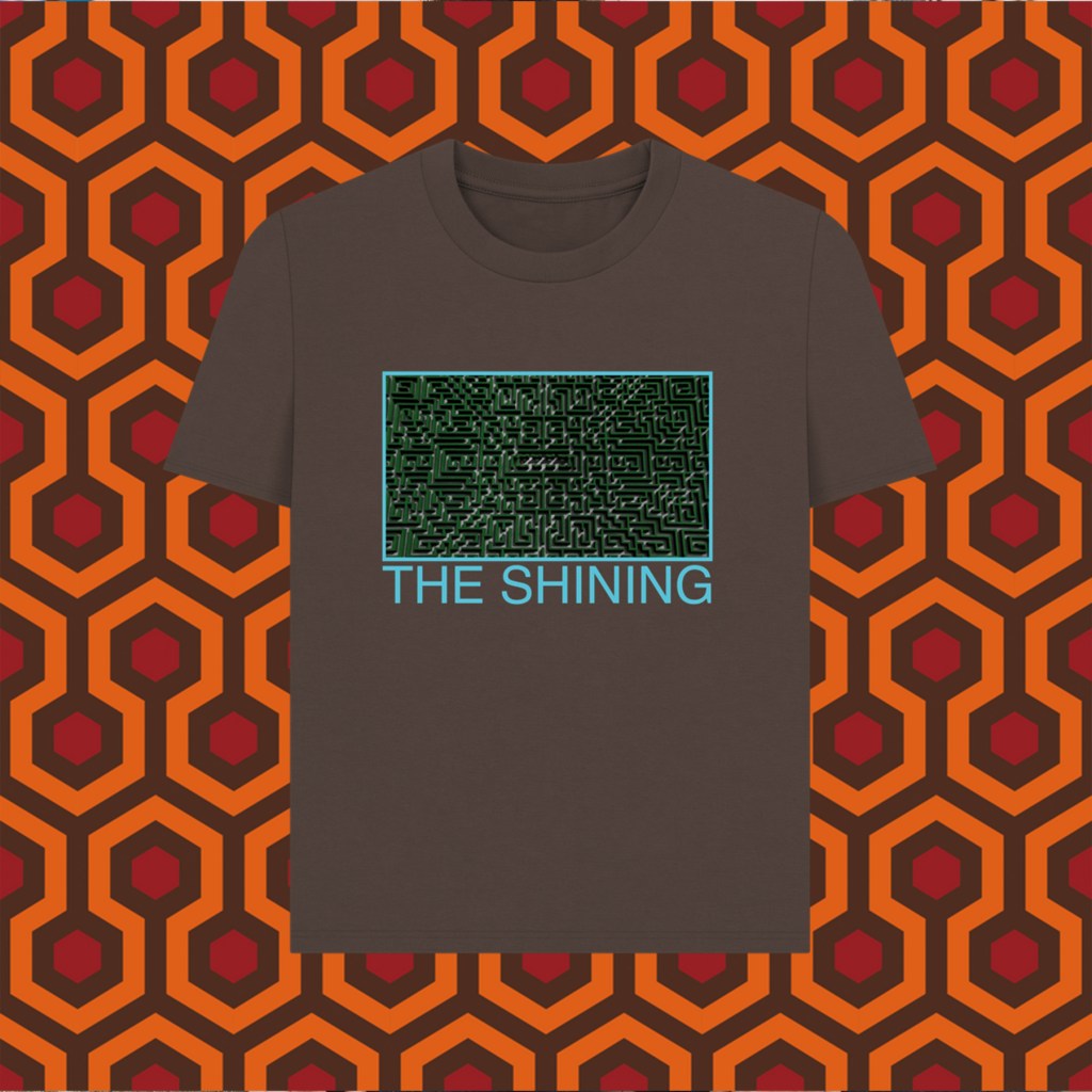
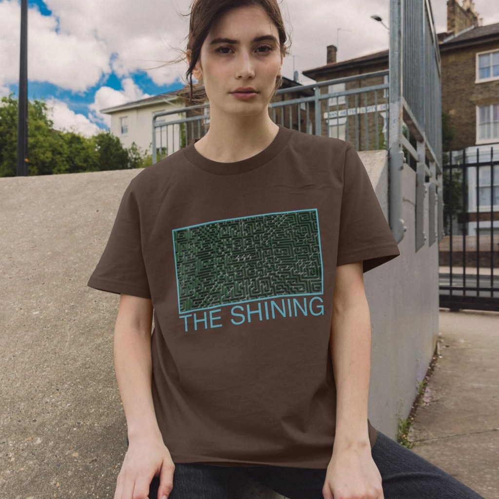
A slightly brain-melting design for our Rewind Movie Podcast episode. Prints and t-shirts are available on my Teemill store.

An experiment, my 2nd ever oil painting after an introductory class. I used only 4 paints, the Zorn palette (Cadmium Red, Black, Yellow Ochre and Titanium White), on the figure. Using an acrylic wash to create a cool, light midtone, I used quick, thin layers of paint to try and suggest the subtle differences between the skin tones in a minimal, pale colour scheme. The background was a mixture of rich blue mixed only with black and white, laid on thicker to help offset the more hesitant strokes on the main subject.
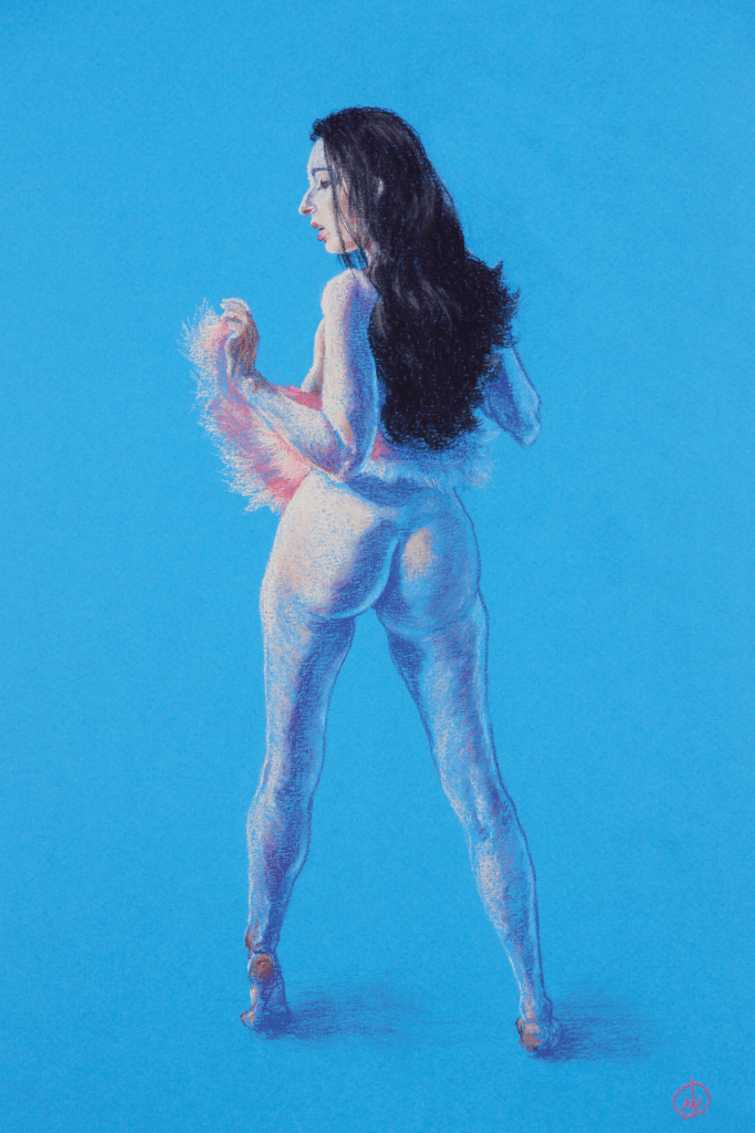
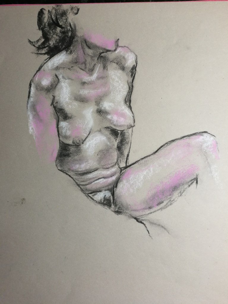
The reference image I found for this sketch had a fantastic interplay of bright, pale key light, and a vibrant blue fill light against a blue background. I wanted to use the density of the pastel across the upper left, through the face and shoulder, to illustrate the more intense light, and let the background show through more sporadic, messy, reflected light in the lower part. On the shadow/key side, a darker blue pencil was used, with a purple pencil to handle the warmer, subsurface scattering as the colder colours meet the pale pinks of the direct light. The flash of pink of the outfit made for a bold focal point to ensure the drawing didn’t end up too cold overall, to establish the hints of pink and pale reds in the skin tones.
Available.