Created for our Rewind episode on Steven Spielberg’s debut feature (originally an ABC Movie of the Week, of course!)
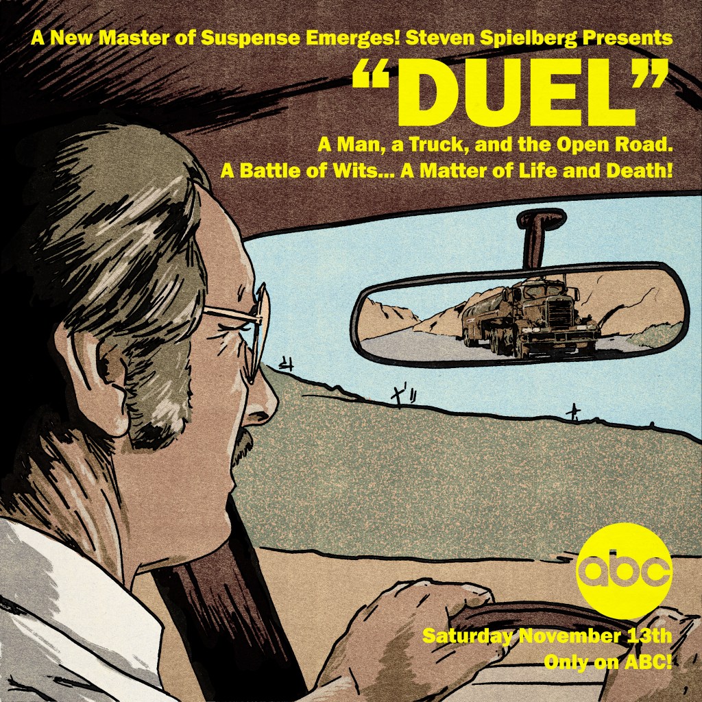
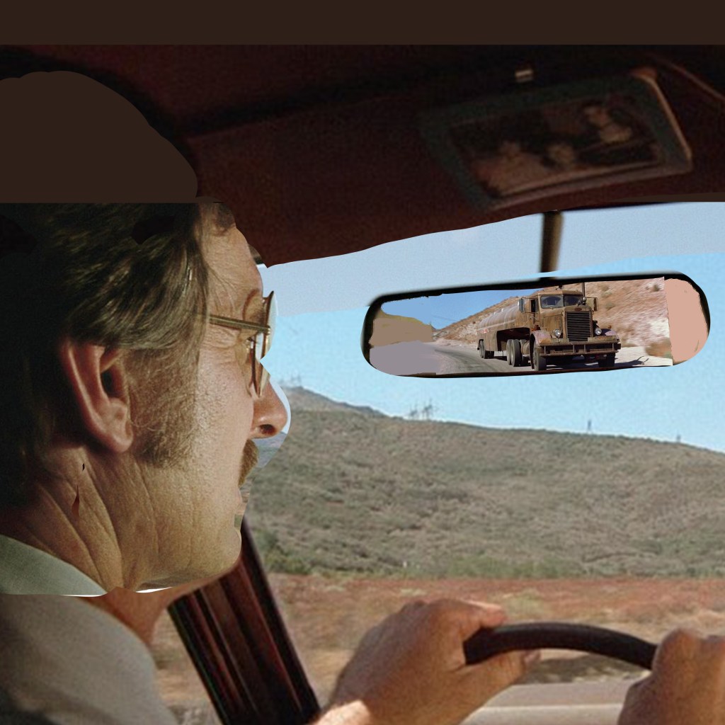
This one started life as an incredibly janky composite of screenshots in Photoshop, just to see how best to organise the elements into the square frame. I pulled a stack of images and pushed a few around, eventually landing on a layout that had a dominant, but indirect, image of lead actor Dennis Weaver, with the truck looming in his rearview mirror:
As a cover image that would be primarily used on podcast platforms, it would need to be a square format. Given that most of my design work recently is intended for Rewind episodes, that has meant that I’ve had to become comfortable with an image shape that I don’t find particularly natural or accomodating. Although, in this instance, it was useful on two counts – first, for a sense of claustrophobia that suits the film’s juxtaposition of wide-open vistas and sweaty, intimate in-car panic. And second, to mimic the boxy format that the original airing would have had, before the theatrical re-edit that opened up to widescreen.
Downsides – of course, a driver would not have a rearview mirror jammed right in front of their eyeline. And, without being able to open up the format to something wider, that meant that the truck – the main selling point of the film – would appear pretty small overall. So, I wanted to mitigate by ensuring that David Mann’s eyeline leads the viewer right to the truck. That it would sit in and break up a patch of pleasant blue sky and provide a messy, eye-catching feature among an otherwise quite simple layout.
That influenced how I drew the final piece, too. I still did not know how I would render this. Realistic? Illustrative? Painterly? A big factor, perhaps the main factor, was time. And skill. I would have trusted myself to render something more representative of real life if I had time to transfer the image to paper and render in charcoals. But I didn’t see that I would be able to do it justice in that format – it didn’t really suit the image, which I use more often for more traditional portature. I also just do not have the skill to render realistically in digital illustration. I have only a stylus that interacts with my touchscreen laptop, which is not a professional grade drawing tablet. And I don’t find digital illustration intuitive at all. I would love to be able to layer delicate brush work to build up the atmosphere, but it’s not something I know how to do.
So that left me with something more like a vintage comic book style – like Creepshow. I first laid down the ink work – using a variable width ink brush from True Grit Texture Supply Co. I laid a flat white layer down, and varied the opacity so I could see different levels of detail of the photomontage beneath for a loose trace. I intentionally used a wider brush on the car, the environment, and David – around 16-18 pixels I think – than I used on the truck, more like 8-10 pixels. The extra detail was to ensure that, if the viewer really got into looking closely, there was enough of the unique character of the truck to be interesting.
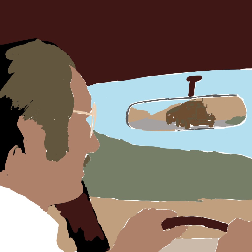
Then, again, to save time, I blocked in the colours extremely flat. I limited to around 6 colours in total, I think – all were droppered from the reference picture itself and then tweaked a little, to ensure that despite the cartoony render, it would be grounded in realistic colour tones. One flat tone for the sandy landscape, one for David’s main skin tone, one for the grass, a dark maroon for the car interior, and a specific tone for the truck. I think also the dashboard is a slightly different beige. Can’t remember. You can see below, without the ink work:
Then, it was time to add high and lowlights. I used a brush called Dry Brush Inker, that allowed for a bit of a break from anything too cheap-looking – I wanted a semblance of tactility. I also used the sandy colour as a texture to lay over the grass, to stop that looking too lush and keep the desert look intact. This was my second attempt – initially, I used a grain shader to try to build up detail and visual interest across all the areas. But this looked too modern, too much like a 2010s comic book – it couldn’t concievably pass as a vintage illustration. Using these modern techniques to ape obsolete techniques is always a fine line to walk. Obvious pastiche looks cheap. It was also important to NOT introduce any new colours at this point – all digital paint added to the image is drawn from that original palette.
Once the colours and the inks looked about right, I exported the inks alone as a PNG, and used a Photoshop process from Spoon Graphics called Bad Print Effects to add a number of filters and degradations that would mitigate the clean, boring flat vector style that it had. I did not process the colour elements – I find it a bit too harsh on those, so processed the colour paint layers separately in Camera Raw Filter and just added grain and texture, also using a vintage paper texture as an added layer to give some variance. But, it really helps to give the solid ink lines some imperfections and a hint of translucence – I used the same process on my Coffy poster.
The Bad Print process also comes with a harsh, aged paper texture as a background. I used GIMP to enact the Color to Alpha process on that background, and leave only a scuzzy, fibrous overlay that would make it seem as if the ink has bled into cheap paper. One more layer of old paper as a screen for variance, and we were done.
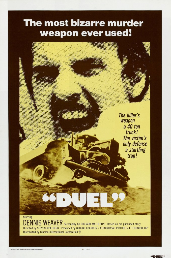
Then, it was time for text. For the podcast, I needed only the name of the podcast and the episode number. But for the print, I wanted to make it seem like an ad printed in an old comic book, which meant tagline, title, and the original air date of the TV movie. The colour choice was influenced equally by the yellow of the original 1971/72 release poster, by the blocky yellow text of Columbo, which Spielberg had just directed before this also for Universal Television Productions, and the repeated use of yellow to signify danger that my good friend Matt identified in watching Jaws. I loved the way the title was in inverted commas on the release poster, so nicked that for mine. I also paraphrased a great tagline from another.
The use of text also re-emphasised the primacy of the truck in the layout. The right-justified text was a matter of necessity – that’s where the spare real estate was – but also, as you read down the bright yellow text , your eye is led right to the truck, with nothing else to attract the eye directly below until you get to the network logo in the bottom right.
All-in-all, a fun, mostly instinctive path through the making of this poster. There’s plenty I would have fixed if I had spent more time, but I think in retrospect the only thing I would have definitely done differently is to lay down the ink work direct onto Bristol board in pen, then scanned. I have better control physically, and once scanned, can always make changes digitally where necessary.

