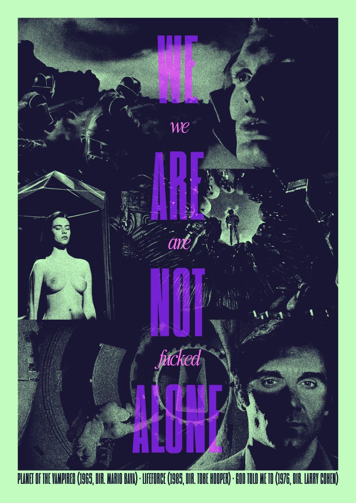
Created for HalloRe’ewind 2025
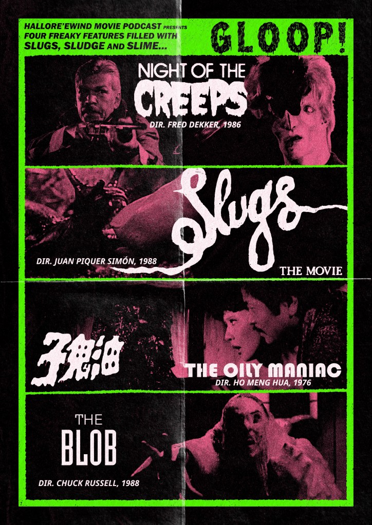
Created for HalloRe’ewind 2023
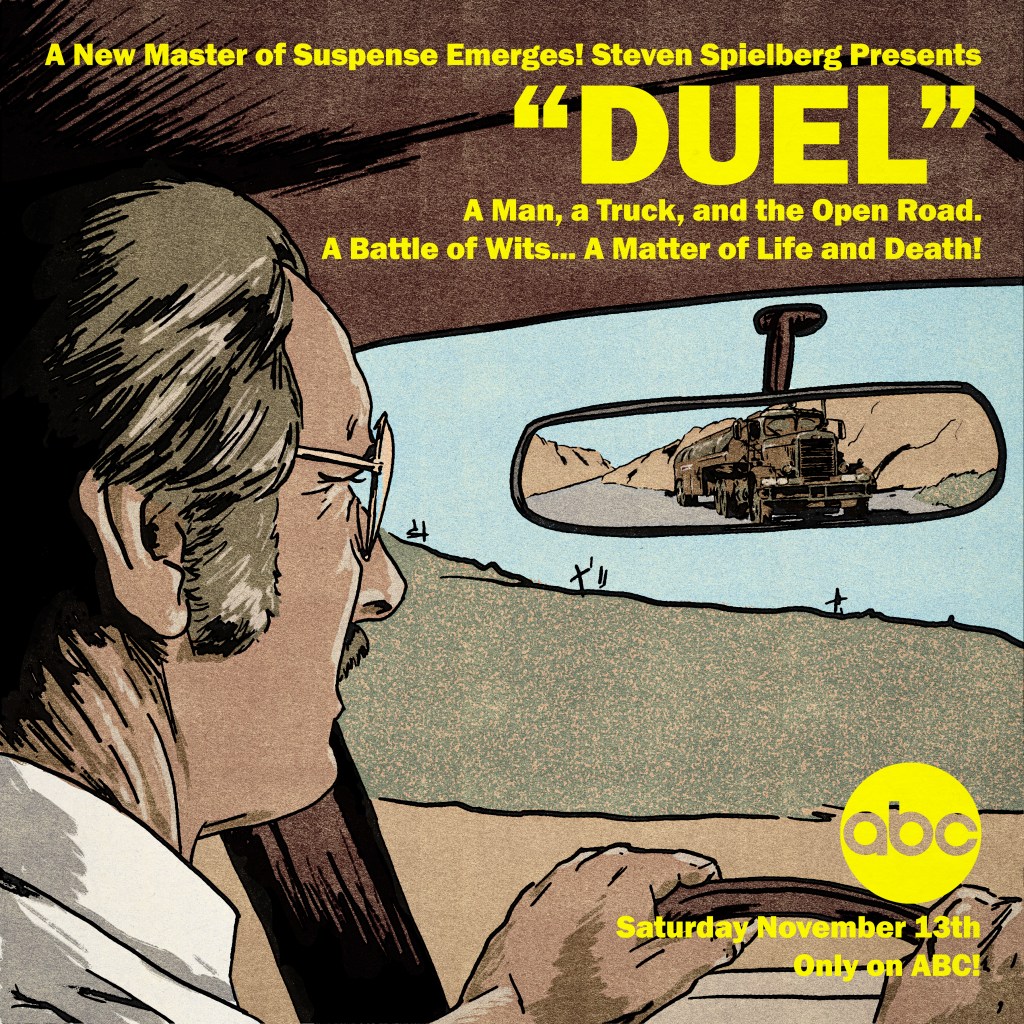
Created for our Rewind episode on Steven Spielberg’s debut feature (originally an ABC Movie of the Week, of course!)
This one started life as an incredibly janky composite of screenshots in Photoshop, just to see how best to organise the elements into the square frame. I pulled a stack of images and pushed a few around, eventually landing on a layout that had a dominant, but indirect, image of lead actor Dennis Weaver, with the truck looming in his rearview mirror:
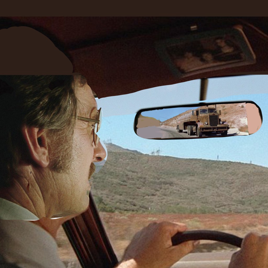
As a cover image that would be primarily used on podcast platforms, it would need to be a square format. Given that most of my design work recently is intended for Rewind episodes, that has meant that I’ve had to become comfortable with an image shape that I don’t find particularly natural or accomodating. Although, in this instance, it was useful on two counts – first, for a sense of claustrophobia that suits the film’s juxtaposition of wide-open vistas and sweaty, intimate in-car panic. And second, to mimic the boxy format that the original airing would have had, before the theatrical re-edit that opened up to widescreen.
Downsides – of course, a driver would not have a rearview mirror jammed right in front of their eyeline. And, without being able to open up the format to something wider, that meant that the truck – the main selling point of the film – would appear pretty small overall. So, I wanted to mitigate by ensuring that David Mann’s eyeline leads the viewer right to the truck. That it would sit in and break up a patch of pleasant blue sky and provide a messy, eye-catching feature among an otherwise quite simple layout.
That influenced how I drew the final piece, too. I still did not know how I would render this. Realistic? Illustrative? Painterly? A big factor, perhaps the main factor, was time. And skill. I would have trusted myself to render something more representative of real life if I had time to transfer the image to paper and render in charcoals. But I didn’t see that I would be able to do it justice in that format – it didn’t really suit the image, which I use more often for more traditional portature. I also just do not have the skill to render realistically in digital illustration. I have only a stylus that interacts with my touchscreen laptop, which is not a professional grade drawing tablet. And I don’t find digital illustration intuitive at all. I would love to be able to layer delicate brush work to build up the atmosphere, but it’s not something I know how to do.
So that left me with something more like a vintage comic book style – like Creepshow. I first laid down the ink work – using a variable width ink brush from True Grit Texture Supply Co. I laid a flat white layer down, and varied the opacity so I could see different levels of detail of the photomontage beneath for a loose trace. I intentionally used a wider brush on the car, the environment, and David – around 16-18 pixels I think – than I used on the truck, more like 8-10 pixels. The extra detail was to ensure that, if the viewer really got into looking closely, there was enough of the unique character of the truck to be interesting.
Then, again, to save time, I blocked in the colours extremely flat. I limited to around 6 colours in total, I think – all were droppered from the reference picture itself and then tweaked a little, to ensure that despite the cartoony render, it would be grounded in realistic colour tones. One flat tone for the sandy landscape, one for David’s main skin tone, one for the grass, a dark maroon for the car interior, and a specific tone for the truck. I think also the dashboard is a slightly different beige. Can’t remember. You can see below, without the ink work:
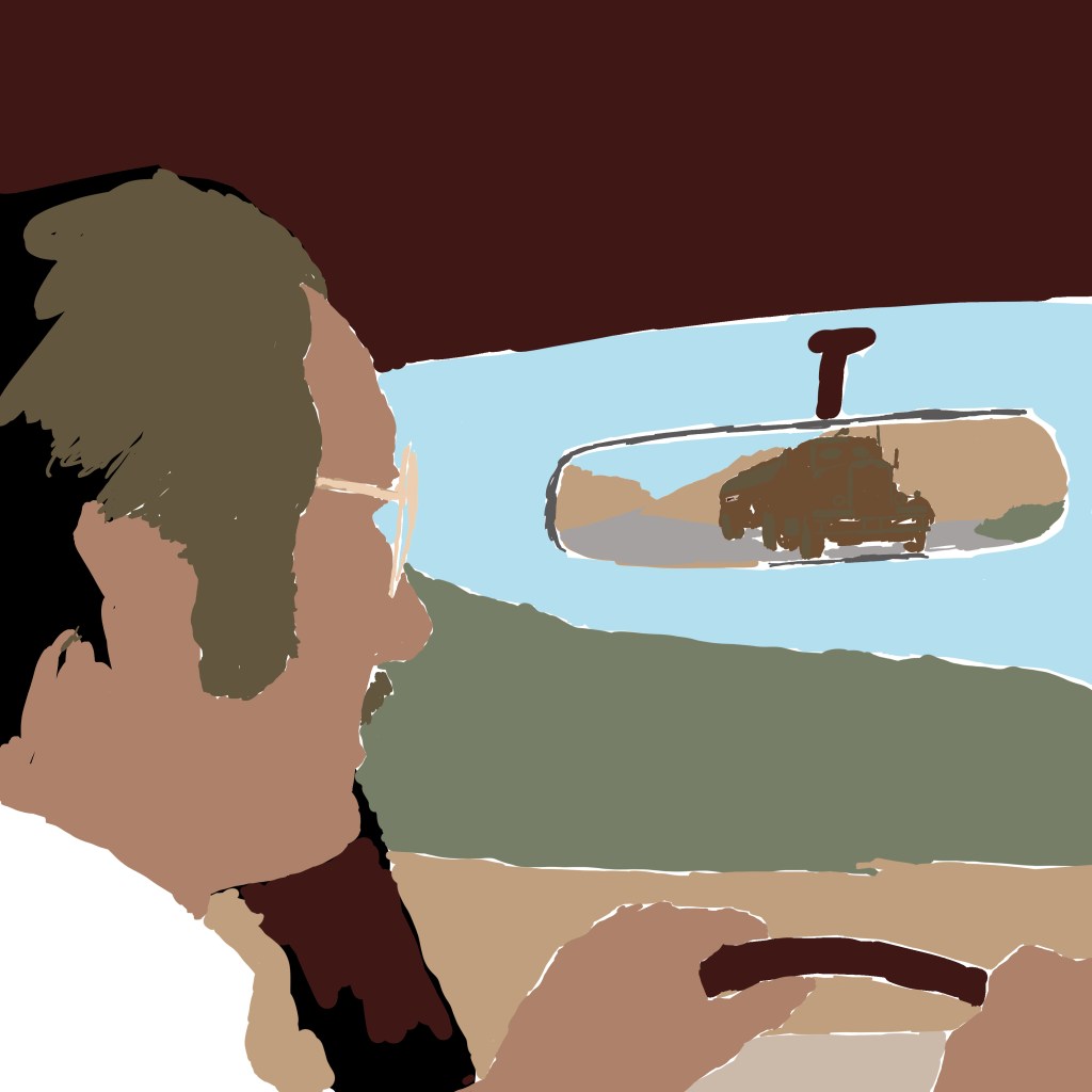
Then, it was time to add high and lowlights. I used a brush called Dry Brush Inker, that allowed for a bit of a break from anything too cheap-looking – I wanted a semblance of tactility. I also used the sandy colour as a texture to lay over the grass, to stop that looking too lush and keep the desert look intact. This was my second attempt – initially, I used a grain shader to try to build up detail and visual interest across all the areas. But this looked too modern, too much like a 2010s comic book – it couldn’t concievably pass as a vintage illustration. Using these modern techniques to ape obsolete techniques is always a fine line to walk. Obvious pastiche looks cheap. It was also important to NOT introduce any new colours at this point – all digital paint added to the image is drawn from that original palette.
Once the colours and the inks looked about right, I exported the inks alone as a PNG, and used a Photoshop process from Spoon Graphics called Bad Print Effects to add a number of filters and degradations that would mitigate the clean, boring flat vector style that it had. I did not process the colour elements – I find it a bit too harsh on those, so processed the colour paint layers separately in Camera Raw Filter and just added grain and texture, also using a vintage paper texture as an added layer to give some variance. But, it really helps to give the solid ink lines some imperfections and a hint of translucence – I used the same process on my Coffy poster.
The Bad Print process also comes with a harsh, aged paper texture as a background. I used GIMP to enact the Color to Alpha process on that background, and leave only a scuzzy, fibrous overlay that would make it seem as if the ink has bled into cheap paper. One more layer of old paper as a screen for variance, and we were done.
Then, it was time for text. For the podcast, I needed only the name of the podcast and the episode number. But for the print, I wanted to make it seem like an ad printed in an old comic book, which meant tagline, title, and the original air date of the TV movie. The colour choice was influenced equally by the yellow of the original 1971/72 release poster, by the blocky yellow text of Columbo, which Spielberg had just directed before this also for Universal Television Productions, and the repeated use of yellow to signify danger that my good friend Matt identified in watching Jaws. I loved the way the title was in inverted commas on the release poster, so nicked that for mine. I also paraphrased a great tagline from another.
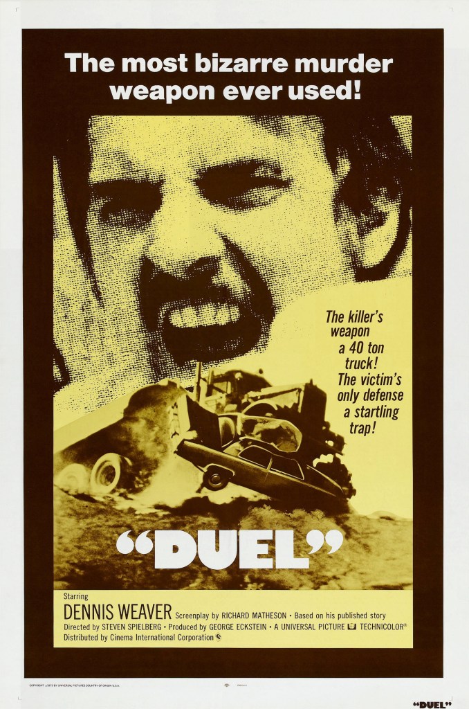
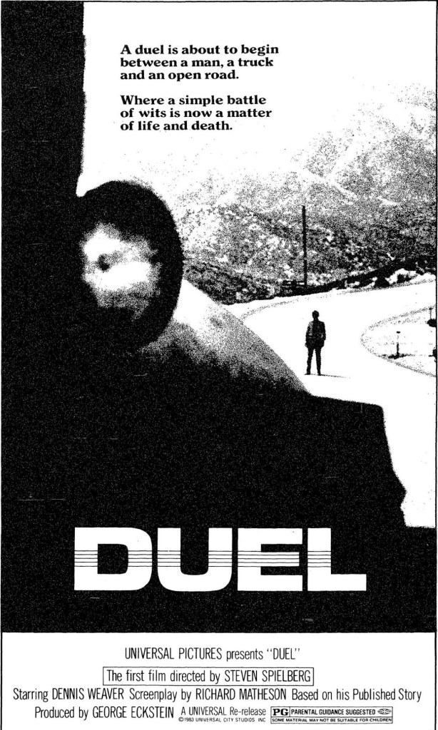
The use of text also re-emphasised the primacy of the truck in the layout. The right-justified text was a matter of necessity – that’s where the spare real estate was – but also, as you read down the bright yellow text , your eye is led right to the truck, with nothing else to attract the eye directly below until you get to the network logo in the bottom right.
All-in-all, a fun, mostly instinctive path through the making of this poster. There’s plenty I would have fixed if I had spent more time, but I think in retrospect the only thing I would have definitely done differently is to lay down the ink work direct onto Bristol board in pen, then scanned. I have better control physically, and once scanned, can always make changes digitally where necessary.
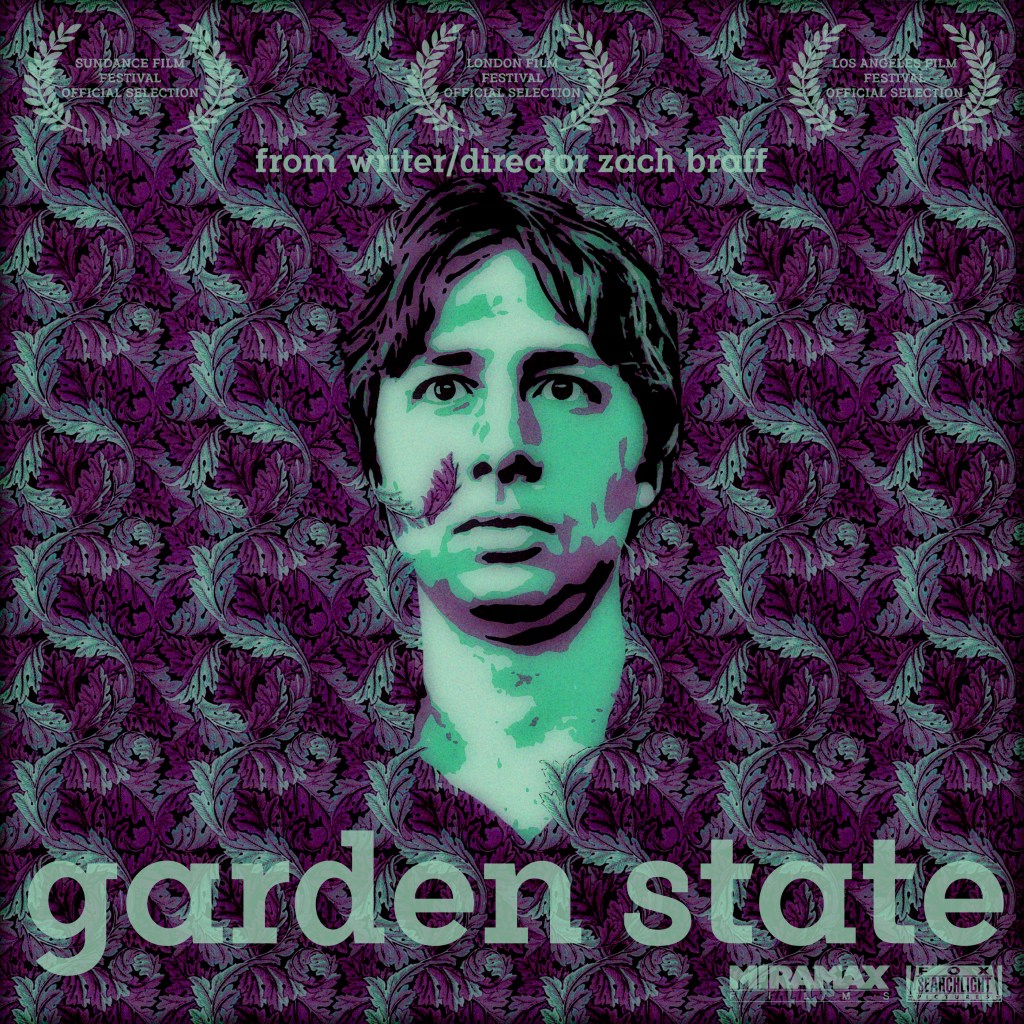
A film I have a complicated relationship with, but made for a really interesting Rewind Movie Podcast episode. I wanted to utilise the very overused, well-known image of Andrew “Large” Largeman sinking into the background as he tries on a shirt made from the same material as the recently renovated bathroom in his childhood home from which he has become so alienated (why was there leftover fabric from a bathroom wall that could be used to make a man’s shirt? I do not know!), but give it a bit more thematic weight.
I sourced the closest analogue I could find of the wallpaper pattern, a William Morris (proud son of Walthamstow!) design called Acanthus. I could only find a small square, so I had to line it up by eye and create a repeatable pattern big enough to fill a Photoshop square. I then eyeballed a purple and green colour-scheme based partly on the screenshots I could source from the movie, and partly one that I thought seemed attractive – aware that I was going to potentially tweak this heavily later.
I used a faux-vectoring technique (I no longer have Illustrator, so have to create a workaround using a YouTube video from TextureLabs that is intended to mimic screenprinting) to create a three colour Braff face, that I matched to the colours in the wallpaper pattern. I manually erased some of his face to allow tendrils of the background plants to show through on his face.
Then, I didn’t like the cartoony boldness – so I ran it through a Studio 2am effect called Indie Dreams, which seemed appropriate in capturing a hazy, early-’00s sensitive colour pallete. There were a number of options, so I used one that shifted more towards a colder green/purple tone. It helped to remove some of the lazy pixellation I’d left in my haste to construct the wallpaper pattern. Finally, I grabbed a font that seemed to match a less familiar release poster I’d found, a blocky serif font called Flamente Cairo. I stuck to the late-Gen-X penchant for all lower case text, and added the same festival laurels that the poster I sourced proclaimed. It felt, again, true to 2004 to trumpet the cachet that came with festival slots in the dog days of the Peak Sundance era.

An ink sketch, scanned and digitally coloured by my good friend and Rewind co-host Scarious Artists. Available on my Teemill.

A slightly brain-melting design for our Rewind Movie Podcast episode. Prints and t-shirts are available on my Teemill store.

From our Rewind Movie Podcast “HalloRe’ewind” episode for this year, a tribute to Edgar Wright’s heavily-quoted classic zomedy.
Available as a high quality A4 poster here. Original available, contact for details.
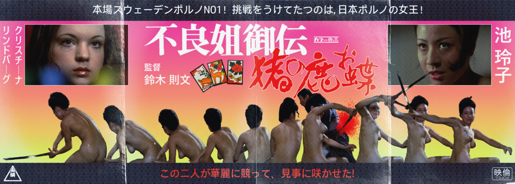
Toei Studios’ reigning queen of Pinky Violence, Reiko Ike, stars in Norifumi Suzuki’s infamous, overheated Jidaigeki classic of gambling, espionage, murder, revenge, and naked swordfighting. In contrast to Shunya Itō’s furious, near-contemporaneous Female Prisoner Scorpion trilogy (and Yasuharu Hasebe’s series capper), the thrills and spills on display here don’t carry quite the same message of righteous female empowerment, falling more into the more prurient end of the pinku spectrum of the era. But, that’s not to diminish the utter badassery and screen presence of the incandescent Ike, who cuts a swathe through the film and the series of miserable baddies that killed her detective father when she was a mere child. Emerging after 2 decades as a skilled gamber, pickpocket, and brawler, she navigates the underbelly of Tokyo with smoky eyes and a sly smile that disappears when it’s time to slaughter a dozen lackeys in the snow without a stitch of clothing. While in a separate subplot, Swedish exploitation star Christina Lindberg struggles gamely with her accent as a British dancer embroiled in a plot by the dastardly British to undermine the emerging Japan’s power, despite her romantic entanglement with a Japanese political activist. The film heads towards a shocking, somewhat blasphemous, bloody and oddly captivating full-throttle conclusion (mostly stolen from Meiko Kaji’s Lady Snowblood). It’s a heady stew of bad taste good times, anchored by one of the most charismatic performers of her era relishing the solo spotlight (Ike was more often paired with the intense Miki Sugimoto during this period).
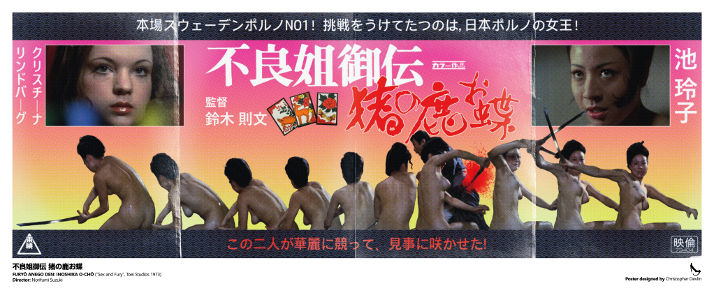
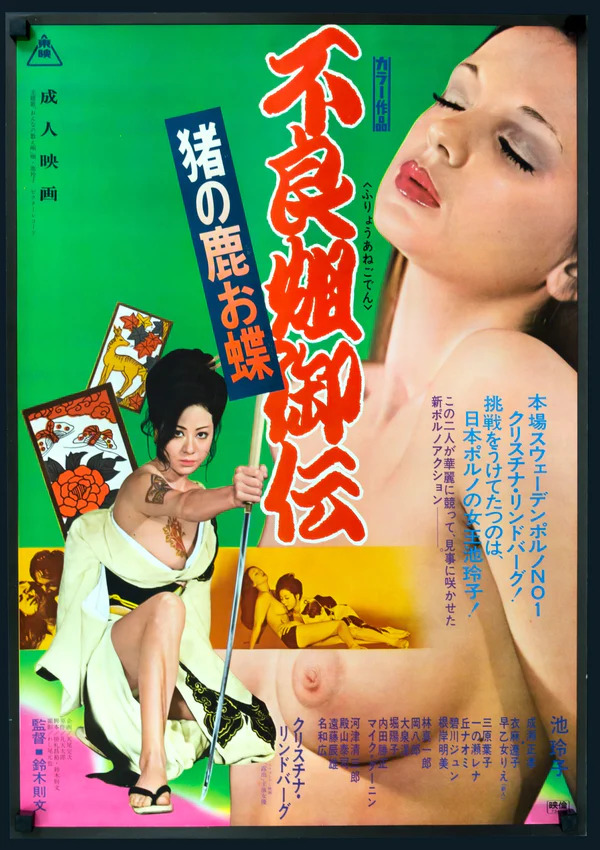
Here are my two designs inspired by the magnificent 不良姐御伝 猪の鹿お蝶 (Furyō anego den: Inoshika o-Chō) a.k.a SEX AND FURY! A large format full-colour poster print, available at Etsy as a gallery grade, 36cm x 87cm giclee print:
You can also pick up a t-shirt, or A3 poster print, of this alternative black and white design over at Teemill, from another original photomontage layout:
Full Colour Poster Process
For this poster, I knew I wanted to use the infamous naked bath house sword fight as the key image. It’s the most iconic scene in the film, utterly ridiculous, moronically cool, and the perfect hook for the type of poster I wanted to create – as close a rendition as I could manage of the early 1970s Japanese exploitaion movie posters that didn’t hold back on the base-level thrills they used to hook viewers. However, my standard edition DVD is the only source I have available for any images for this film; high resolution digital images seemed scarce and while I believe there may be a Blu-ray release of Teruo Ishii’s sequel Yasagure anego den: Sôkatsu rinchi, a.k.a Female Yakuza Tale: Inquisition and Torture, I couldn’t find one for this. That meant that, no matter if I could pull images, there would be such pixellation that I would have to degrade the picture substantially to avoid this being visible at scale. The first task was screenshotting a section of the fight – the moment Ike jumps from the bath gave the clearest set of images. These were enlarged as best I could within Photoshop, cropped (leaving the unfortunate victim of the katana-slashing intact in one), and the sword replaced in all but one shot due to the motion blur rendering them all but invisible.
Next, these screenshots were laid out together, with the spacing between them planned as best as possible to show the movement. This started to determine the shape of the poster (highly unusual in Japan – most posters of these dimensions would actually be vertical, not horizontal). While I had thought initially that they could run across the bottom of a larger design, the lack of good quality material determined that I preferred to make this the centrepiece. There were a few readjustments before I struck in the idea of a 4-folded sheet of roughly 4 x A4 paper. The size felt right: a 30cm height would be feasible for the print quality. That led to the idea to actually add ‘folds’ to the final design, one of a number of elements that would help hide the deficiencies of the original images. I liked the idea of a ‘widescreen’ poster – this influenced the idea to have a border of some kind to help create a more horizontal look, to allow for the very wide, 10 screenshot montage to not look too out of place. In this new layout (which at this point had only plain black letterbox borders) the images took roughly half of the vertical space remaining. I’d screenshotted a striking close up of Ike’s face that felt to me as the natural choice for her ‘hero’ shot; I wasn’t sure how to use it, but by adding a white layer border it looked more intentional. By this time, I’d added the pink-to-yellow colour blend as a background. The choice was largely organic – I’d seen a similar fade effect in the background of numerous Japanese posters of the era, and the pink represented, simply enough, pinku as a genre. The yellow was both complementary, and allowed for the somewhat clumsy blood splatter to be visible. That red element was tricky. I had taken screenshots of the title screens to the film, snipped them, and run both through Illustrator to create vectors. I knew I wanted the titles in red and white, but the pink background made it difficult to read. Luckily, the solution matched the white border I’d chosen to add to Ike’s closeup. A comparable close up for Christina Lindberg seemed natural – after all, on the original release poster (and subsequent DVD and video releases), she’s actually featured far larger than the film’s actual star.
Basic elements in place, I started adding text. Again, I think the mixture of vertical and horizontal text would actually be highly unusual in a poster of this era. Ike’s name goes first, as vertical text is read right-to-left rather than left-to-right, although this change was made very last minute after I hired a translator from Fiverr to translate the tagline to the film. It, in the very blunt manner you’d expect, refers to ‘Sweden’s No.1 Porno Queen!’, Lindberg, and that ‘Japan’s Porn Queen Reiko Ike!’ answers her challenge. This, then, dictated the order of the main images. The rest of the tagline, which says something like ‘These two will fight elegantly, and gracefully make the flower bloom!’, was added to the lower part of the poster, in red to help with the colour balance.
Those border sections felt like they needed something additional – I downloaded a pattern maker from Adobe Stock and created a simple wave pattern that I felt evoked the period film trappings, and used the exact shade of dark brown of Ike’s hair as the dominant colour to try to ensure that it felt organically connected, and to evoke the narrower colour palettes of older posters with limited inking abilites. The dark blue was added purely to allow it to stand out, and to hopefully make some sense of the blue light flare that was in the best available close up I could source of Lindberg.

The importance of the Hanafuda cards – the gambling cards that carry the images of the deer, the boar, and the butterfly – was something I’d wanted to include. First, via a screenshot of the cards clutched in Ike’s father’s dying hand, but I didn’t think that it fit the layout I had to this point. I managed to find, on a US Embassy website of all places, a clear image of the cards on a plain background. I separated them, and laid them out in a space that had emerged to the left of the film’s title. Adding in the various logos that would somewhat allow this to pass as a genuine period poster, including the Toei logo in the bottom left and the registration mark in the bottom right, I felt the design itself was done.
To get a vintage print style, I first downloaded Studio 2am‘s Zine effect process, as I wasn’t sure where to start with creating a realistically aged print effect. Unfortunately, the dimensions of the standard version were too small. I retrofitted the various layers of filters and processes as best I could, most importantly a color halftone effect that helped to obliterate the pixellation of the source images. Among others, there is a sandstone texture, added noise, gaussian blurs, and finally the halftone effect, set to 4 pixels. This was then exported, and dropped into a new psd.
I stitched together 4 creased paper overlays that I found on Adobe Effects – black screens that contained realistic paper fold damage – and shaped them to cover the image as needed, before using the eraser to avoid contaminating the image too much. I set this as a ‘screen’ layer, and added one more, different paper texture effect to offset the lightening that resulted with some darker paper grain.
Finally it was time to set up the print layout – I’ve ended up with slightly bizarre final dimensions, but was unwilling to affect the specific halftone pixel size by reducing the final exported image to fit a print border/bleed. I decided to add the English text based on a book I have of Japanese cult posters, Tokyo Cinegraphix, and allow for a wider border across the bottom edge. Each poster in that book has a little information block regarding the year of production, Japanese, and English translated titles. The book series is excellent, and highly recommended!

Buy shirts at Teemill and giclee poster prints at Etsy!
My final poster design in the Female Prisoner Scorpion series is for director Yasuharu Hasebe’s only entry, and Meiko Kaji’s last outing as Nami Matsushima/Sasori/The Scorpion, Grudge Song. While it lacks the wild creativity of Shunya Itō’s incredible trilogy, Hasebe was no slouch – a veteran of Nikkatsu’s ‘borderless action’ yazuka movies of the late 1960s, including his remarkable Retaliation which featured Meiko Kaji in a supporting role, and 3 entries into Kaji’s sukeban series Stray Cat Rock. A sombre and fascinating coda to the wilder Itō pictures, this film allows Kaji to ground her portrayal of Nami more than at any other time in the run – even going so far as to find her a male love interest for the first time since the evil corrupt cop that sent her down the path of cyclical incerceration and revenge. The film even features fascinating visual callbacks to the first film in the cycle that evoke that relationship, deepening the drama and dourness when things inevitably go awry for our stoic heroine.
I’ve tried to capture that pared-back simplicity with a bold and stark design that incorporates a flower-shaped bloodstain – visually representing one of the more memorable kills in the series as Nami eludes capture by driving a flower into a cop’s jugular. The bloodstained fabric refers to that visual callback during Nami’s brief moment of physical intimacy she shares with the damaged anarchist she comes to trust enough to take to bed – a visual motif that in the original film also recalls the hinomaru flag.

Smile, you sonofabitch.
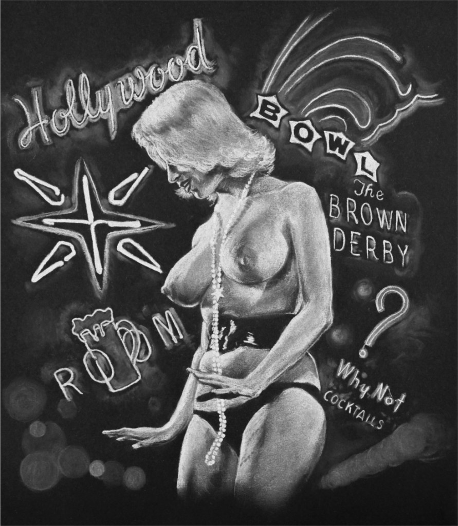
I read about Jimmy McDonough’s extraordinary biography of the inimitable, proudly disrespectful auteur Russ Meyer, Big Bosoms and Square Jaws, kinda by accident in a stray magazine article. I remembered having seen Faster, Pussycat, Kill! Kill! several years earlier as part of a loosely defined weekend tribute to The Cramps, big fans of Meyer’s work, and figured I’d give it a read as I thought the film was pretty amazing at the time. Little did I know that this brilliant book would spark a total fascination with his work – the kind of fascination that only comes with seeing a weird man lay out the most base and bizarre parts of his psyche for all to see without the pesky filters of good taste or meddlesome industry requirements.
1964’s Lorna, Meyer’s first foray outside of the “nudie cutie” genre he basically pioneered with the 1959 feature The Immoral Mr. Teas, was, of course, driven at least in part by his insatiable appetite for financial success in the burgeoning exploitation market. As he would proudly boast, he got in to the business to get rich, and get laid. But what fascinates me is the meticulous technical artistry which he brought to bear on his films – the innovative camera tricks, pin-sharp focussed and gorgeously lit visuals (usually using reflectors to harness the harsh light of his often desolate locations), and drum-tight editing that stands out from his pack of innovators who were usually content to drag meaningless, shabbily shot scenes out in pursuit of nothing more than the contractually-obligated runtime and minimum amount of indifferently presented nudity to sate the suckers in the cinema stalls. That, and the twisted and increasingly manic plots he trotted out. In Lorna, the kickoff to the Gothic/”roughie” phase of his career, this takes the form of a parable of sorts – a wild-eyed preacher/narrator (scriptwriter James Griffiths, who dashed off the screenplay in 4 days) halts the audience as it hurtles down a desolate highway, warning us of the immorality and shame that lie beyond. As he steps aside, we alight in a bleak little nowhere town, and meet a pair of shady, no-good scumbags and their hapless, blandly handsome co-worker. They cajole and bully him over his beautiful but inattentive wife, the titular (…) Lorna, played by pneumatic newcomer Lorna Maitland. Cue another sleazy gent, an escaped convict who happens upon Lorna indulging in some extended skinny dipping in a filthy-looking lake, and a whole lot of overwrought tragedy ensues.

The main image of the poster portrays Lorna lost in a reverie for a life of go-go neon excess and excitement that she so desperately craves, a phenomenal, overwhelming montage of champagne and pearls. Leering from above her, against a foreboding background of the stark and thorny swamp that is her dreary daily reality, are the three lascivious degenerates that desire her, alongside her sadsack spouse.

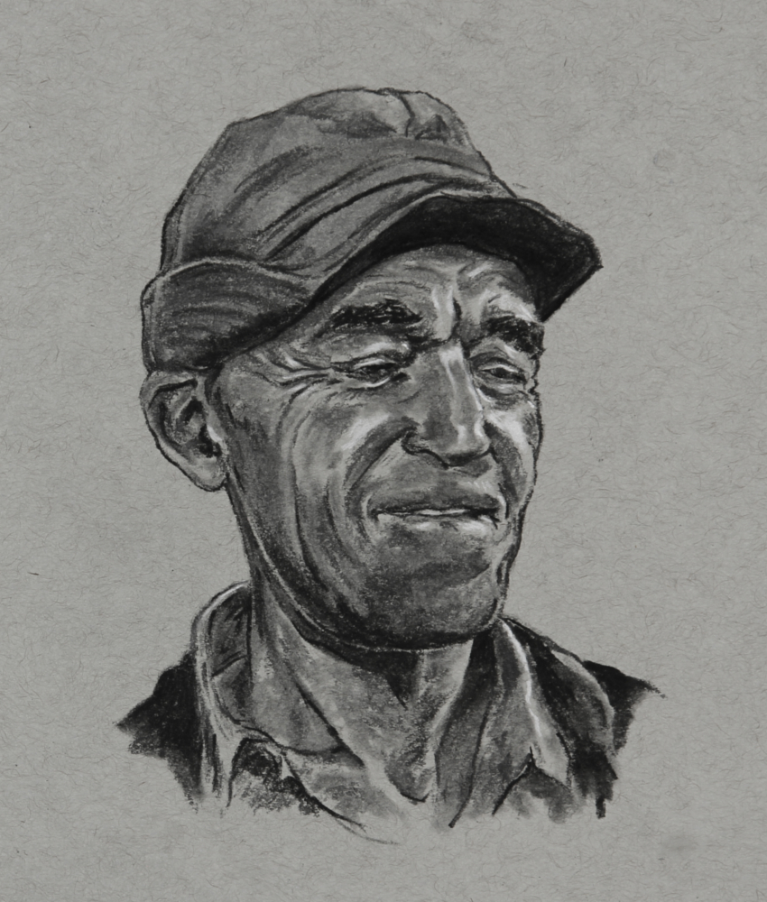
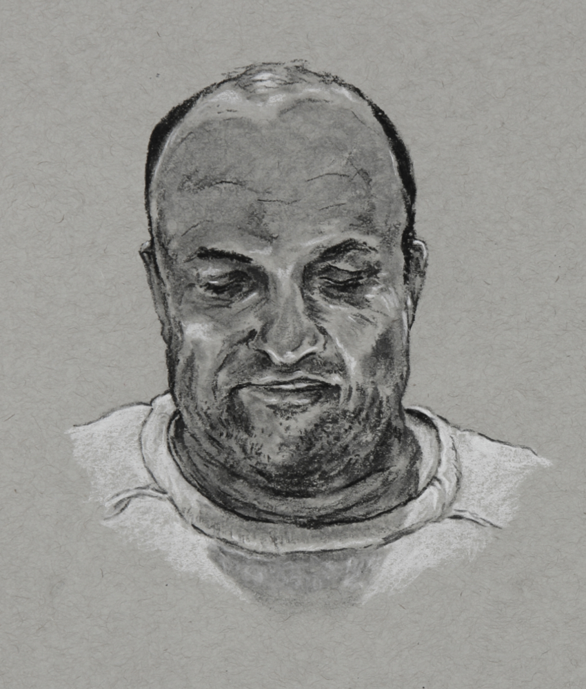
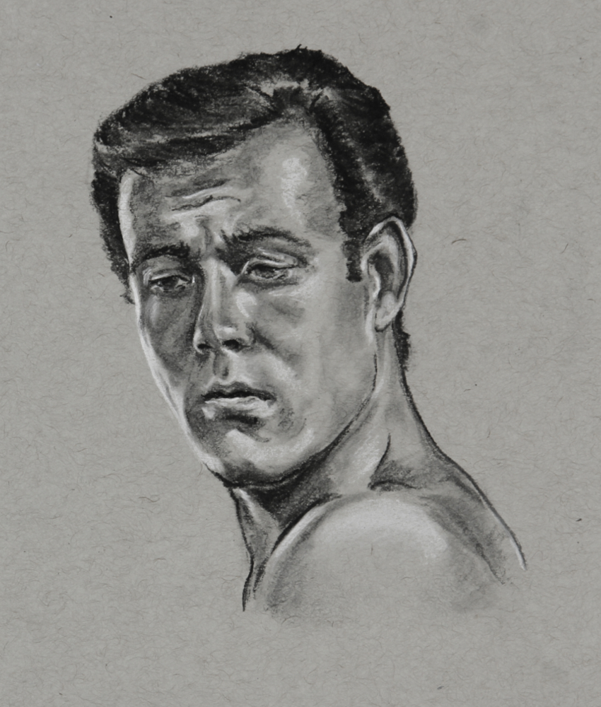
The final artwork dimensions are 30cm x 60cm, with each copy professionally giclee printed in archival quality lightfast pigment inks with extraordinary lifelike rendering of the pencil and paper textures of the original sketches, on Hahnemuehle Photo Rag 308gsm paper. This is a limited run of 64 signed and numbered prints.
Available now on ETSY