An experiment, my 2nd ever oil painting after an introductory class. I used only 4 paints, the Zorn palette (Cadmium Red, Black, Yellow Ochre and Titanium White), on the figure. Using an acrylic wash to create a cool, light midtone, I used quick, thin layers of paint to try and suggest the subtle differences between the skin tones in a minimal, pale colour scheme. The background was a mixture of rich blue mixed only with black and white, laid on thicker to help offset the more hesitant strokes on the main subject.
Shameful confession time: I’d never seen any of Pam Grier’s classic 1970s blaxploitation features until only a few weeks before making these pieces. Of course I’d seen Quentin Tarantino’s love letter to her, Jackie Brown, and had enjoyed the Roger Corman saucy Roman smackdown Arena on some cheap DVD I’d picked up, but somehow I’d always left Coffy, Foxy Brown, Friday Foster and the likes on my watchlist. Finally picking up Arrow Video’s typically excellent Blu-ray of Coffy, I was knocked on my, as the Americans say, ass by the full-bore majesty of this incredible actioner. The terrific, efficient direction of Jack Hill offers the perfect stage for Grier’s wonderful performance that runs the gamut from regal self-possession, through radiant sexiness, all the way to ruthless vengeful violence. A clear, vibrant, anti-establishment plot, a colourful cast of supporting characters (most notably Sid Haig as a reptilian gangster), and some magnificently messy scenes of squib-laden gun battles, automotive destruction, and drag-out catfights add up to one of the most satisfying film experiences I’d had in some time.
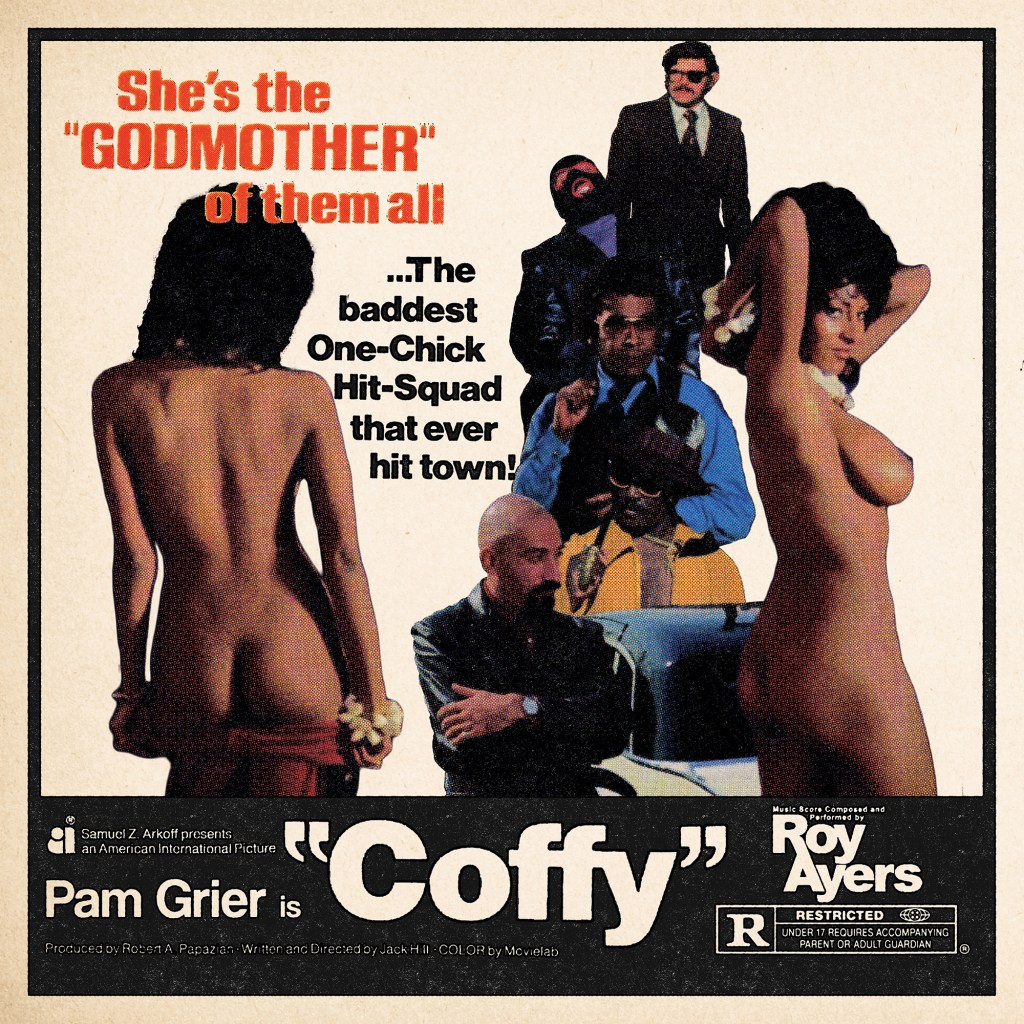
I was compelled to put together a poster – I wanted something simple, vintage-looking, and, for extremely obvious and undeniably prurient reasons, a design that would seek to honour just how incredible Pam Grier looked in this film. Veering away from the release poster designs which foregrounded Coffy’s powerful, shotgun-toting path of revenge, instead, I wanted to illustrate how the character weaponised her charms in order to lull her opponents into a false sense of security, before dispatching them with righteous fury.
Using simple screenshots from the streaming version of the film, I first identified the scene where Coffy seduces the absurdly-dressed pimp King George and pulled two related shots. I then figured I’d need to fill the remaining space with a selection of the bastards Coffy would spend the 90 minutes or so taking down – I cascaded them in a loose vertical structure, arranging them around the tagline which I had clipped from a hi-res scan of the release poster and simply cropped and dropped in place. The layout of these elements came from simple trial-and-error. I knew I wanted the poster to look almost like one of the newspaper ads rather than a full illustrated poster, so decided to include a thick black border and black bar at the bottom where I would place the title and a small amount of other information. I wanted to include only a few key elements – the production company, the producer and director, Pam Grier, and the MPAA rating. All elements, except for Pam Grier’s name, were cropped and image traced from original elements sourced online. I knew I would be able to keep these less than uniform, as I had planned to use a Photoshop action I’d downloaded from Spoon Graphics which I’d been dying to try on the right project – this created a realistic, black-shifted, aged, messy 4-colour ink process. However, it didn’t process the photographic elements very well – I lost almost all of the nuance in the faces. So, I decided to use this only for the black ink text elements and the black frame – I created a high contrast monotone black-only layer for the ink process, and the colours were created utilising a standard halftone filter in Photoshop on a separate layer of the combined final photographic montage, with all black pixels removed after the fact.
A final pass of textures, including a further aging on the black ink elements, and the addition of a nice paper texture, and we were all done! Well, with this one at least – I just had to do something for Jack Hill’s follow-up feature Foxy Brown.
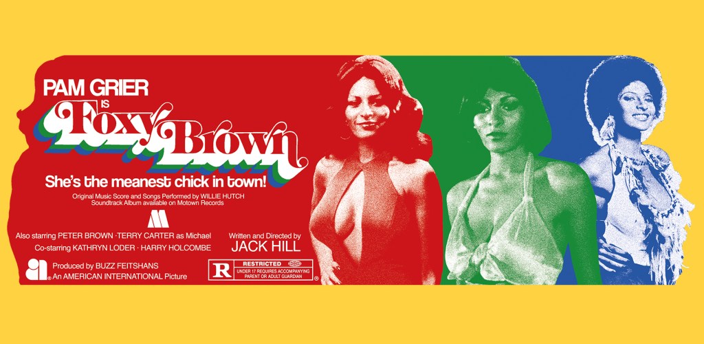
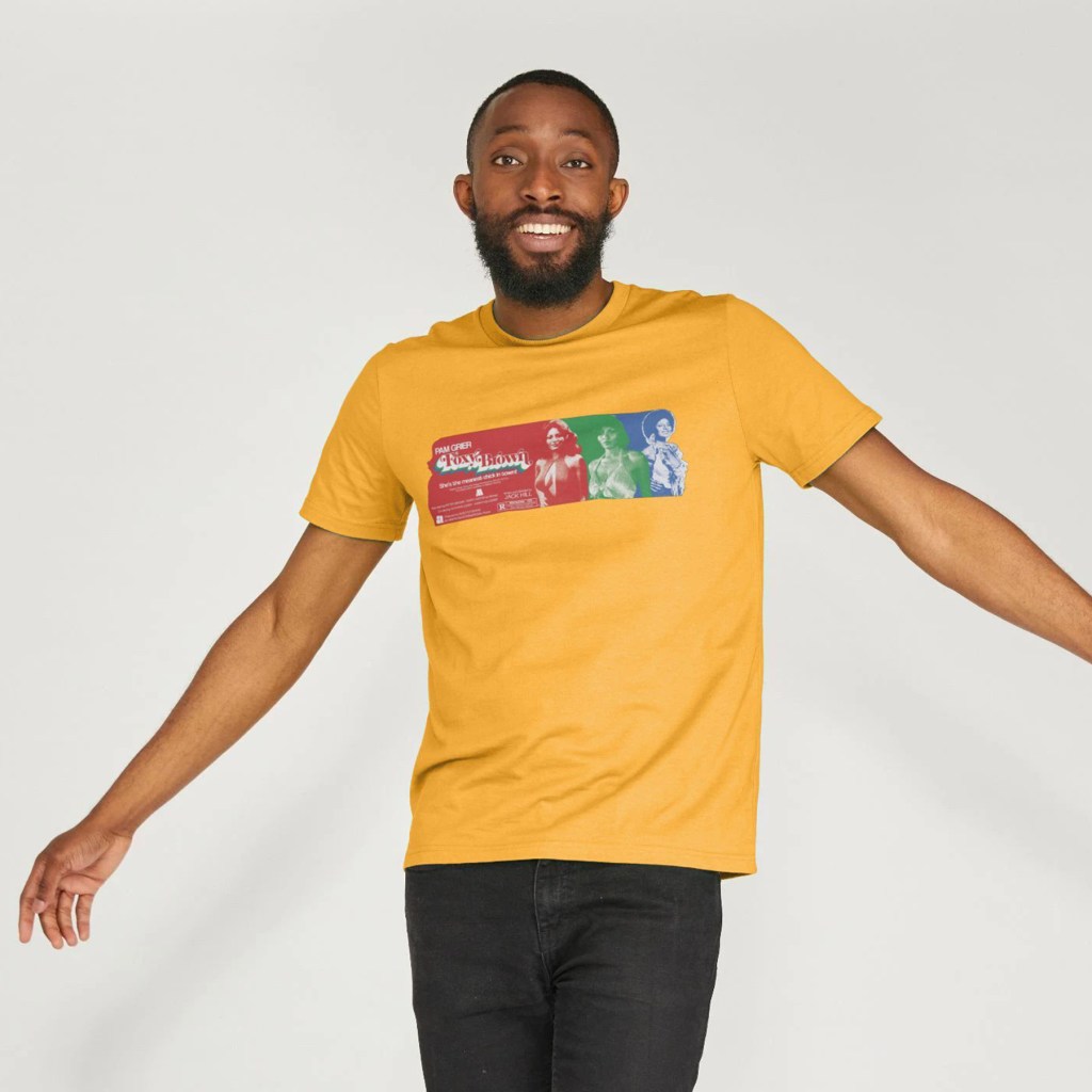
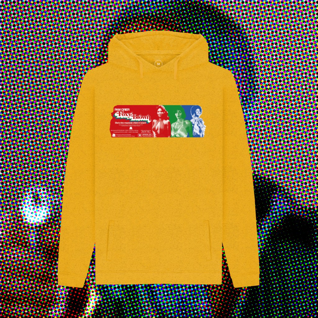
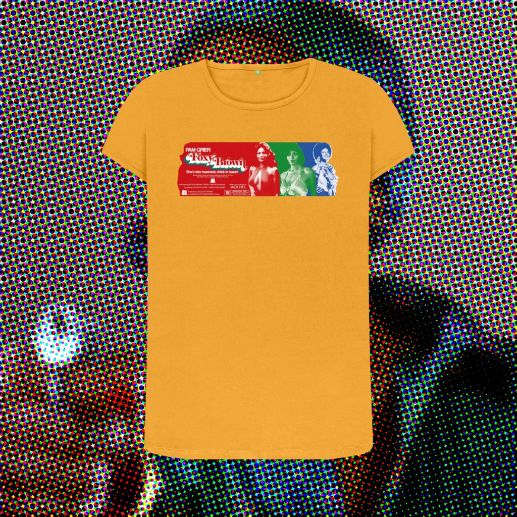
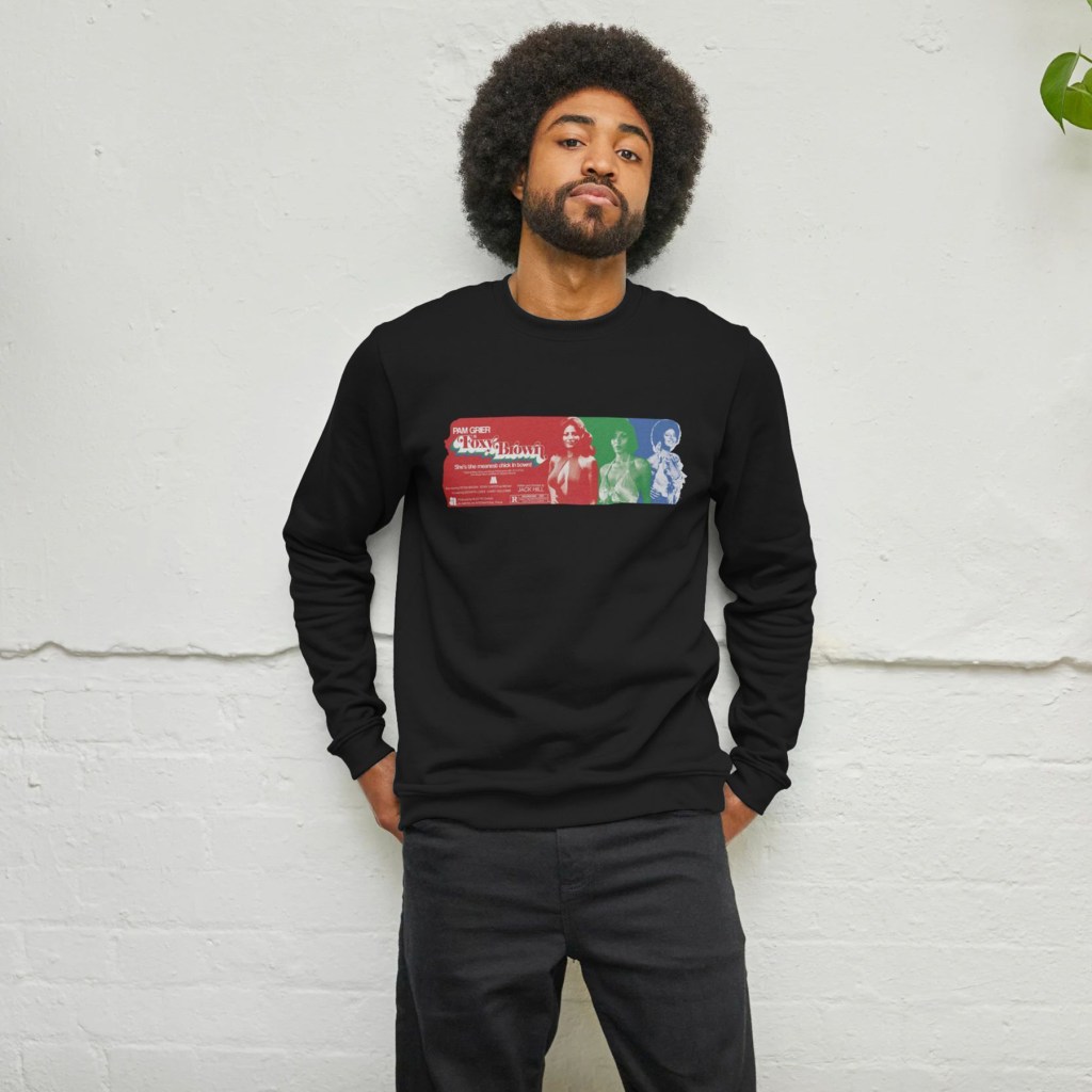
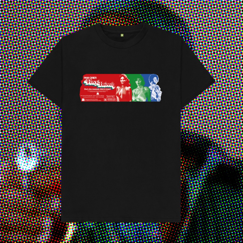
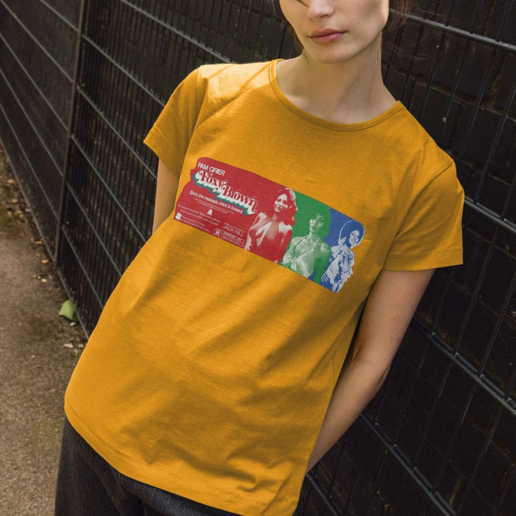
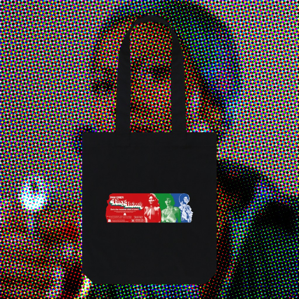
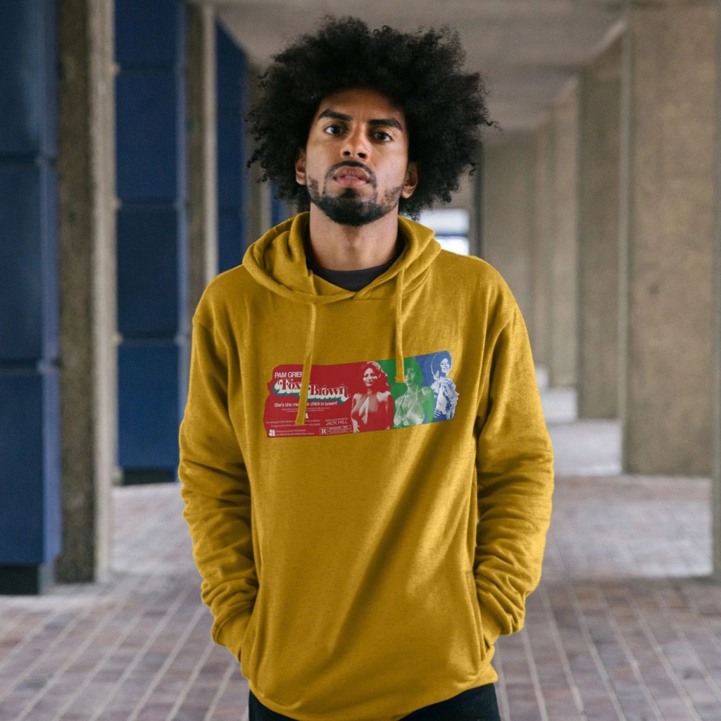
Foxy Brown‘s excellent, psychadelic opening credits inspired this colourful celebration of Pam Grier’s imcredible costumes throughout the film, again going undercover as a sexed-up and powerful woman who delves into the murky world of white drug dealers and pimps to exact brutal revenge.
Once I’d found reference pictures that covered the range of looks she sports throughout the runtime, and discarded those that didn’t meet the minimum requirements for clarity, these three images pretty much picked themselves. I’d originally envisioned full body images, like those scene in the credits dance sequence, but the majority were waist-up portraits, so that dictated the form. I wanted to have overlapping, colour coded stripes that would end with a single-colour image that would create a Grier-shaped end piece, before the next colour stripe took over. The credits scene involved 3 colours, so that’s what I wanted to do too – also, this meant I could play with the classic RGB 3 colour TV look, evoking the era, and using more than 3 images would have eradicated the long horizontal band that I wanted to form at least half, if not more, of the print.
Once I’d created my 3 images, I struggled with keeping the design as horizontal as I wanted. Shrinking the processed photographs meant losing clarity – some of this was intentional, to create a riso print starkness, but I still wanted the images to be legible and distinct. I also wanted the shirt to have a band of colour, rather than the chunkier, more maximalist designs I have created so far, so there was much push-and-pull in deciding how wide vs how tall to make the full shape. When the layout was finalised, I felt I had the balance roughly where I wanted it, but this taller band of red felt like wasted space. So, I pulled elements again from the release poster, bolstered others with typed text (the tagline is in a very nice font called Coolvetica), and used the image of Pam as a layer mask to create that end shape on the left, with the hair flick and insouciant hand-on-hip pose.
Hopefully these will serve as adequate tributes to, truly, one of the coolest screen presences I’ve belatedly discovered.
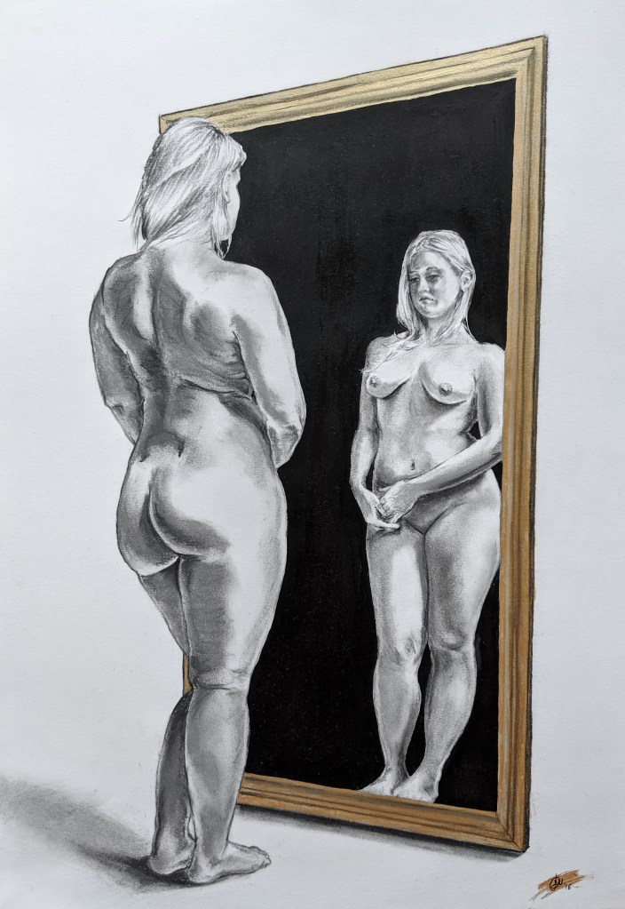
“Gilt Mirror”, 2016, compressed charcoal and acrylic paint on Bristol paper, 16″ x 9″
An early experiment, using mixed media on a flat paper surface from an online reference image. Not hugely successful, but I think it has some kind of physicality to it which I quite like.
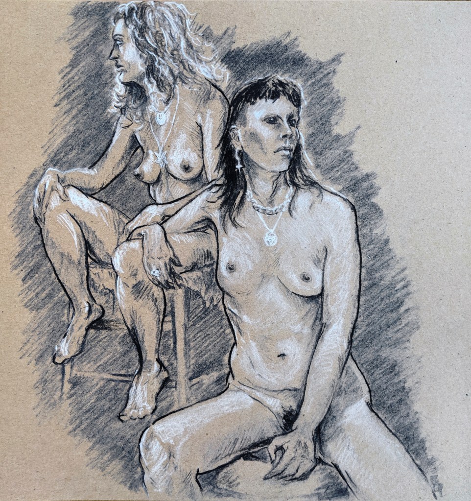
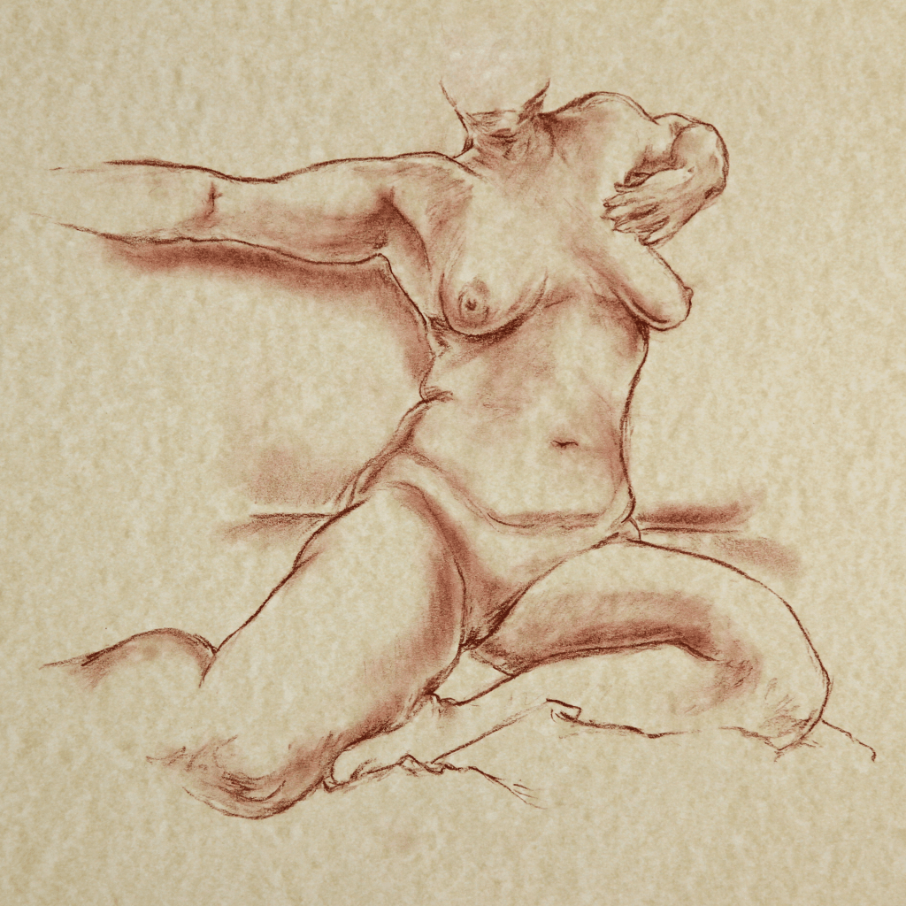
“Guardians”, 2019, charcoal pencils on toned tan sketchbook, 12″ x 12″
Drawn from life at Candid Arts Trust Islington, October 2019.
Drawn as part of a Hallowe’en special event (I took the day off work for it to attend in the afternoon; my other blog at Rewind will probably explain better why I love the festival so much), this pose felt really powerful. I added a few little flourishes – blacked out eyes for Sugar, whited out for Sofia, to emphasise their preternatural calm. I loved working with the contrasts and the similarities, and the way they seemed to complement each other so easily.
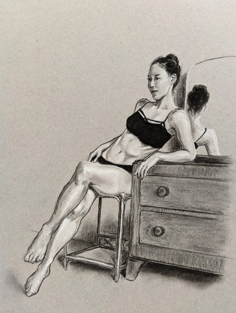
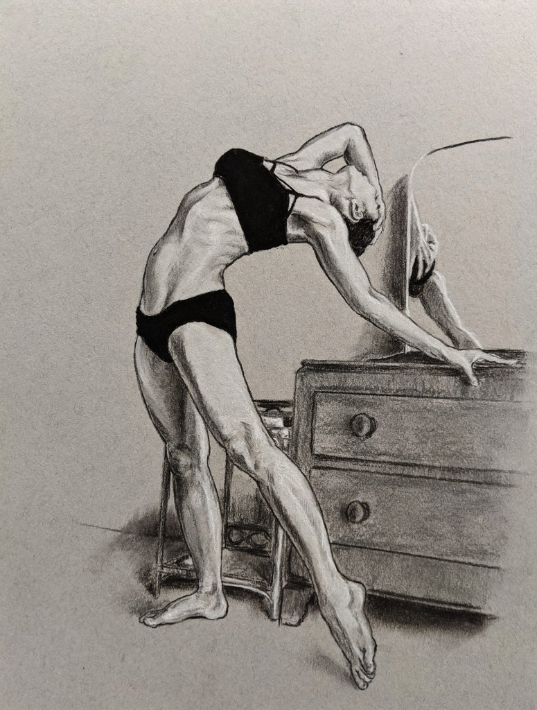
“Natsumi At Her Dresser”, 2020, charcoal pencils on toned grey paper, each piece 12″ x 9″
Drawn from live online life drawing session with LiveArtOnline and finished from reference images, June 2020.
Natsumi is a tremendously athletic model, able to hold almost impossibly graceful poses for great lengths of time. I’ve often struggled a little when sketching Natsumi in person because I tend to get intimidated by these wonderfully balletic angles that I’m not sure my clumsy hands can interpret properly. Even here, with the benefit of being able to draw from reference videos at my own pace, I don’t think I was light enough to entirely do these justice, but I was inspired by the coiled energy followed by the energetic release, the tension held within the limbs even when seated.
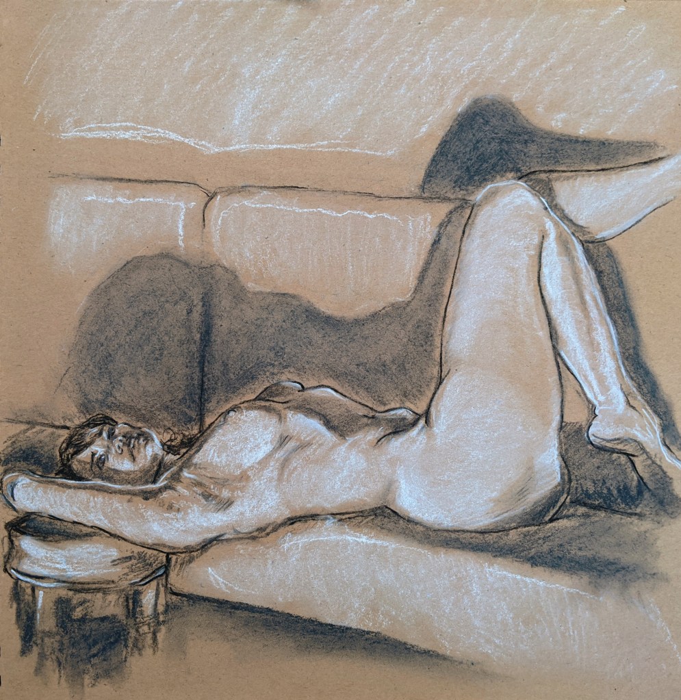
“Carla In The Spotlight”, 2019, charcoal pencils on toned tan sketchbook, 12″ x 12″
Drawn from life at The Moon and Nude Clapham, September 2019.
A longer pose captured, with great luck, on a 12″ x 12″ square scrapbook that proved very unforgiving when trying to erase mistakes, of which there were (for once) relatively few. Sprawled across a sofa and a bar stool, Carla absolutely transcended the mundane pub function room surroundings and looked like a total megastar.
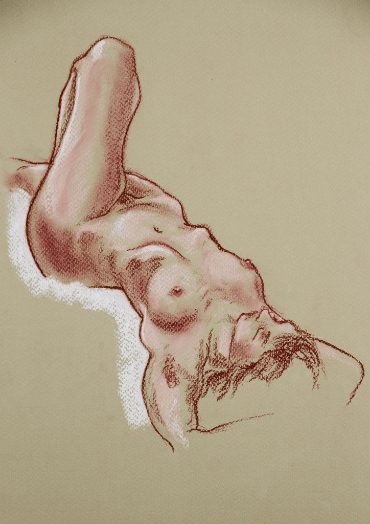
“Sol Seated With Stretch”, 2019, sanguine pencil on card, 14″ x 9″
Drawn from life at The Moon and Nude Clapham, May 2019.
Sol is always so generous in these sessions, and even in longer poses will seek to offer something to latch on to and create interesting shapes. This was probably around 30 minutes, using a Derwent dark sanguine pastel pencil on an unusual piece of very thick dappled card I found somewhere. The surface was remarkably smooth but had a very nice off-white staining across it.
“Juliet Reclines”, 2019, sanguine pencil and chalk pastel on pastel paper, 12″ x 9″
Drawn from life at The Moon and Nude Clapham, February 2019.
This pose felt so self-possessed, and I was lucky to have such a great diagonal angle to try and capture. This was an early experiment with sanguine pencil, and with pastel paper which created this rough dappling effect.
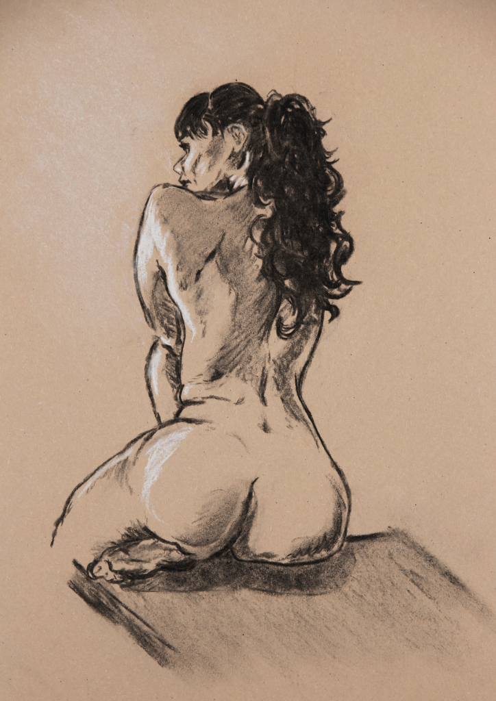
“Carla Seated”, 2018, vine charcoal and pastel on sugar paper, 14″ x 10″
Drawn from life at The Moon and Nude Clapham, March 2018.
Carla is always such a vibrant and friendly sitter, and while this piece is very rough and sketchy, I do like that it manages to catch a facial likeness, and shows the effort and dynamism that she puts in to all of her poses with the tension in the back and arm.