Garden State

Posters

A film I have a complicated relationship with, but made for a really interesting Rewind Movie Podcast episode. I wanted to utilise the very overused, well-known image of Andrew “Large” Largeman sinking into the background as he tries on a shirt made from the same material as the recently renovated bathroom in his childhood home from which he has become so alienated (why was there leftover fabric from a bathroom wall that could be used to make a man’s shirt? I do not know!), but give it a bit more thematic weight.

I sourced the closest analogue I could find of the wallpaper pattern, a William Morris (proud son of Walthamstow!) design called Acanthus. I could only find a small square, so I had to line it up by eye and create a repeatable pattern big enough to fill a Photoshop square. I then eyeballed a purple and green colour-scheme based partly on the screenshots I could source from the movie, and partly one that I thought seemed attractive – aware that I was going to potentially tweak this heavily later.

I used a faux-vectoring technique (I no longer have Illustrator, so have to create a workaround using a YouTube video from TextureLabs that is intended to mimic screenprinting) to create a three colour Braff face, that I matched to the colours in the wallpaper pattern. I manually erased some of his face to allow tendrils of the background plants to show through on his face.

Then, I didn’t like the cartoony boldness – so I ran it through a Studio 2am effect called Indie Dreams, which seemed appropriate in capturing a hazy, early-’00s sensitive colour pallete. There were a number of options, so I used one that shifted more towards a colder green/purple tone. It helped to remove some of the lazy pixellation I’d left in my haste to construct the wallpaper pattern. Finally, I grabbed a font that seemed to match a less familiar release poster I’d found, a blocky serif font called Flamente Cairo. I stuck to the late-Gen-X penchant for all lower case text, and added the same festival laurels that the poster I sourced proclaimed. It felt, again, true to 2004 to trumpet the cachet that came with festival slots in the dog days of the Peak Sundance era.

Prints are available here at Teemill.

Pam Grier

Posters

BUY THIS POSTER as a gallery-grade 12″ x 12″ giclee print at Etsy!

Shameful confession time: I’d never seen any of Pam Grier’s classic 1970s blaxploitation features until only a few weeks before making these pieces. Of course I’d seen Quentin Tarantino’s love letter to her, Jackie Brown, and had enjoyed the Roger Corman saucy Roman smackdown Arena on some cheap DVD I’d picked up, but somehow I’d always left Coffy, Foxy Brown, Friday Foster and the likes on my watchlist. Finally picking up Arrow Video’s typically excellent Blu-ray of Coffy, I was knocked on my, as the Americans say, ass by the full-bore majesty of this incredible actioner. The terrific, efficient direction of Jack Hill offers the perfect stage for Grier’s wonderful performance that runs the gamut from regal self-possession, through radiant sexiness, all the way to ruthless vengeful violence. A clear, vibrant, anti-establishment plot, a colourful cast of supporting characters (most notably Sid Haig as a reptilian gangster), and some magnificently messy scenes of squib-laden gun battles, automotive destruction, and drag-out catfights add up to one of the most satisfying film experiences I’d had in some time.

I was compelled to put together a poster – I wanted something simple, vintage-looking, and, for extremely obvious and undeniably prurient reasons, a design that would seek to honour just how incredible Pam Grier looked in this film. Veering away from the release poster designs which foregrounded Coffy’s powerful, shotgun-toting path of revenge, instead, I wanted to illustrate how the character weaponised her charms in order to lull her opponents into a false sense of security, before dispatching them with righteous fury.

Using simple screenshots from the streaming version of the film, I first identified the scene where Coffy seduces the absurdly-dressed pimp King George and pulled two related shots. I then figured I’d need to fill the remaining space with a selection of the bastards Coffy would spend the 90 minutes or so taking down – I cascaded them in a loose vertical structure, arranging them around the tagline which I had clipped from a hi-res scan of the release poster and simply cropped and dropped in place. The layout of these elements came from simple trial-and-error. I knew I wanted the poster to look almost like one of the newspaper ads rather than a full illustrated poster, so decided to include a thick black border and black bar at the bottom where I would place the title and a small amount of other information. I wanted to include only a few key elements – the production company, the producer and director, Pam Grier, and the MPAA rating. All elements, except for Pam Grier’s name, were cropped and image traced from original elements sourced online. I knew I would be able to keep these less than uniform, as I had planned to use a Photoshop action I’d downloaded from Spoon Graphics which I’d been dying to try on the right project – this created a realistic, black-shifted, aged, messy 4-colour ink process. However, it didn’t process the photographic elements very well – I lost almost all of the nuance in the faces. So, I decided to use this only for the black ink text elements and the black frame – I created a high contrast monotone black-only layer for the ink process, and the colours were created utilising a standard halftone filter in Photoshop on a separate layer of the combined final photographic montage, with all black pixels removed after the fact.

A final pass of textures, including a further aging on the black ink elements, and the addition of a nice paper texture, and we were all done! Well, with this one at least – I just had to do something for Jack Hill’s follow-up feature Foxy Brown.

BUY SHIRTS, HOODIES, TOTE BAGS AND MORE from Teemill!

Foxy Brown‘s excellent, psychadelic opening credits inspired this colourful celebration of Pam Grier’s imcredible costumes throughout the film, again going undercover as a sexed-up and powerful woman who delves into the murky world of white drug dealers and pimps to exact brutal revenge.

Once I’d found reference pictures that covered the range of looks she sports throughout the runtime, and discarded those that didn’t meet the minimum requirements for clarity, these three images pretty much picked themselves. I’d originally envisioned full body images, like those scene in the credits dance sequence, but the majority were waist-up portraits, so that dictated the form. I wanted to have overlapping, colour coded stripes that would end with a single-colour image that would create a Grier-shaped end piece, before the next colour stripe took over. The credits scene involved 3 colours, so that’s what I wanted to do too – also, this meant I could play with the classic RGB 3 colour TV look, evoking the era, and using more than 3 images would have eradicated the long horizontal band that I wanted to form at least half, if not more, of the print.

Once I’d created my 3 images, I struggled with keeping the design as horizontal as I wanted. Shrinking the processed photographs meant losing clarity – some of this was intentional, to create a riso print starkness, but I still wanted the images to be legible and distinct. I also wanted the shirt to have a band of colour, rather than the chunkier, more maximalist designs I have created so far, so there was much push-and-pull in deciding how wide vs how tall to make the full shape. When the layout was finalised, I felt I had the balance roughly where I wanted it, but this taller band of red felt like wasted space. So, I pulled elements again from the release poster, bolstered others with typed text (the tagline is in a very nice font called Coolvetica), and used the image of Pam as a layer mask to create that end shape on the left, with the hair flick and insouciant hand-on-hip pose.

Hopefully these will serve as adequate tributes to, truly, one of the coolest screen presences I’ve belatedly discovered.

Female Prisoner Scorpion: Beast Stable

Posters

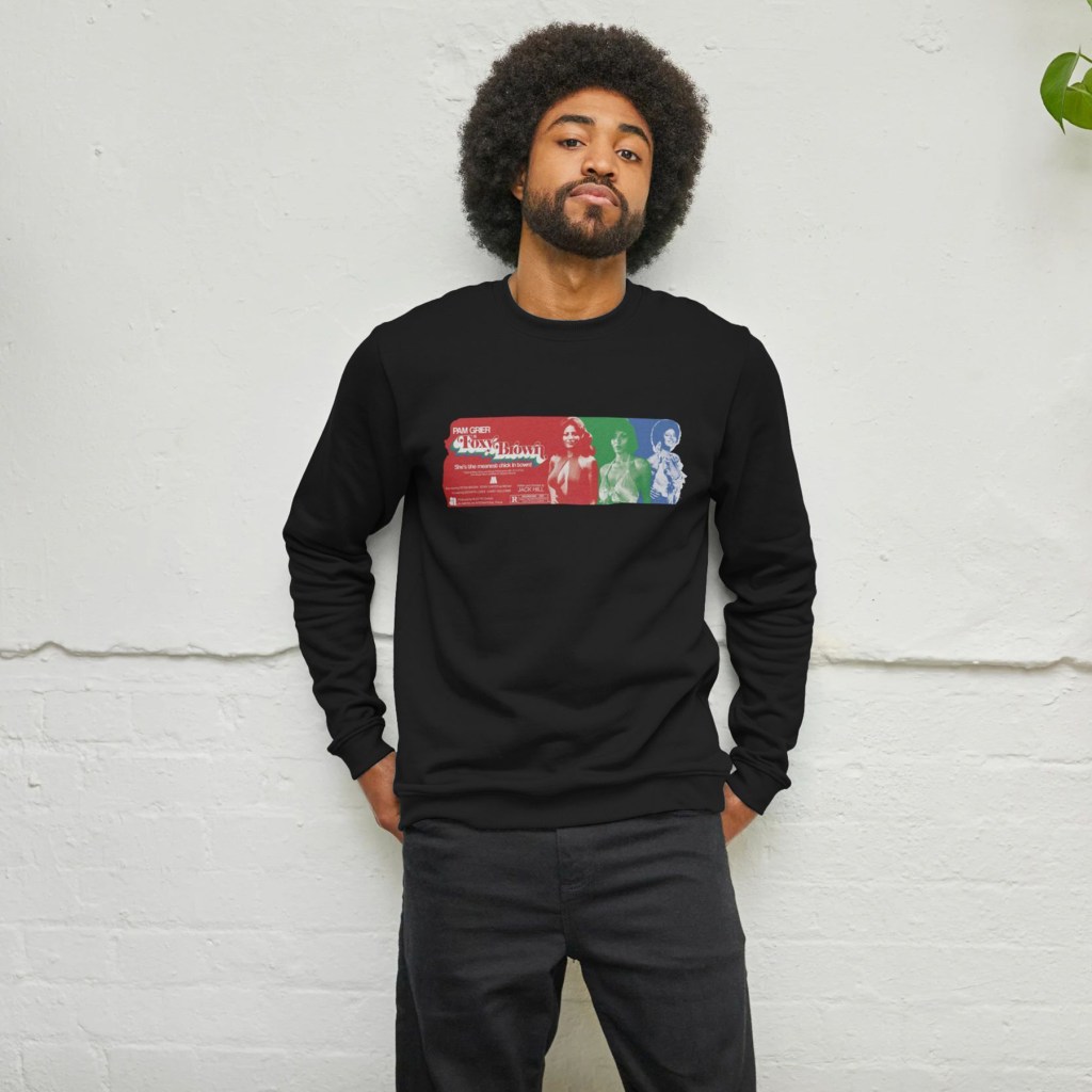
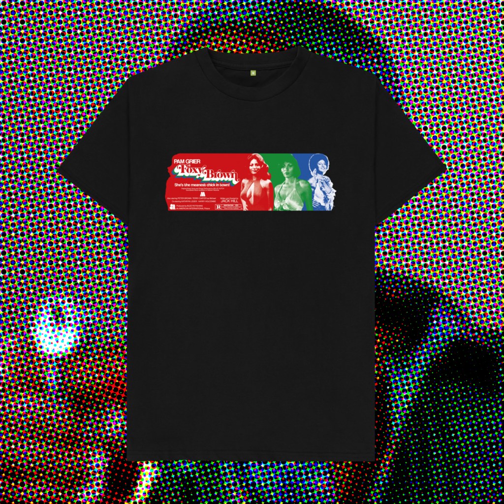
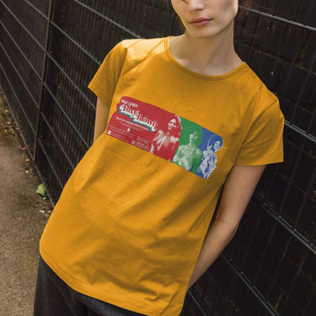
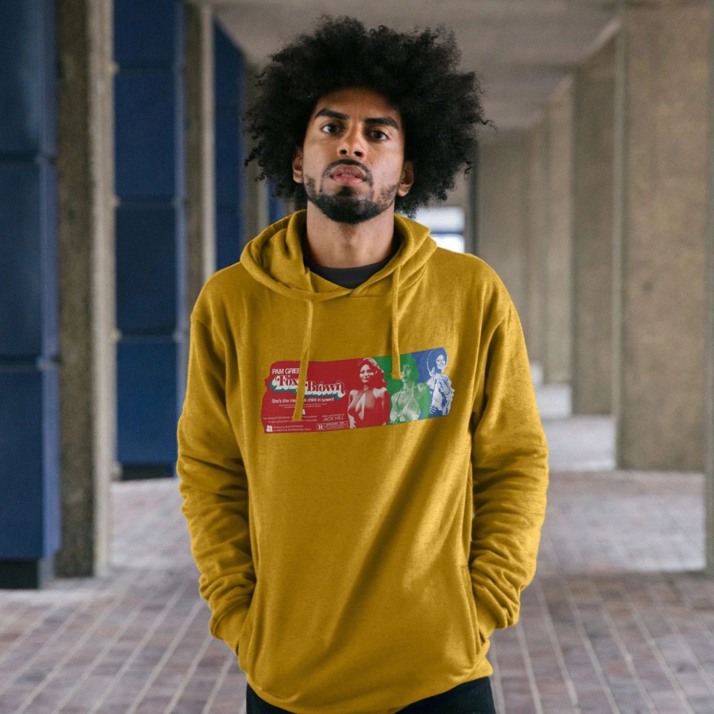
Buy shirts at Teemill and giclee poster prints at Etsy!

Shunya Itō’s third and final Female Prisoner Scorpion film opens with a bravura jolt – Nami Matsushima, Sasori, the Scorpion, is out of prison and on the run. As superimposed wanted posters fly past the screen while the camera barrels down a Metro track, we eventually enter the carriage where a glowering, olive green jacket-clad Matsu stares dead ahead while a crew of detectives scour the faces of the passengers. As their eyes lock, she springs violently into action, slashing away at the cops with a knife and escaping as the train pulls up to a platform. Alas, one dogged detective catches her arm and slaps the cuffs on her wrist, and tethers it to his own, just as the doors are closing. Wide-eyed, desperate, she takes a second to assess the situation and then begins hacking away with the blade, eventually severing his arm in a torrent of blood as she swings his severed appendage above her arm. Freeze frame, blood red title card, the first blast of Meiko Kaji’s now familiar theme song enters, as the image becomes aggresively solarised. The stricken cop writhes on the floor, as Matsu takes flight, emerging into the harsh light of the Tokyo streets. She sprints through panicked pedestrians with the bloodied arm flailing in her wake, we know that once again, Itō isn’t going to let his audience settle in to the familiar despite the rapid production schedule of his series.

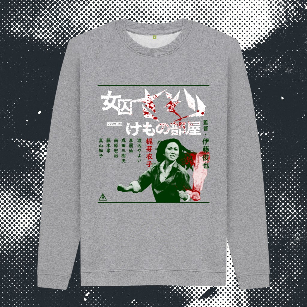
This vérité approach strips away the grim-yet-operatic visuals of the previous film, coming off more like the street-level gangster movies that preceeded it. The poster has, in tandem with the film’s more toned down, gritty, comparatively stripped-down aesthetic, been created to emphasise fewer elements (and increased violence). Again using the stripes of the iconic prison uniforms as a guide, I wanted to divide the poster into three horizontal strips, and was immediately convinced that the image of Nami dragging the detective’s severed arm would be her hero shot at the bottom – unrestricted by the stripes that would run across the top and middle. With realtively little real estate to work with, choosing the right images for the rest of the poster was a challenge. Originally I had used a screenshot of Katsu and her gang menacing Yuki, but the brutality of the sequence, divorced from the context of the film and the intent and artistry of Itō surrounding it, came across as too extreme and exploitative to use as a standalone image. These posters do have to strike a balance – these films are, after all, ‘exploitation’ films, which the artwork has to reflect, but should never stray too far into the realm of bad taste where they become too unpleasant or triggering. Even when dealing with somewhat extreme material, there are still lines to be drawn. And while the backstory behind the image of Yuki I did end up using is of course horrifying (she is raising a knife to her brother, wondering whether to kill him to spare them both the pain of their desperate situation), visually it seemed to me to be compelling, suitably harsh for the tone of the film, but falling just barely on the right side of acceptability. It was also one of many of Itō’s beautifully composed and lit shots, Yuki’s heavy makeup popping out of the gloomy dark room, the blade poised dangerously across her, the Dutch angle of the camera creating the fantastic diagonal sweep of the room behind her.

The colour scheme, overall, came to me instinctively. Again, the green was inspired by the original release poster, albeit that one was a very dark green, with red, blue and yellow along with a large image of a crow. I used Nami’s jacket as inspiration for a more military green mid-tone, with a pale green background – much in the same way the #701 poster used a solid blue over a pale blue background. And I knew I wanted to have the title text in white – which meant using a less detailed image for the middle strip upon which it would sit. I stumped for a wide shot of the one-armed Detective Kondo walking down a dark, industrial-looking street plastered with wanted posters – this time with all white removed so that the whole image was green-on-green. That was when the idea hit to incorporate red into the image. First, I wanted Kondo’s severed arm to be in red, so that it would be clearer to the viewer what it was (the downside of this film’s use of exterior, almost documentary footage is that both focussing issues and massively increased grain, coupled with a reduction in the kind of contrast you get from studio lighting, meant that the main image of Nami was, and remains, a little soft). A few tweaks were made to the image – painting in more detail on the hand, the cuffs, and most controversially and experimentally, running the face of the image through an AI enhancer. Knowing that the riso filter process would help to smooth over any mismatches in the image quality, I feel that it was important in being able to make the main hero image of the poster stand out, and was happy with the result in the end.

When I had just the arm in red, it felt very disjointed (so to speak). So, I experimented with using a blood splash to link it to Nami at the top and bottom. I felt this looked a lot better, and this inspired the further use of the splash across the text. In turn, that necessitated using red on the top image. At first, I had a horizontal streak running through the middle of the image, but this seemed to imbalance the layout. I experimented next with a splash, which looked more in keeping, but now seemed to be overusing the effect and diminishing its impact. Finally, it hit me to use the diagonal back wall – that a diagonal streak would direct the eye through the image, and would mirror the angle of Nami’s right arm, almost like a chevron, running from the top left, through the right middle, and back to the bottom left, encompassing the whole poster.

Now all that remained was the lettering. Each poster has had very different fonts – chunky and minimal for #701, more traditional and elaborate for Jailhouse 41 – and here, I wanted to use a more functional, appropriately 1970s street signage font. The final decision was to highlight Meiko Kaji’s acting credit in red, in a placement that I felt helped draw the eye in that chevron-esque direction through the composition. All this achieved, I felt that the poster had done all I could hope for. I was disappointed to not be able to include Katsu or her birds, or Kaji’s horror scene where she attempts to grind off her handcuffs while grasping Kondo’s disembodied arm in her teeth in a graveyard, but I feel like, if I saw this poster, I’d go and seek out this film. Which is surely what it’s all about.

To adapt this into a shirt design, I simplified the design down to just Nami’s daring escape, and kept the blood-spattered title text and the credits. I added the horizontal dark green bars top and bottom just to create some solidity to the layout (it also reminded me of a fantastic Stars of the Lid band shirt I owned many years ago! Head to Teemill for shirts and sweatshirts.