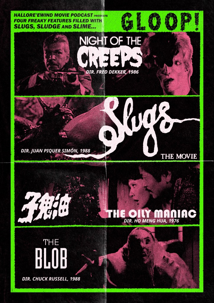
Created for HalloRe’ewind 2025
Created for HalloRe’ewind 2023
TRY GETTING A RESERVATION AT DORSIA NOW, YOU FUCKING STUPID BASTARD! YOU FUCKING BASTARD!
They’re only noodles, Michael.

Chill out. Dickwad.
Buy stickers of this image over at Teemill.

Buy A4 posters of this sketch over at Teemill.
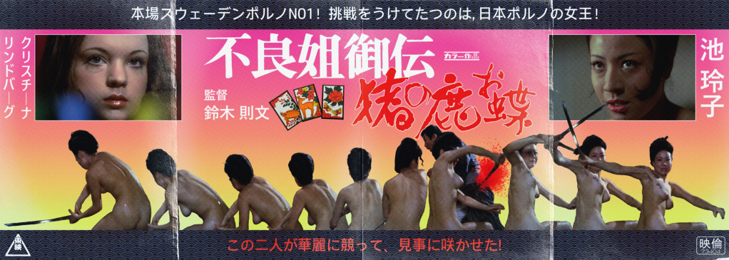
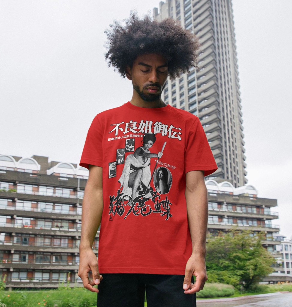
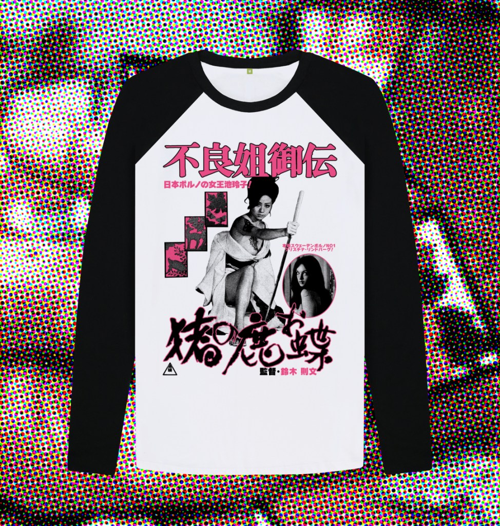
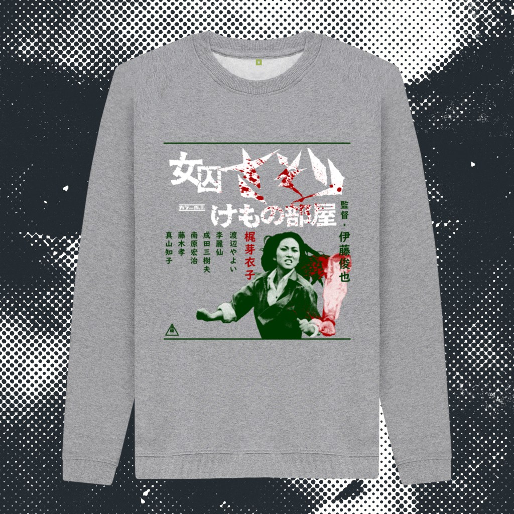
Toei Studios’ reigning queen of Pinky Violence, Reiko Ike, stars in Norifumi Suzuki’s infamous, overheated Jidaigeki classic of gambling, espionage, murder, revenge, and naked swordfighting. In contrast to Shunya Itō’s furious, near-contemporaneous Female Prisoner Scorpion trilogy (and Yasuharu Hasebe’s series capper), the thrills and spills on display here don’t carry quite the same message of righteous female empowerment, falling more into the more prurient end of the pinku spectrum of the era. But, that’s not to diminish the utter badassery and screen presence of the incandescent Ike, who cuts a swathe through the film and the series of miserable baddies that killed her detective father when she was a mere child. Emerging after 2 decades as a skilled gamber, pickpocket, and brawler, she navigates the underbelly of Tokyo with smoky eyes and a sly smile that disappears when it’s time to slaughter a dozen lackeys in the snow without a stitch of clothing. While in a separate subplot, Swedish exploitation star Christina Lindberg struggles gamely with her accent as a British dancer embroiled in a plot by the dastardly British to undermine the emerging Japan’s power, despite her romantic entanglement with a Japanese political activist. The film heads towards a shocking, somewhat blasphemous, bloody and oddly captivating full-throttle conclusion (mostly stolen from Meiko Kaji’s Lady Snowblood). It’s a heady stew of bad taste good times, anchored by one of the most charismatic performers of her era relishing the solo spotlight (Ike was more often paired with the intense Miki Sugimoto during this period).
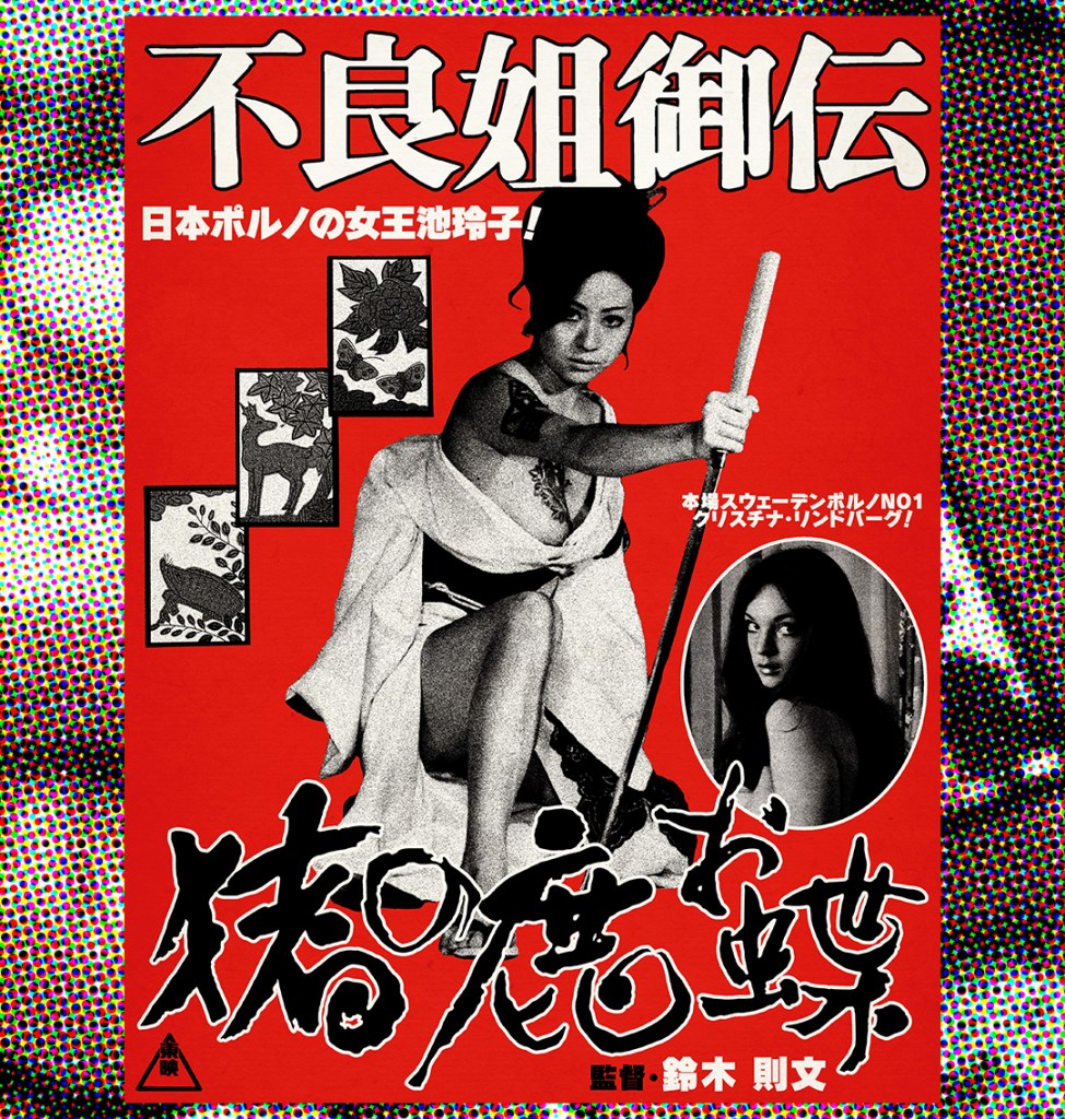
Here are my two designs inspired by the magnificent 不良姐御伝 猪の鹿お蝶 (Furyō anego den: Inoshika o-Chō) a.k.a SEX AND FURY! A large format full-colour poster print, available at Etsy as a gallery grade, 36cm x 87cm giclee print:
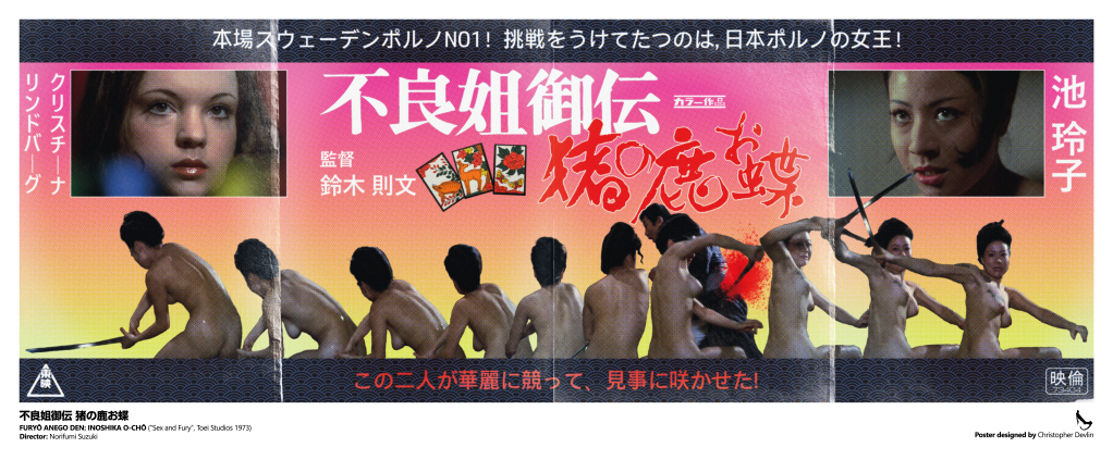
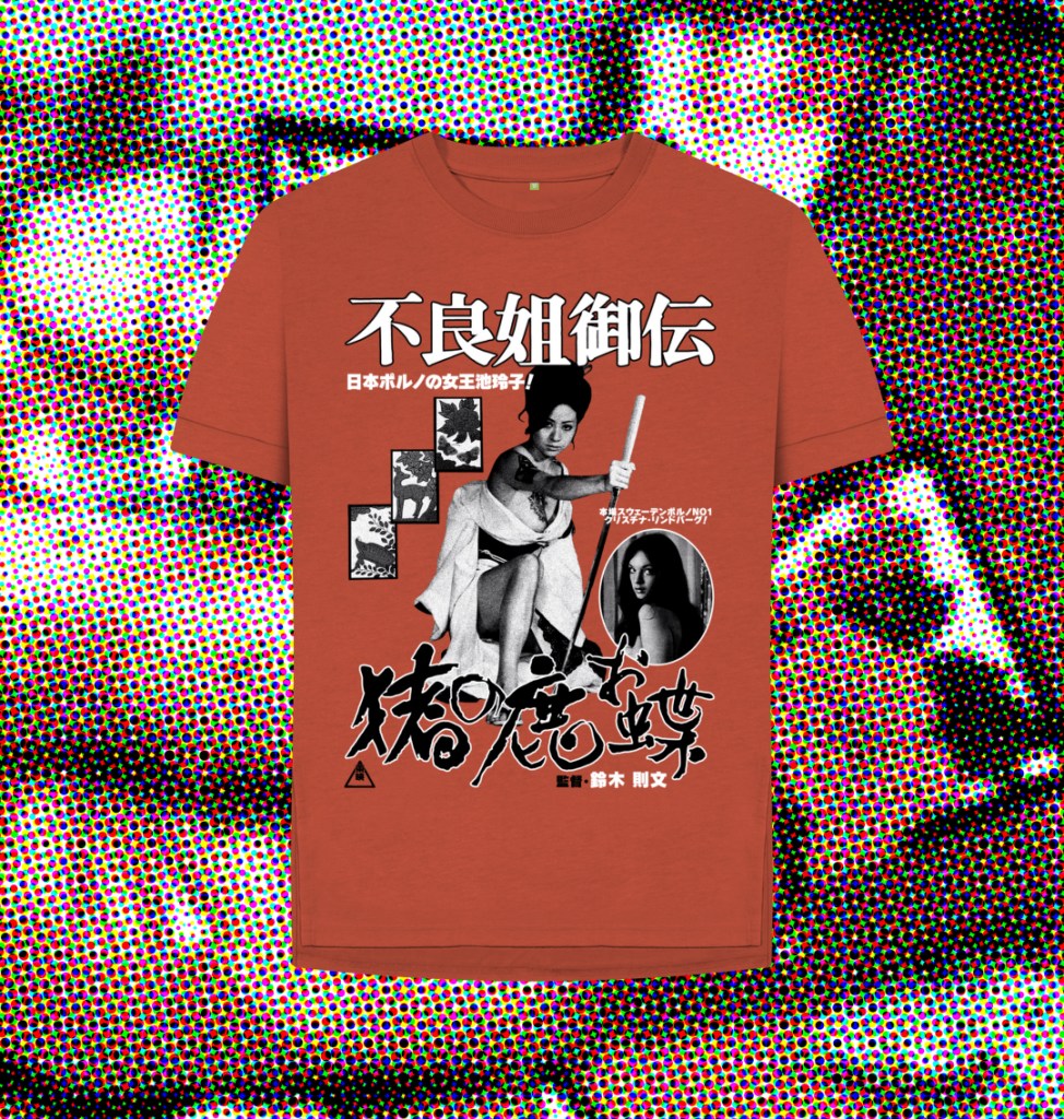
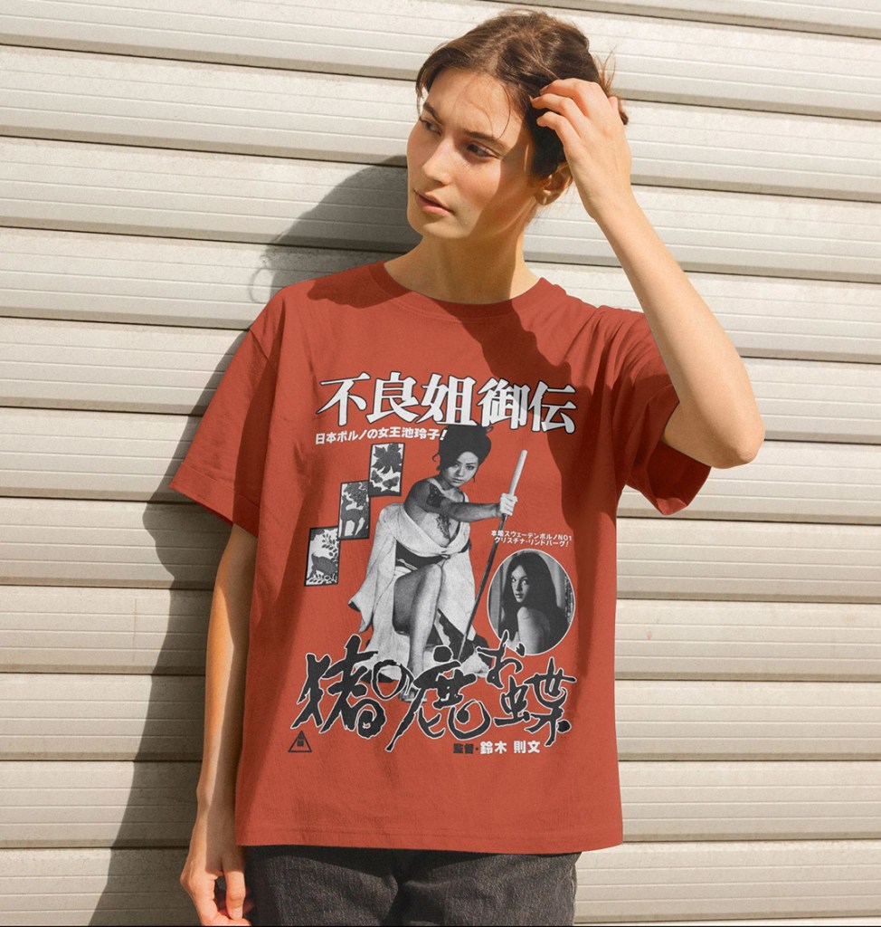
You can also pick up a t-shirt, or A3 poster print, of this alternative black and white design over at Teemill, from another original photomontage layout:
Full Colour Poster Process
For this poster, I knew I wanted to use the infamous naked bath house sword fight as the key image. It’s the most iconic scene in the film, utterly ridiculous, moronically cool, and the perfect hook for the type of poster I wanted to create – as close a rendition as I could manage of the early 1970s Japanese exploitaion movie posters that didn’t hold back on the base-level thrills they used to hook viewers. However, my standard edition DVD is the only source I have available for any images for this film; high resolution digital images seemed scarce and while I believe there may be a Blu-ray release of Teruo Ishii’s sequel Yasagure anego den: Sôkatsu rinchi, a.k.a Female Yakuza Tale: Inquisition and Torture, I couldn’t find one for this. That meant that, no matter if I could pull images, there would be such pixellation that I would have to degrade the picture substantially to avoid this being visible at scale. The first task was screenshotting a section of the fight – the moment Ike jumps from the bath gave the clearest set of images. These were enlarged as best I could within Photoshop, cropped (leaving the unfortunate victim of the katana-slashing intact in one), and the sword replaced in all but one shot due to the motion blur rendering them all but invisible.
Next, these screenshots were laid out together, with the spacing between them planned as best as possible to show the movement. This started to determine the shape of the poster (highly unusual in Japan – most posters of these dimensions would actually be vertical, not horizontal). While I had thought initially that they could run across the bottom of a larger design, the lack of good quality material determined that I preferred to make this the centrepiece. There were a few readjustments before I struck in the idea of a 4-folded sheet of roughly 4 x A4 paper. The size felt right: a 30cm height would be feasible for the print quality. That led to the idea to actually add ‘folds’ to the final design, one of a number of elements that would help hide the deficiencies of the original images. I liked the idea of a ‘widescreen’ poster – this influenced the idea to have a border of some kind to help create a more horizontal look, to allow for the very wide, 10 screenshot montage to not look too out of place. In this new layout (which at this point had only plain black letterbox borders) the images took roughly half of the vertical space remaining. I’d screenshotted a striking close up of Ike’s face that felt to me as the natural choice for her ‘hero’ shot; I wasn’t sure how to use it, but by adding a white layer border it looked more intentional. By this time, I’d added the pink-to-yellow colour blend as a background. The choice was largely organic – I’d seen a similar fade effect in the background of numerous Japanese posters of the era, and the pink represented, simply enough, pinku as a genre. The yellow was both complementary, and allowed for the somewhat clumsy blood splatter to be visible. That red element was tricky. I had taken screenshots of the title screens to the film, snipped them, and run both through Illustrator to create vectors. I knew I wanted the titles in red and white, but the pink background made it difficult to read. Luckily, the solution matched the white border I’d chosen to add to Ike’s closeup. A comparable close up for Christina Lindberg seemed natural – after all, on the original release poster (and subsequent DVD and video releases), she’s actually featured far larger than the film’s actual star.
Basic elements in place, I started adding text. Again, I think the mixture of vertical and horizontal text would actually be highly unusual in a poster of this era. Ike’s name goes first, as vertical text is read right-to-left rather than left-to-right, although this change was made very last minute after I hired a translator from Fiverr to translate the tagline to the film. It, in the very blunt manner you’d expect, refers to ‘Sweden’s No.1 Porno Queen!’, Lindberg, and that ‘Japan’s Porn Queen Reiko Ike!’ answers her challenge. This, then, dictated the order of the main images. The rest of the tagline, which says something like ‘These two will fight elegantly, and gracefully make the flower bloom!’, was added to the lower part of the poster, in red to help with the colour balance.
Those border sections felt like they needed something additional – I downloaded a pattern maker from Adobe Stock and created a simple wave pattern that I felt evoked the period film trappings, and used the exact shade of dark brown of Ike’s hair as the dominant colour to try to ensure that it felt organically connected, and to evoke the narrower colour palettes of older posters with limited inking abilites. The dark blue was added purely to allow it to stand out, and to hopefully make some sense of the blue light flare that was in the best available close up I could source of Lindberg.

The importance of the Hanafuda cards – the gambling cards that carry the images of the deer, the boar, and the butterfly – was something I’d wanted to include. First, via a screenshot of the cards clutched in Ike’s father’s dying hand, but I didn’t think that it fit the layout I had to this point. I managed to find, on a US Embassy website of all places, a clear image of the cards on a plain background. I separated them, and laid them out in a space that had emerged to the left of the film’s title. Adding in the various logos that would somewhat allow this to pass as a genuine period poster, including the Toei logo in the bottom left and the registration mark in the bottom right, I felt the design itself was done.
To get a vintage print style, I first downloaded Studio 2am‘s Zine effect process, as I wasn’t sure where to start with creating a realistically aged print effect. Unfortunately, the dimensions of the standard version were too small. I retrofitted the various layers of filters and processes as best I could, most importantly a color halftone effect that helped to obliterate the pixellation of the source images. Among others, there is a sandstone texture, added noise, gaussian blurs, and finally the halftone effect, set to 4 pixels. This was then exported, and dropped into a new psd.
I stitched together 4 creased paper overlays that I found on Adobe Effects – black screens that contained realistic paper fold damage – and shaped them to cover the image as needed, before using the eraser to avoid contaminating the image too much. I set this as a ‘screen’ layer, and added one more, different paper texture effect to offset the lightening that resulted with some darker paper grain.
Finally it was time to set up the print layout – I’ve ended up with slightly bizarre final dimensions, but was unwilling to affect the specific halftone pixel size by reducing the final exported image to fit a print border/bleed. I decided to add the English text based on a book I have of Japanese cult posters, Tokyo Cinegraphix, and allow for a wider border across the bottom edge. Each poster in that book has a little information block regarding the year of production, Japanese, and English translated titles. The book series is excellent, and highly recommended!

Buy shirts at Teemill and giclee poster prints at Etsy!
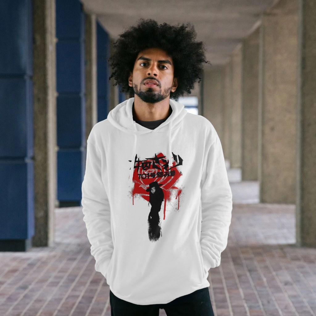
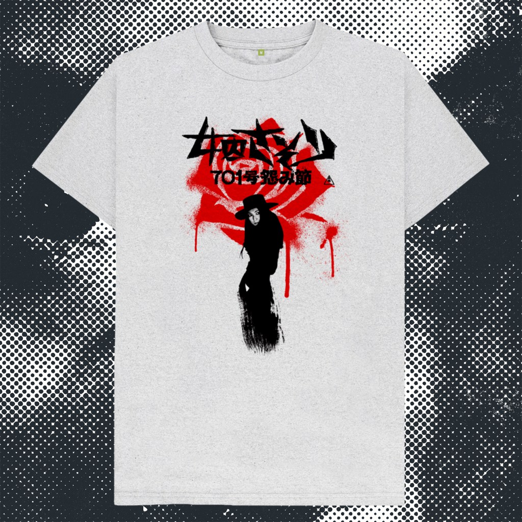
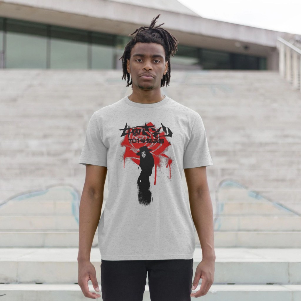
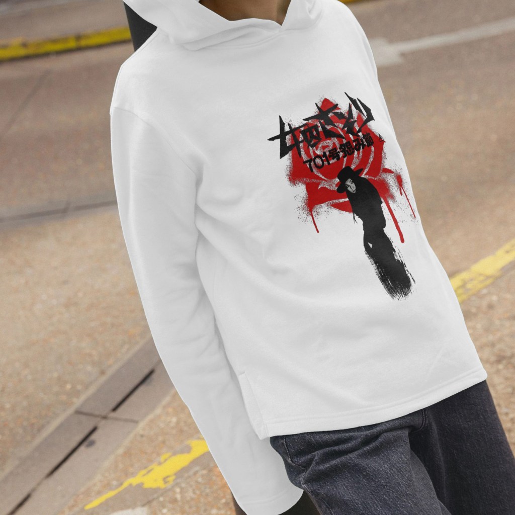
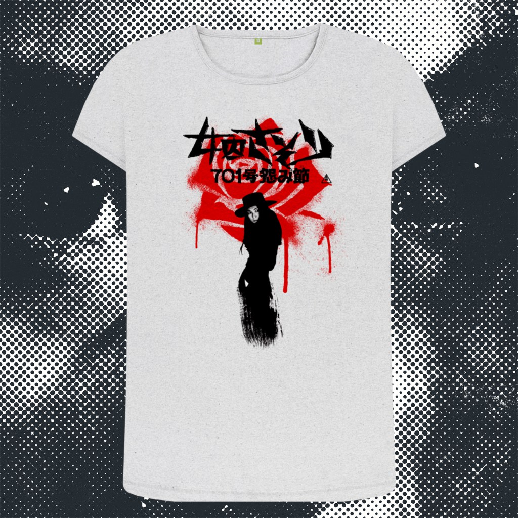
My final poster design in the Female Prisoner Scorpion series is for director Yasuharu Hasebe’s only entry, and Meiko Kaji’s last outing as Nami Matsushima/Sasori/The Scorpion, Grudge Song. While it lacks the wild creativity of Shunya Itō’s incredible trilogy, Hasebe was no slouch – a veteran of Nikkatsu’s ‘borderless action’ yazuka movies of the late 1960s, including his remarkable Retaliation which featured Meiko Kaji in a supporting role, and 3 entries into Kaji’s sukeban series Stray Cat Rock. A sombre and fascinating coda to the wilder Itō pictures, this film allows Kaji to ground her portrayal of Nami more than at any other time in the run – even going so far as to find her a male love interest for the first time since the evil corrupt cop that sent her down the path of cyclical incerceration and revenge. The film even features fascinating visual callbacks to the first film in the cycle that evoke that relationship, deepening the drama and dourness when things inevitably go awry for our stoic heroine.
I’ve tried to capture that pared-back simplicity with a bold and stark design that incorporates a flower-shaped bloodstain – visually representing one of the more memorable kills in the series as Nami eludes capture by driving a flower into a cop’s jugular. The bloodstained fabric refers to that visual callback during Nami’s brief moment of physical intimacy she shares with the damaged anarchist she comes to trust enough to take to bed – a visual motif that in the original film also recalls the hinomaru flag.

Buy shirts at Teemill and giclee poster prints at Etsy!
Shunya Itō’s third and final Female Prisoner Scorpion film opens with a bravura jolt – Nami Matsushima, Sasori, the Scorpion, is out of prison and on the run. As superimposed wanted posters fly past the screen while the camera barrels down a Metro track, we eventually enter the carriage where a glowering, olive green jacket-clad Matsu stares dead ahead while a crew of detectives scour the faces of the passengers. As their eyes lock, she springs violently into action, slashing away at the cops with a knife and escaping as the train pulls up to a platform. Alas, one dogged detective catches her arm and slaps the cuffs on her wrist, and tethers it to his own, just as the doors are closing. Wide-eyed, desperate, she takes a second to assess the situation and then begins hacking away with the blade, eventually severing his arm in a torrent of blood as she swings his severed appendage above her arm. Freeze frame, blood red title card, the first blast of Meiko Kaji’s now familiar theme song enters, as the image becomes aggresively solarised. The stricken cop writhes on the floor, as Matsu takes flight, emerging into the harsh light of the Tokyo streets. She sprints through panicked pedestrians with the bloodied arm flailing in her wake, we know that once again, Itō isn’t going to let his audience settle in to the familiar despite the rapid production schedule of his series.
This vérité approach strips away the grim-yet-operatic visuals of the previous film, coming off more like the street-level gangster movies that preceeded it. The poster has, in tandem with the film’s more toned down, gritty, comparatively stripped-down aesthetic, been created to emphasise fewer elements (and increased violence). Again using the stripes of the iconic prison uniforms as a guide, I wanted to divide the poster into three horizontal strips, and was immediately convinced that the image of Nami dragging the detective’s severed arm would be her hero shot at the bottom – unrestricted by the stripes that would run across the top and middle. With realtively little real estate to work with, choosing the right images for the rest of the poster was a challenge. Originally I had used a screenshot of Katsu and her gang menacing Yuki, but the brutality of the sequence, divorced from the context of the film and the intent and artistry of Itō surrounding it, came across as too extreme and exploitative to use as a standalone image. These posters do have to strike a balance – these films are, after all, ‘exploitation’ films, which the artwork has to reflect, but should never stray too far into the realm of bad taste where they become too unpleasant or triggering. Even when dealing with somewhat extreme material, there are still lines to be drawn. And while the backstory behind the image of Yuki I did end up using is of course horrifying (she is raising a knife to her brother, wondering whether to kill him to spare them both the pain of their desperate situation), visually it seemed to me to be compelling, suitably harsh for the tone of the film, but falling just barely on the right side of acceptability. It was also one of many of Itō’s beautifully composed and lit shots, Yuki’s heavy makeup popping out of the gloomy dark room, the blade poised dangerously across her, the Dutch angle of the camera creating the fantastic diagonal sweep of the room behind her.
The colour scheme, overall, came to me instinctively. Again, the green was inspired by the original release poster, albeit that one was a very dark green, with red, blue and yellow along with a large image of a crow. I used Nami’s jacket as inspiration for a more military green mid-tone, with a pale green background – much in the same way the #701 poster used a solid blue over a pale blue background. And I knew I wanted to have the title text in white – which meant using a less detailed image for the middle strip upon which it would sit. I stumped for a wide shot of the one-armed Detective Kondo walking down a dark, industrial-looking street plastered with wanted posters – this time with all white removed so that the whole image was green-on-green. That was when the idea hit to incorporate red into the image. First, I wanted Kondo’s severed arm to be in red, so that it would be clearer to the viewer what it was (the downside of this film’s use of exterior, almost documentary footage is that both focussing issues and massively increased grain, coupled with a reduction in the kind of contrast you get from studio lighting, meant that the main image of Nami was, and remains, a little soft). A few tweaks were made to the image – painting in more detail on the hand, the cuffs, and most controversially and experimentally, running the face of the image through an AI enhancer. Knowing that the riso filter process would help to smooth over any mismatches in the image quality, I feel that it was important in being able to make the main hero image of the poster stand out, and was happy with the result in the end.
When I had just the arm in red, it felt very disjointed (so to speak). So, I experimented with using a blood splash to link it to Nami at the top and bottom. I felt this looked a lot better, and this inspired the further use of the splash across the text. In turn, that necessitated using red on the top image. At first, I had a horizontal streak running through the middle of the image, but this seemed to imbalance the layout. I experimented next with a splash, which looked more in keeping, but now seemed to be overusing the effect and diminishing its impact. Finally, it hit me to use the diagonal back wall – that a diagonal streak would direct the eye through the image, and would mirror the angle of Nami’s right arm, almost like a chevron, running from the top left, through the right middle, and back to the bottom left, encompassing the whole poster.
Now all that remained was the lettering. Each poster has had very different fonts – chunky and minimal for #701, more traditional and elaborate for Jailhouse 41 – and here, I wanted to use a more functional, appropriately 1970s street signage font. The final decision was to highlight Meiko Kaji’s acting credit in red, in a placement that I felt helped draw the eye in that chevron-esque direction through the composition. All this achieved, I felt that the poster had done all I could hope for. I was disappointed to not be able to include Katsu or her birds, or Kaji’s horror scene where she attempts to grind off her handcuffs while grasping Kondo’s disembodied arm in her teeth in a graveyard, but I feel like, if I saw this poster, I’d go and seek out this film. Which is surely what it’s all about.
To adapt this into a shirt design, I simplified the design down to just Nami’s daring escape, and kept the blood-spattered title text and the credits. I added the horizontal dark green bars top and bottom just to create some solidity to the layout (it also reminded me of a fantastic Stars of the Lid band shirt I owned many years ago! Head to Teemill for shirts and sweatshirts.