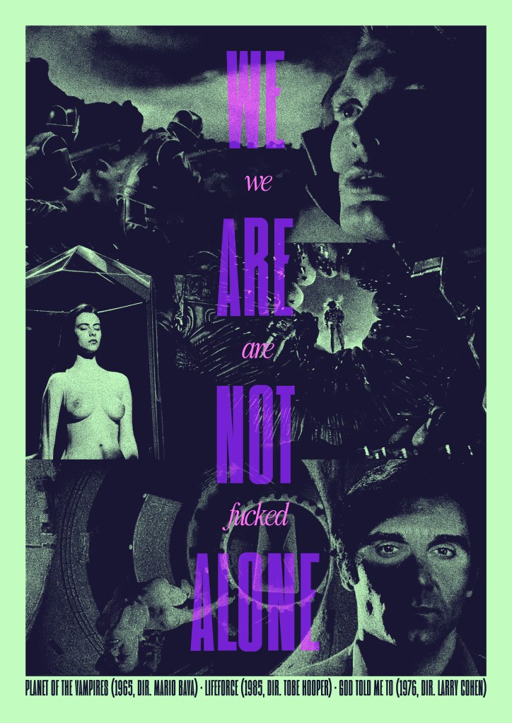
Created for HalloRe’ewind 2025
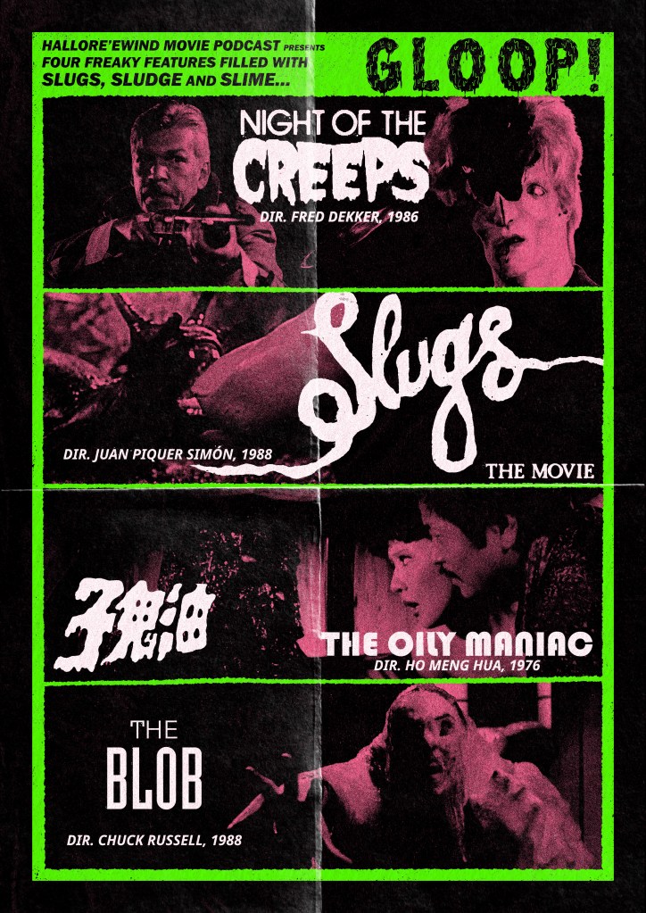
Created for HalloRe’ewind 2023
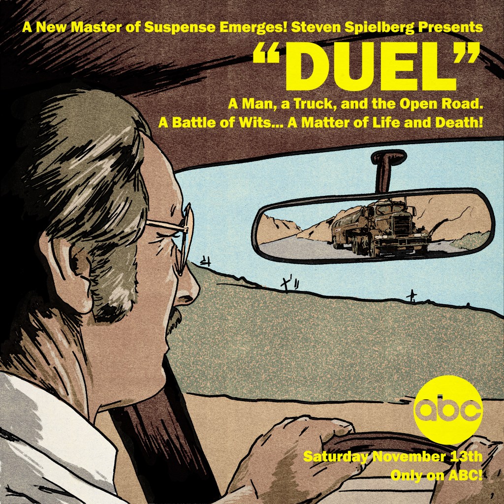
Created for our Rewind episode on Steven Spielberg’s debut feature (originally an ABC Movie of the Week, of course!)
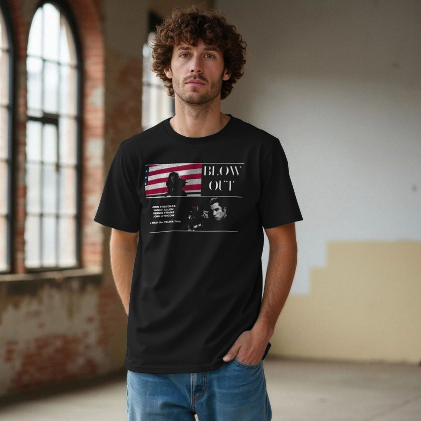
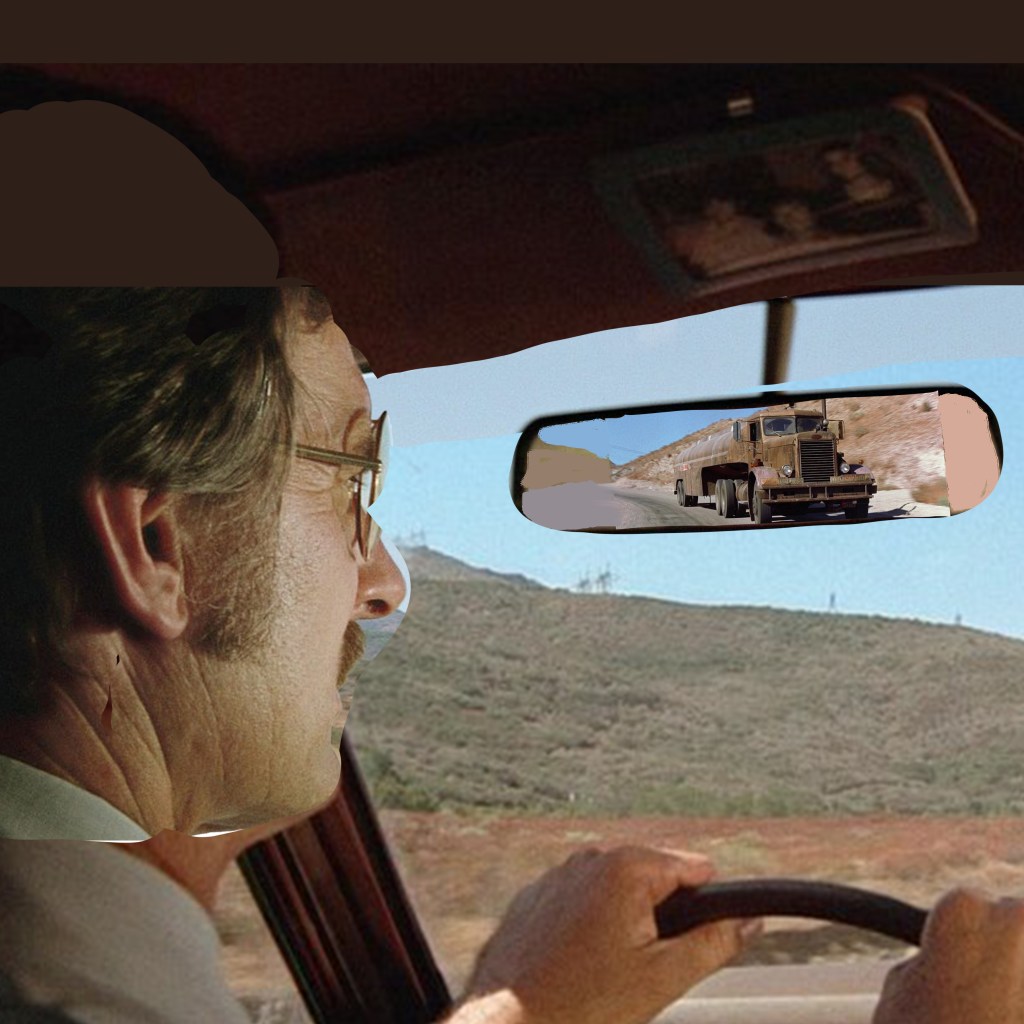
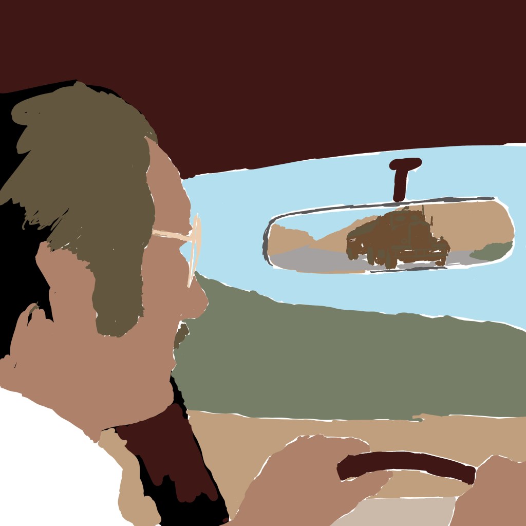
This one started life as an incredibly janky composite of screenshots in Photoshop, just to see how best to organise the elements into the square frame. I pulled a stack of images and pushed a few around, eventually landing on a layout that had a dominant, but indirect, image of lead actor Dennis Weaver, with the truck looming in his rearview mirror:
As a cover image that would be primarily used on podcast platforms, it would need to be a square format. Given that most of my design work recently is intended for Rewind episodes, that has meant that I’ve had to become comfortable with an image shape that I don’t find particularly natural or accomodating. Although, in this instance, it was useful on two counts – first, for a sense of claustrophobia that suits the film’s juxtaposition of wide-open vistas and sweaty, intimate in-car panic. And second, to mimic the boxy format that the original airing would have had, before the theatrical re-edit that opened up to widescreen.
Downsides – of course, a driver would not have a rearview mirror jammed right in front of their eyeline. And, without being able to open up the format to something wider, that meant that the truck – the main selling point of the film – would appear pretty small overall. So, I wanted to mitigate by ensuring that David Mann’s eyeline leads the viewer right to the truck. That it would sit in and break up a patch of pleasant blue sky and provide a messy, eye-catching feature among an otherwise quite simple layout.
That influenced how I drew the final piece, too. I still did not know how I would render this. Realistic? Illustrative? Painterly? A big factor, perhaps the main factor, was time. And skill. I would have trusted myself to render something more representative of real life if I had time to transfer the image to paper and render in charcoals. But I didn’t see that I would be able to do it justice in that format – it didn’t really suit the image, which I use more often for more traditional portature. I also just do not have the skill to render realistically in digital illustration. I have only a stylus that interacts with my touchscreen laptop, which is not a professional grade drawing tablet. And I don’t find digital illustration intuitive at all. I would love to be able to layer delicate brush work to build up the atmosphere, but it’s not something I know how to do.
So that left me with something more like a vintage comic book style – like Creepshow. I first laid down the ink work – using a variable width ink brush from True Grit Texture Supply Co. I laid a flat white layer down, and varied the opacity so I could see different levels of detail of the photomontage beneath for a loose trace. I intentionally used a wider brush on the car, the environment, and David – around 16-18 pixels I think – than I used on the truck, more like 8-10 pixels. The extra detail was to ensure that, if the viewer really got into looking closely, there was enough of the unique character of the truck to be interesting.
Then, again, to save time, I blocked in the colours extremely flat. I limited to around 6 colours in total, I think – all were droppered from the reference picture itself and then tweaked a little, to ensure that despite the cartoony render, it would be grounded in realistic colour tones. One flat tone for the sandy landscape, one for David’s main skin tone, one for the grass, a dark maroon for the car interior, and a specific tone for the truck. I think also the dashboard is a slightly different beige. Can’t remember. You can see below, without the ink work:
Then, it was time to add high and lowlights. I used a brush called Dry Brush Inker, that allowed for a bit of a break from anything too cheap-looking – I wanted a semblance of tactility. I also used the sandy colour as a texture to lay over the grass, to stop that looking too lush and keep the desert look intact. This was my second attempt – initially, I used a grain shader to try to build up detail and visual interest across all the areas. But this looked too modern, too much like a 2010s comic book – it couldn’t concievably pass as a vintage illustration. Using these modern techniques to ape obsolete techniques is always a fine line to walk. Obvious pastiche looks cheap. It was also important to NOT introduce any new colours at this point – all digital paint added to the image is drawn from that original palette.
Once the colours and the inks looked about right, I exported the inks alone as a PNG, and used a Photoshop process from Spoon Graphics called Bad Print Effects to add a number of filters and degradations that would mitigate the clean, boring flat vector style that it had. I did not process the colour elements – I find it a bit too harsh on those, so processed the colour paint layers separately in Camera Raw Filter and just added grain and texture, also using a vintage paper texture as an added layer to give some variance. But, it really helps to give the solid ink lines some imperfections and a hint of translucence – I used the same process on my Coffy poster.
The Bad Print process also comes with a harsh, aged paper texture as a background. I used GIMP to enact the Color to Alpha process on that background, and leave only a scuzzy, fibrous overlay that would make it seem as if the ink has bled into cheap paper. One more layer of old paper as a screen for variance, and we were done.
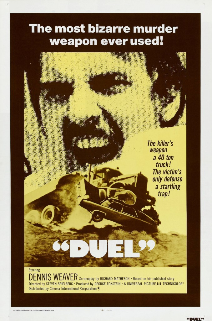
Then, it was time for text. For the podcast, I needed only the name of the podcast and the episode number. But for the print, I wanted to make it seem like an ad printed in an old comic book, which meant tagline, title, and the original air date of the TV movie. The colour choice was influenced equally by the yellow of the original 1971/72 release poster, by the blocky yellow text of Columbo, which Spielberg had just directed before this also for Universal Television Productions, and the repeated use of yellow to signify danger that my good friend Matt identified in watching Jaws. I loved the way the title was in inverted commas on the release poster, so nicked that for mine. I also paraphrased a great tagline from another.
The use of text also re-emphasised the primacy of the truck in the layout. The right-justified text was a matter of necessity – that’s where the spare real estate was – but also, as you read down the bright yellow text , your eye is led right to the truck, with nothing else to attract the eye directly below until you get to the network logo in the bottom right.
All-in-all, a fun, mostly instinctive path through the making of this poster. There’s plenty I would have fixed if I had spent more time, but I think in retrospect the only thing I would have definitely done differently is to lay down the ink work direct onto Bristol board in pen, then scanned. I have better control physically, and once scanned, can always make changes digitally where necessary.

I would like to claim that I was the only kid in Darlington that had a Wu Wear jersey in 1999. It’s probably not true, but I never saw another. I developed an intense fascination with the Wu-Tang Clan in my later secondary school years. Must have been the undeniable parallels I felt, in my formative years on the Grange Estate in Hurworth-on-Tees, with the Park Hill project in Staten Island that birthed the legendary group. To this day, my brother and I can recite the infamous skit from their debut album that precedes the absolutely phenomenal M.E.T.H.O.D. Man (“I’ll just keep feedin’ you, and FEEDIN’ you…”) word-for-word. And often do.
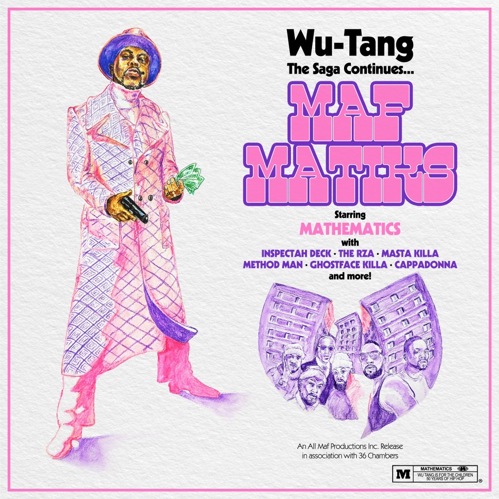
So imagine how nuts I went when I was contacted about the possibility of pitching a cover concept to RZA’s 36 Chambers Record Label for a new album being prepped by long-time group DJ Mathematics. The record was to be themed around Blaxploitation movie scores and tracks, forming the bedrock of each song. I was sent a huge cachet of posters from the era as inspiration, as well as concept art by Mathematics himself – fucking daunting given that he is the man who created the famous W logo. I’d been contacted after posting my Coffy alternative poster. The designs leaned heavily into a busy image of besuited badasses and babes, the draft I saw modelled mostly on 1973’s Black Caesar. Given that this had already been covered, I thought, why not swing for something a bit eye-catching in the same vein? So I cobbled together a direct riff on the brilliant Super Fly poster, a little on the nose of course, but I had a really clear idea of how a white, pink, and purple colour scheme could absolutely jump off the shelves (actual, and digital) in a genre that perhaps shied away from this particular look.
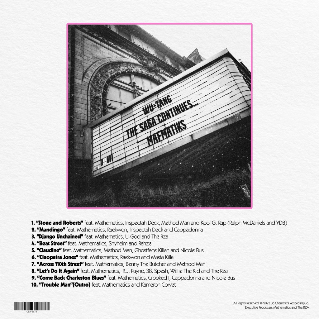
I rushed this placeholder draft out in watercolour pencils, adding a Wu-Tang logo that was hewn out of two tower blocks from that same Park Hill neighbourhood that so fascinated me when I learned how they dubbed the area Shaolin, with the members of the group posed in front of it. On the back cover, I wanted to evoke the nostalgia so many aficionados of cult films feel for the faded fleapits and grindhouses of New York’s 42nd Street. While, for me, this was something I didn’t even know I’d missed until it was long, long gone, the members of the group would have really experienced those cinemas, discovering the Kung Fu gems that so influenced their lexicon.
But, my preferred design sought to reference the brief more tangentially – I saw many posters that used a stark black, yellow, and white colour scheme:

…and figured, what if I could avoid the cliche and the visual overload, while keeping the feel? Many posters include a cityscape, so I grabbed a vintage 1970s photograph of the New York skyline taken from the perspective of the Staten Island ferry as it approaches – figuring, it could evoke the journey the group’s members may have taken into Times Square to see these same, infamous features. I ran a risoprint filter of the image, after isolating the buildings and adding a more highly-contrasted photograph of clouds, to allow for some additional texture.
I ran the filter over the skyline separately, then manually lined up the two images, so that the black and white buildings stood stark against the yellow and white sky.


I used the Wu-Tang W to create a cutout against the buildings, and separately against the sky, and then finally utilised the detailed buildings and bridges to cut off the solid yellow background at the horizon line, leaving the lower third free for ‘credits’ in a font that I felt straddled the line between 1970s-appropriate, with a modern edge. You can see the struts of the bridge at the outer edges if you look close enough.
For the back cover, I repurposed the same image of a broken-down awning, the album name emblazened on it. The work here is extremely rough as it was only intended to be a very indicative, low-res concept pitch, but I thought the overall piece looked like something that brought the right feeling of the 1970s, without seeming too try-hard or tacky. Bold, but not fussy.
Ultimately, of course, this was as far as the job went – I was super happy for the opportunity, a bit bummed out that I didn’t get to contribute to one of my favourite musicians of all time, and fired up to try again.
A film I have a complicated relationship with, but made for a really interesting Rewind Movie Podcast episode. I wanted to utilise the very overused, well-known image of Andrew “Large” Largeman sinking into the background as he tries on a shirt made from the same material as the recently renovated bathroom in his childhood home from which he has become so alienated (why was there leftover fabric from a bathroom wall that could be used to make a man’s shirt? I do not know!), but give it a bit more thematic weight.
I sourced the closest analogue I could find of the wallpaper pattern, a William Morris (proud son of Walthamstow!) design called Acanthus. I could only find a small square, so I had to line it up by eye and create a repeatable pattern big enough to fill a Photoshop square. I then eyeballed a purple and green colour-scheme based partly on the screenshots I could source from the movie, and partly one that I thought seemed attractive – aware that I was going to potentially tweak this heavily later.
I used a faux-vectoring technique (I no longer have Illustrator, so have to create a workaround using a YouTube video from TextureLabs that is intended to mimic screenprinting) to create a three colour Braff face, that I matched to the colours in the wallpaper pattern. I manually erased some of his face to allow tendrils of the background plants to show through on his face.
Then, I didn’t like the cartoony boldness – so I ran it through a Studio 2am effect called Indie Dreams, which seemed appropriate in capturing a hazy, early-’00s sensitive colour pallete. There were a number of options, so I used one that shifted more towards a colder green/purple tone. It helped to remove some of the lazy pixellation I’d left in my haste to construct the wallpaper pattern. Finally, I grabbed a font that seemed to match a less familiar release poster I’d found, a blocky serif font called Flamente Cairo. I stuck to the late-Gen-X penchant for all lower case text, and added the same festival laurels that the poster I sourced proclaimed. It felt, again, true to 2004 to trumpet the cachet that came with festival slots in the dog days of the Peak Sundance era.
All available at my Teemill store!
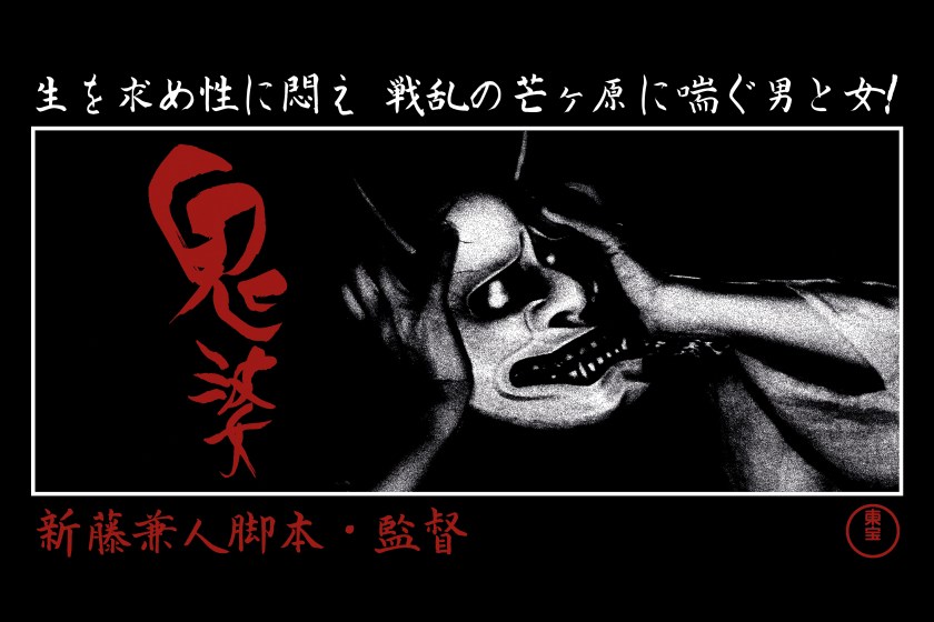
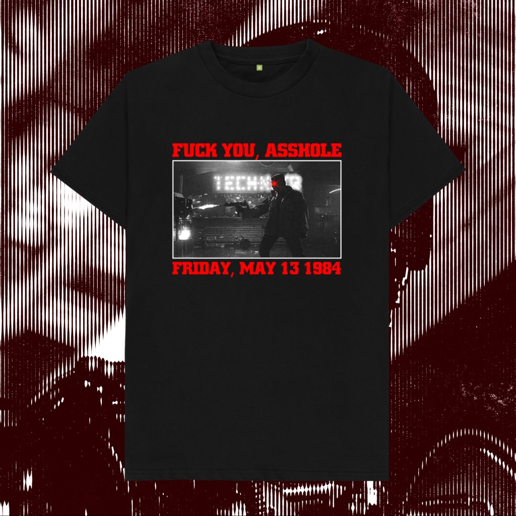
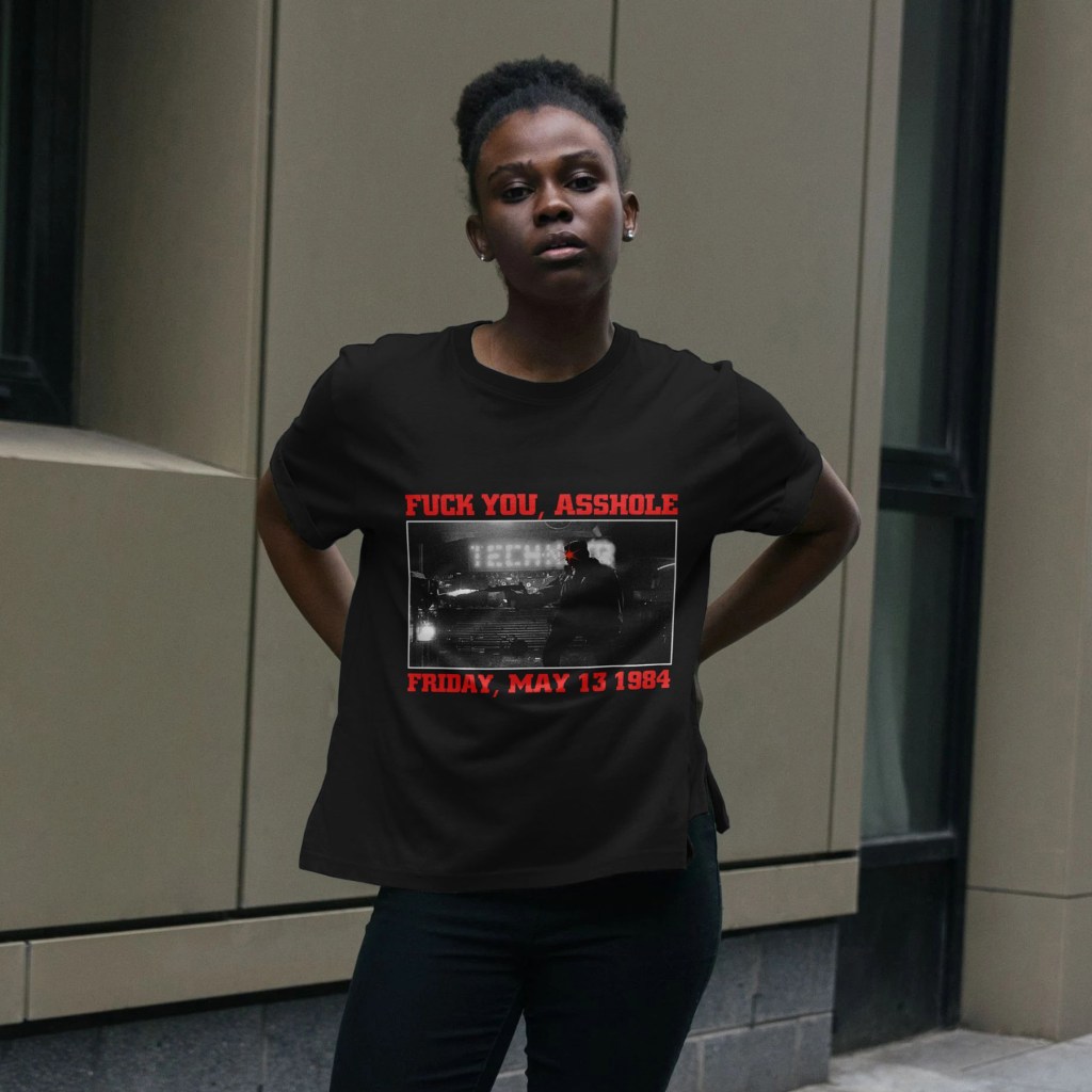
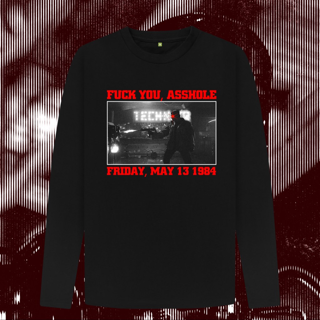
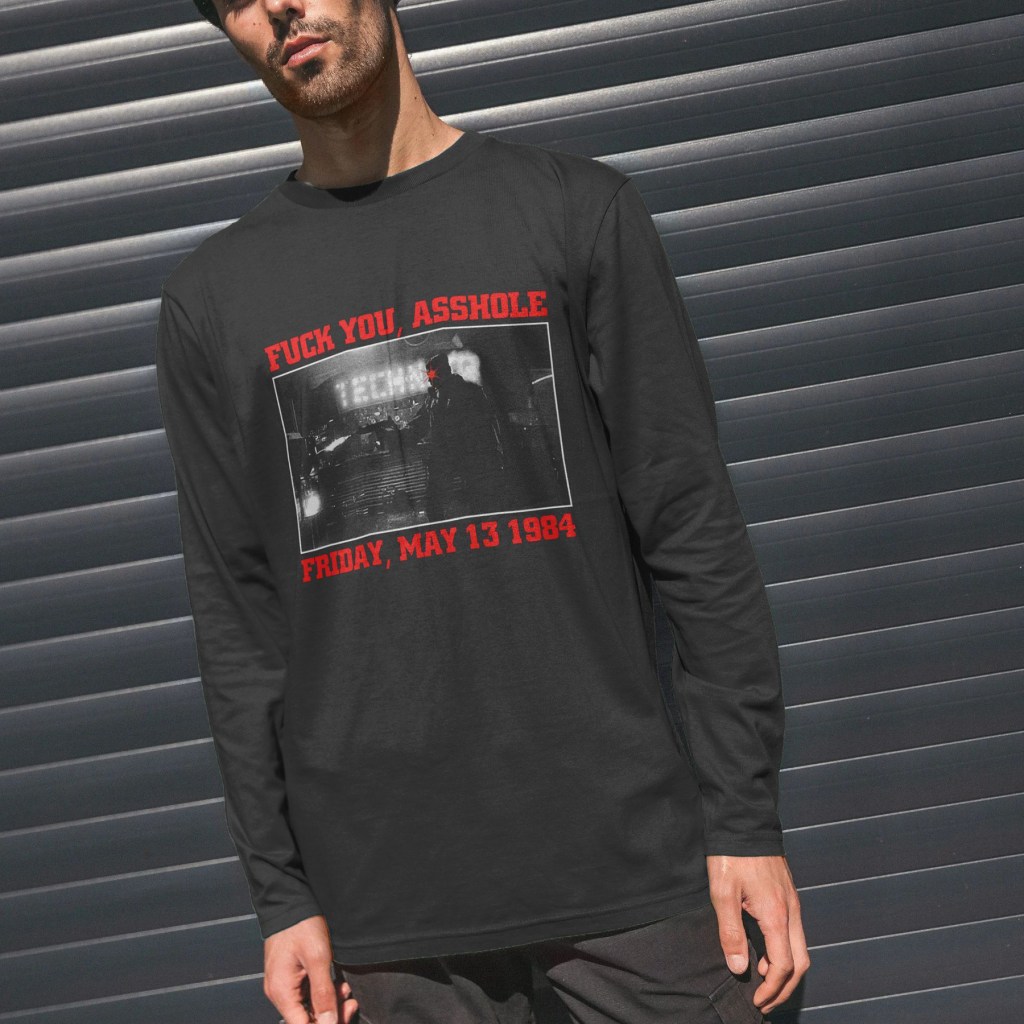
Kaneto Shindō’s bleak and brilliant 1964 masterpiece.
“Come on, big guy. Let’s go for a ride. Let’s cruise.”
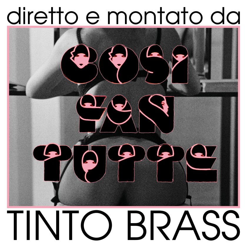
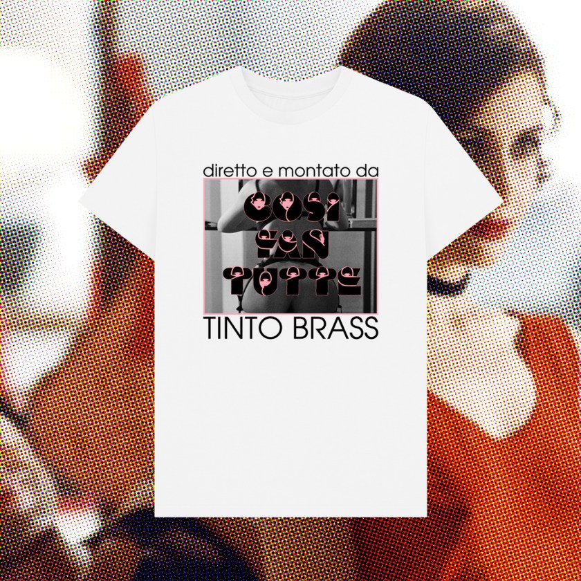
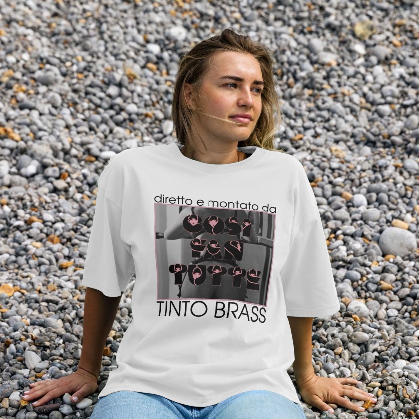
Italy’s premier, posterior-obsessed arthouse provocateur.

An ink sketch, scanned and digitally coloured by my good friend and Rewind co-host Scarious Artists. Available on my Teemill.

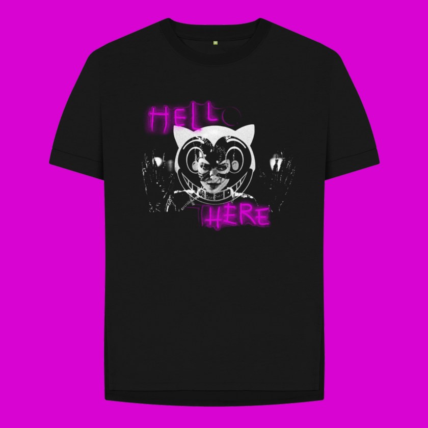
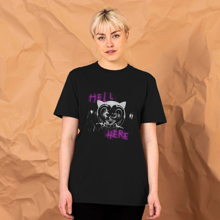
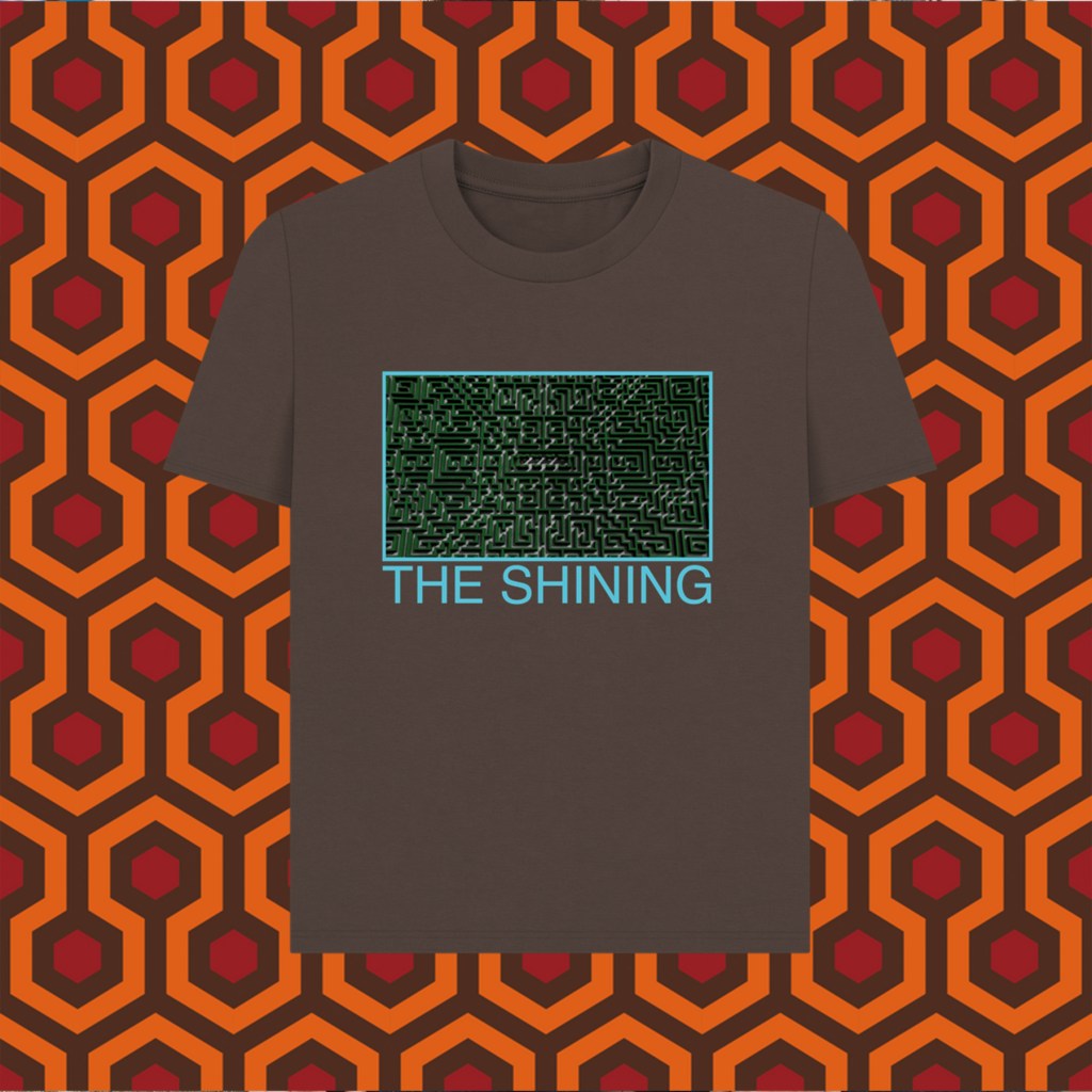
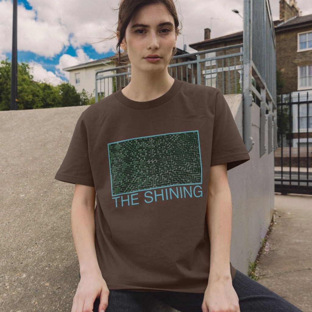
A slightly brain-melting design for our Rewind Movie Podcast episode. Prints and t-shirts are available on my Teemill store.

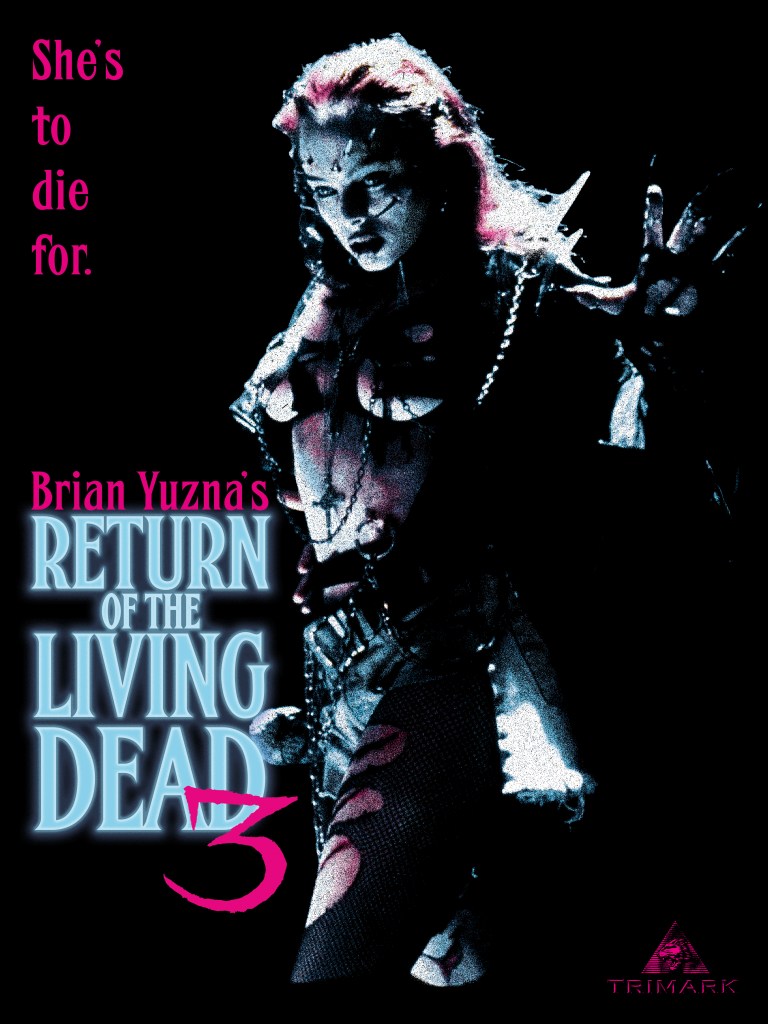
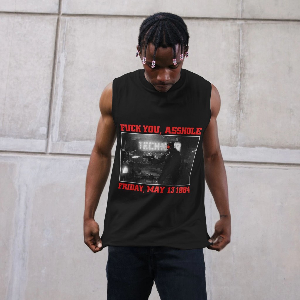
Dan O’Bannon’s anarchic 1985 debut feature may be one of the absolute highlighs of the zombie subgenre – funny, poignant, cynical, and gruesome. The first sequel, directed in 1988 by Ken Wiederhorn, fell flat, despite recycling a number of cast members from the original film in recast roles. Prolific producer/director Brian Yuzna’s third installment succeeds in crafting a weird new spin on the tale of the troublesome 2-4-5 Trioxin gas – an angsty, doomed romantic drama that sees the rebellious teen son of a ranking American military official sneak into his father’s secretive base with his punky girlfriend to witness their experiments on with the zombification agent.
When his beloved Julie dies in a sickening motorcycle accident, he commits the fatal error of reanimating her – complete with an insatiable new hunger for human brains. As they run afoul of a group of local thugs, Julie develops a sick fascination with physical pain – eventually transforming herself into a sadomasichistic human weapon studded with twisted metal and broken glass.
I’ve kept this design very simple, focussing (understandably) on the striking image of Melinda Clarke’s Julie in full, fucked up battle mode. The colour scheme came from two sources – first the video box/release poster, which yielded the maroon and yellow. I wanted to keep these designs as close as possible to realistic screen print as possible – 2 colour, in this case. The exact shade of maroon comes from the colour of the shirts available in my Teemill store. The title font and tagline font are inspired by, but not slavish recreations of, that found on the title card in the film and on the poster. The exception is the numerical 3 – that’s a direct image trace. The alternative version pulls a pale blue and pink scheme from the movie’s title card itself. Again, the idea was to run as close as possible to screen printing techniques, so those two colours, plus white, are the only colours used.

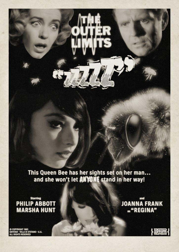
Thanks to the wonderful digital terrestrial channel Talking Pictures TV, I’ve recently become a little fixated on the classic 1960s sci-fi anthology series The Outer Limits. When I was a kid, the 1990s remake series was something that I dimly recall watching, and I think enjoying? Certainly the legendary Control Voice introduction has stuck around in my memory, but not much beyond this. But on a lazy weekday afternoon, searching for something to watch in the background while sketching, I came across an episode from the show’s original series and I was, first and foremost, absolutely floored by the incredible lighting in the episode – so much so I dropped the pencils and watched the full hour. Objects and characters glowed like pearls, within spartan, functional sets that helped to emphasise an almost dreamlike strangeness. It turns out, these wonderful visuals were the work of Conrad Hall, ace cinematographer of Cool Hand Luke, Butch Cassidy and the Sundance Kid, Marathon Man and more. Hall worked on 15 of the original run of 49 episodes, alongside TV veteran John M. Nickolaus Jr. and Kenneth D. Peach, Sr. (who, remarkably, started out on the legendary 1933 King Kong before working with Laurel and Hardy on a number of features), and his episodes, with all respect to those fine technicians, really do stand out.
The 2nd thing that drew me to the episode was the truly hypnotic Joanna Frank as the beautiful Regina – whom the story immediately imparts is a queen bee who has been transformed by some sort of baffling bee science to attempt to seduce a stoic scientist into coupling with her to produce a superhybrid race of Api-Humans. She is, quite simply, one of the most striking actresses I’ve ever seen on TV or film. Her scant list of other appearances only served to highten the mystery of her strange, mannered performance, peering up past a sweep of dark hair that hides half of her face, studying the kindly couple that take her in as a live-in assistant in the lab of Ben, the avuncular husband who is hard at work building a machine that can talk to bees. His wife, Francesca, quickly cottons onto the weirdness, but is perhaps too late in identifying the danger of her young would-be usurper.
I’ve quickly become extremely fond of the series – I adore the sturdy writing that quaintly seeks to stick the landing of its coherent, if sometimes familiar, premises, each episode methodically doling out pertinent information in a recognisable act-structure. So here I present what I hope is an era-appropriate poster homage to this odd little tale. Using some extremely poor resolution screenshots from the show, and a stock photo of a bee’s head, I had to go a little heavy on the texture-making to disguise the pixellation and flaws, but I hope in a way that looks authentic. It’s a little intentionally schlockier than perhaps a genuine ad would have been at the time, but I liked the idea of juxtaposing the conflicted expression of old scientist Ben as he ponders the mysterious Regina, while his wife clocks her for what she really is – a giant usurping bee. Hopefully the similar shapes of the face of Regina and the bee help sell the overall image layout – it was quite a challenge to find a macro photo of a bee that so closely matched the angle of her cheek and jaw.
BUY THIS POSTER as a gallery-grade 12″ x 12″ giclee print at Etsy!
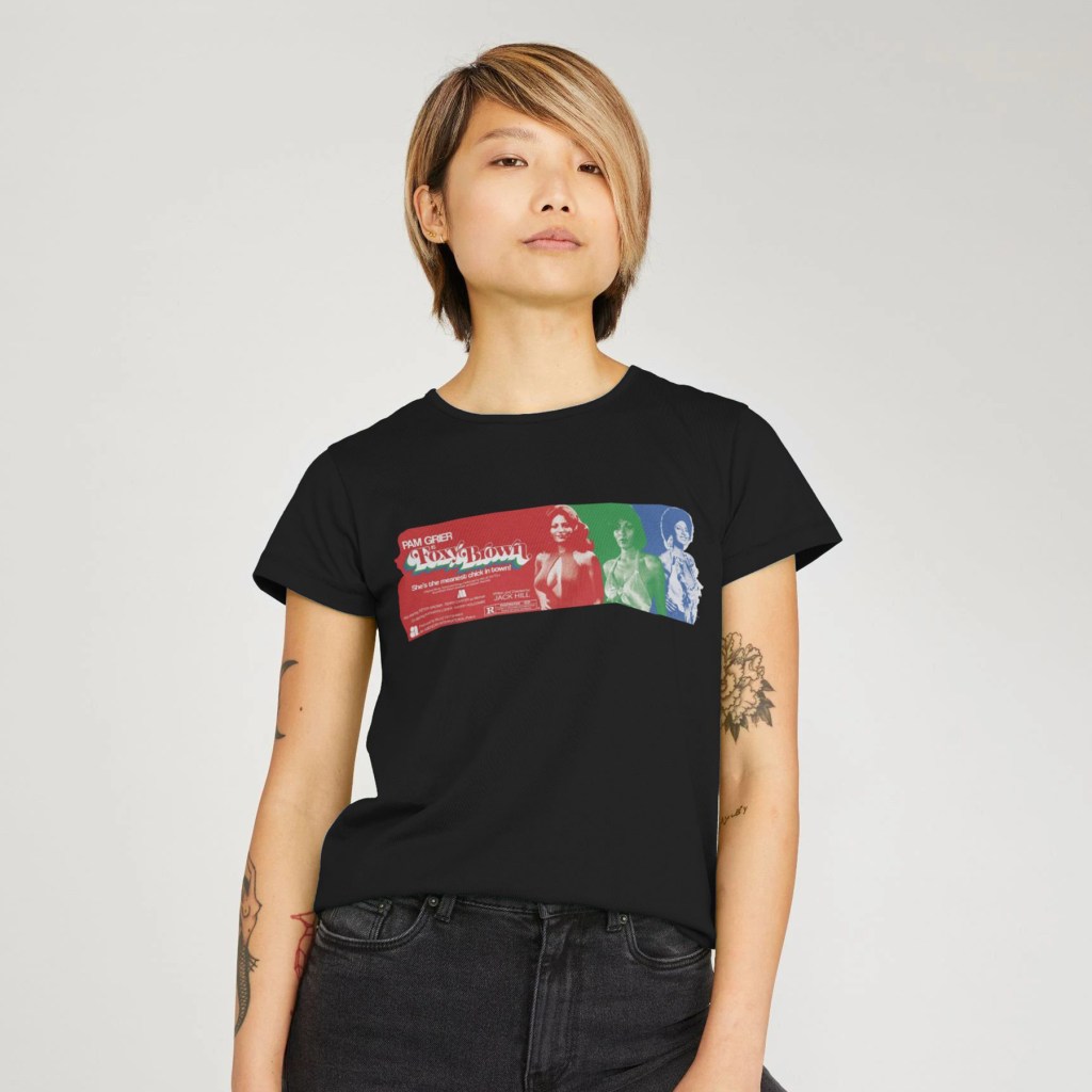
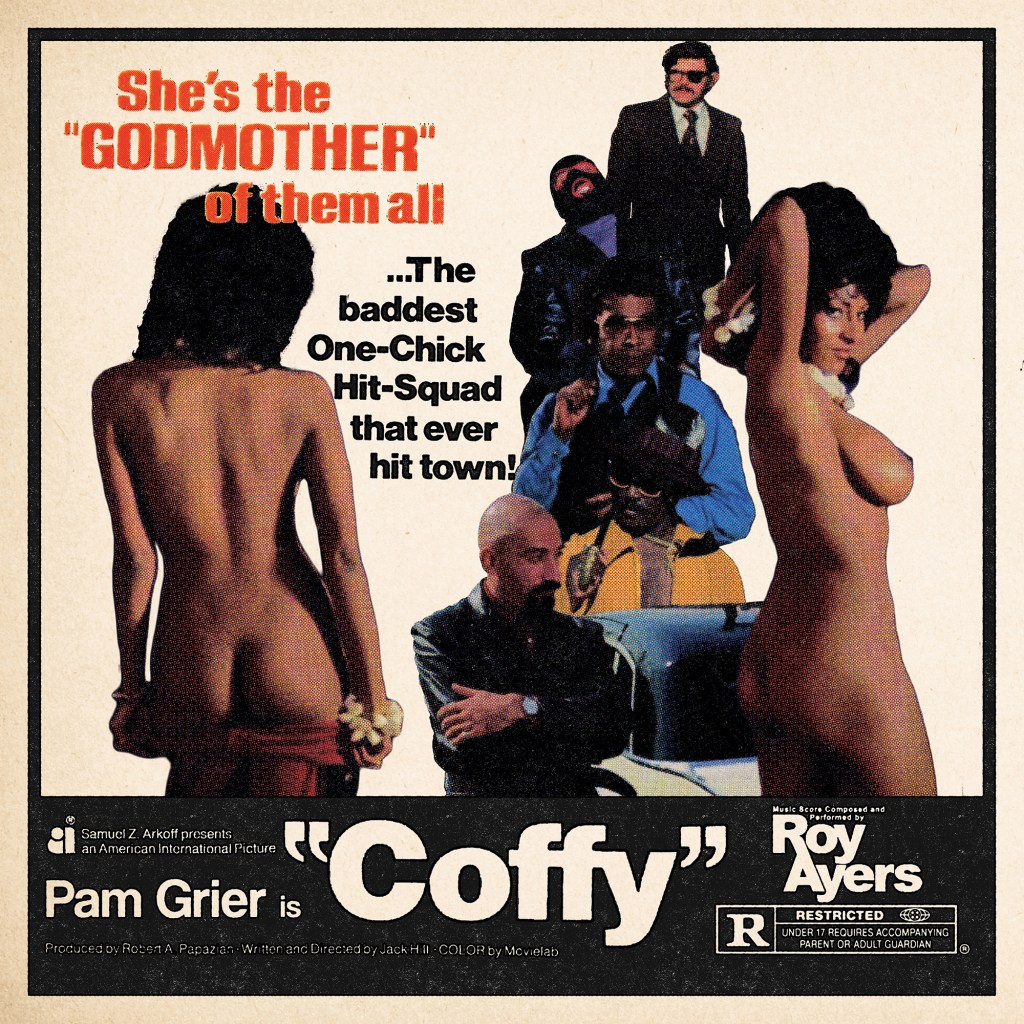
Shameful confession time: I’d never seen any of Pam Grier’s classic 1970s blaxploitation features until only a few weeks before making these pieces. Of course I’d seen Quentin Tarantino’s love letter to her, Jackie Brown, and had enjoyed the Roger Corman saucy Roman smackdown Arena on some cheap DVD I’d picked up, but somehow I’d always left Coffy, Foxy Brown, Friday Foster and the likes on my watchlist. Finally picking up Arrow Video’s typically excellent Blu-ray of Coffy, I was knocked on my, as the Americans say, ass by the full-bore majesty of this incredible actioner. The terrific, efficient direction of Jack Hill offers the perfect stage for Grier’s wonderful performance that runs the gamut from regal self-possession, through radiant sexiness, all the way to ruthless vengeful violence. A clear, vibrant, anti-establishment plot, a colourful cast of supporting characters (most notably Sid Haig as a reptilian gangster), and some magnificently messy scenes of squib-laden gun battles, automotive destruction, and drag-out catfights add up to one of the most satisfying film experiences I’d had in some time.
I was compelled to put together a poster – I wanted something simple, vintage-looking, and, for extremely obvious and undeniably prurient reasons, a design that would seek to honour just how incredible Pam Grier looked in this film. Veering away from the release poster designs which foregrounded Coffy’s powerful, shotgun-toting path of revenge, instead, I wanted to illustrate how the character weaponised her charms in order to lull her opponents into a false sense of security, before dispatching them with righteous fury.
Using simple screenshots from the streaming version of the film, I first identified the scene where Coffy seduces the absurdly-dressed pimp King George and pulled two related shots. I then figured I’d need to fill the remaining space with a selection of the bastards Coffy would spend the 90 minutes or so taking down – I cascaded them in a loose vertical structure, arranging them around the tagline which I had clipped from a hi-res scan of the release poster and simply cropped and dropped in place. The layout of these elements came from simple trial-and-error. I knew I wanted the poster to look almost like one of the newspaper ads rather than a full illustrated poster, so decided to include a thick black border and black bar at the bottom where I would place the title and a small amount of other information. I wanted to include only a few key elements – the production company, the producer and director, Pam Grier, and the MPAA rating. All elements, except for Pam Grier’s name, were cropped and image traced from original elements sourced online. I knew I would be able to keep these less than uniform, as I had planned to use a Photoshop action I’d downloaded from Spoon Graphics which I’d been dying to try on the right project – this created a realistic, black-shifted, aged, messy 4-colour ink process. However, it didn’t process the photographic elements very well – I lost almost all of the nuance in the faces. So, I decided to use this only for the black ink text elements and the black frame – I created a high contrast monotone black-only layer for the ink process, and the colours were created utilising a standard halftone filter in Photoshop on a separate layer of the combined final photographic montage, with all black pixels removed after the fact.
A final pass of textures, including a further aging on the black ink elements, and the addition of a nice paper texture, and we were all done! Well, with this one at least – I just had to do something for Jack Hill’s follow-up feature Foxy Brown.
BUY SHIRTS, HOODIES, TOTE BAGS AND MORE from Teemill!
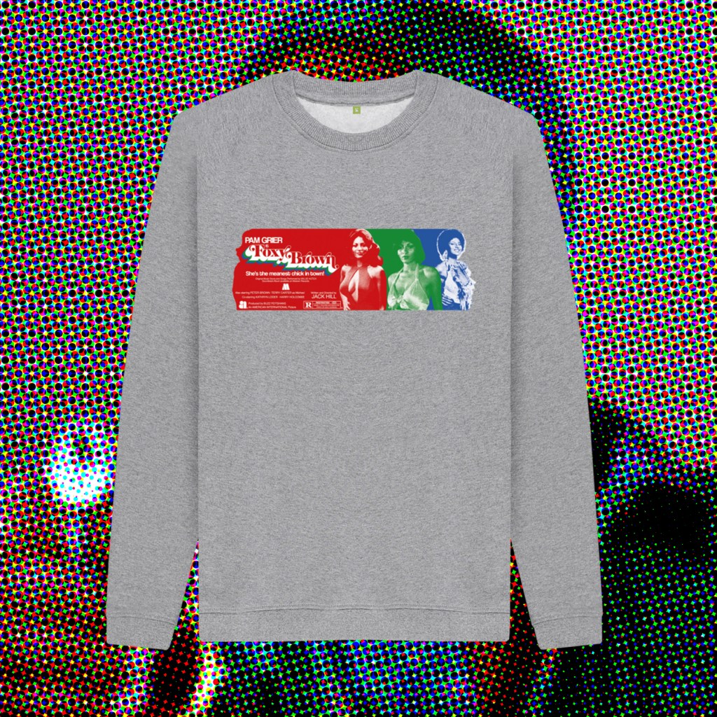
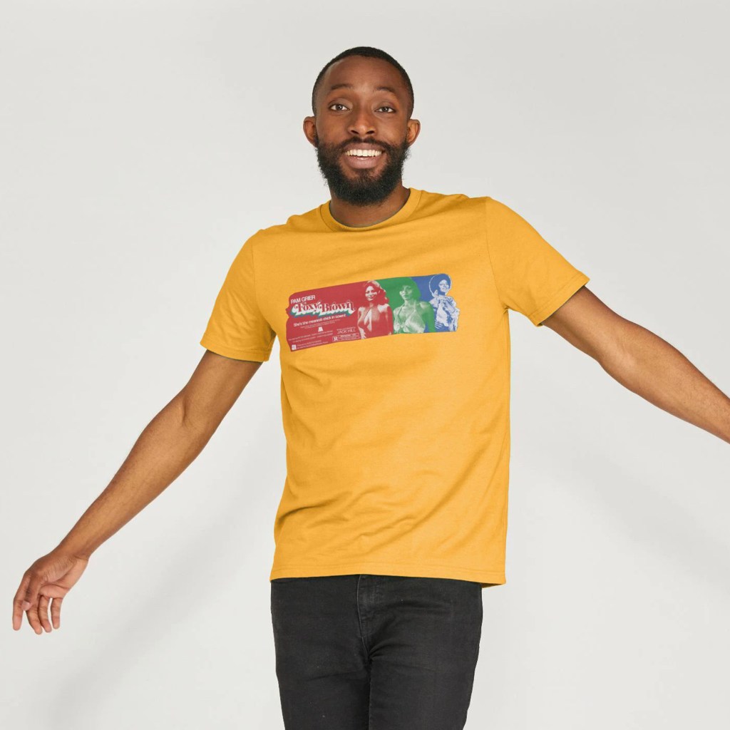
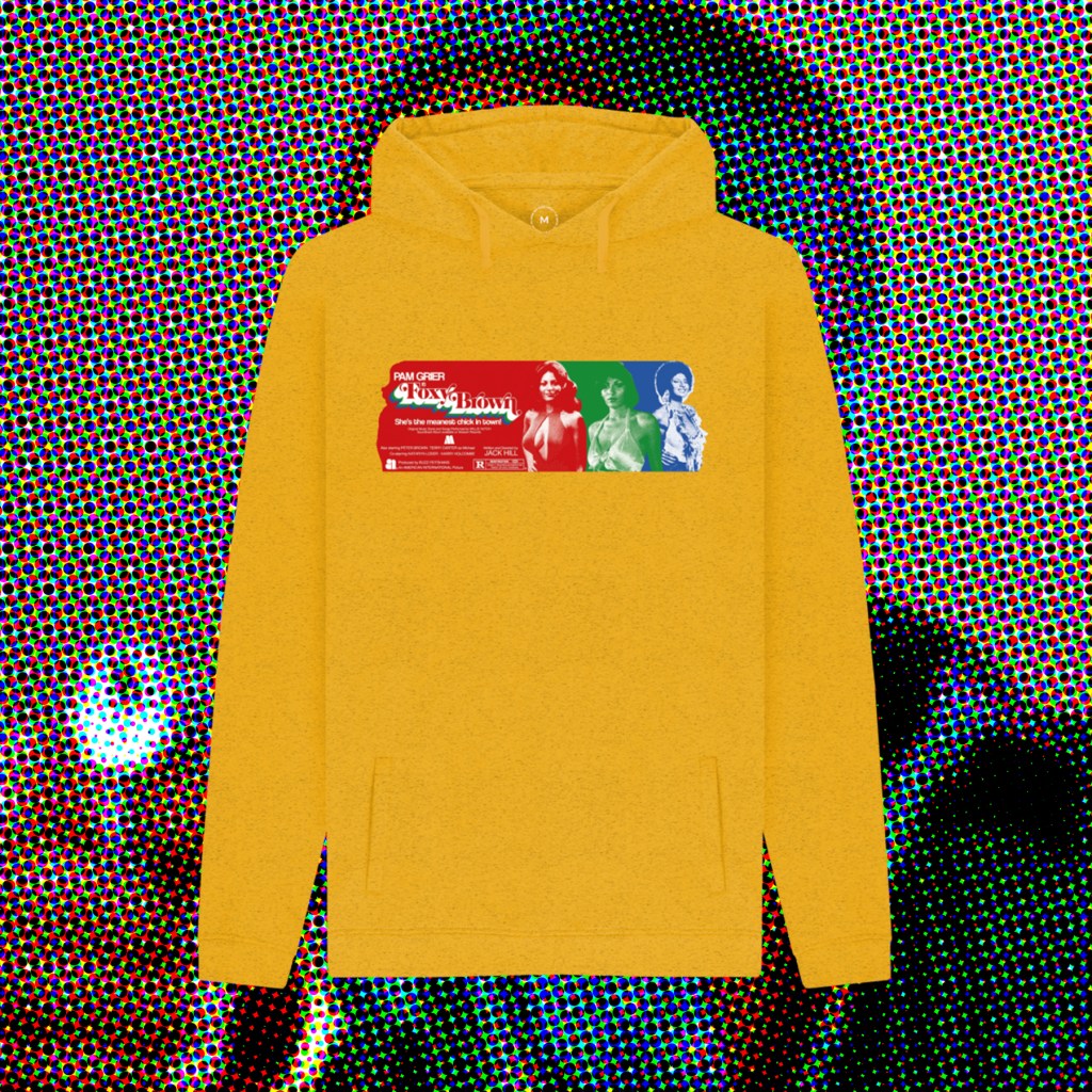
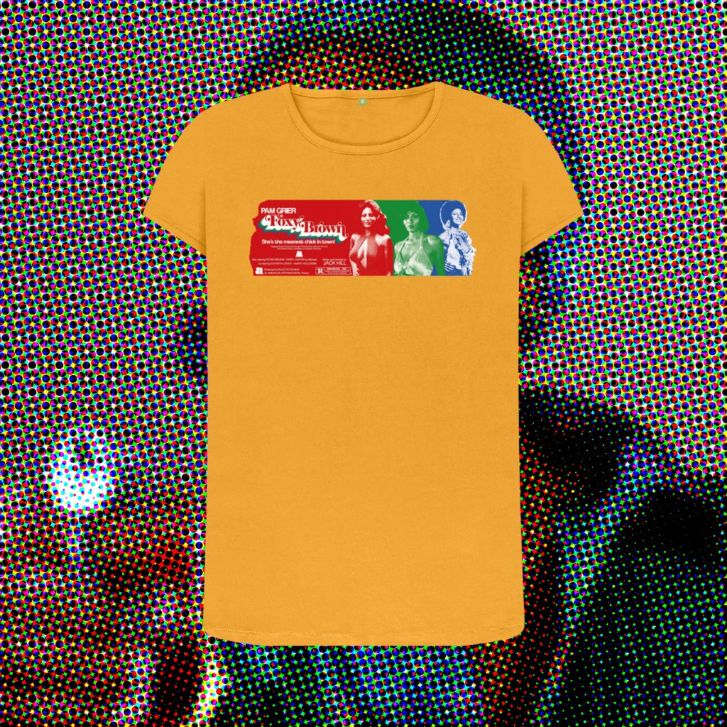
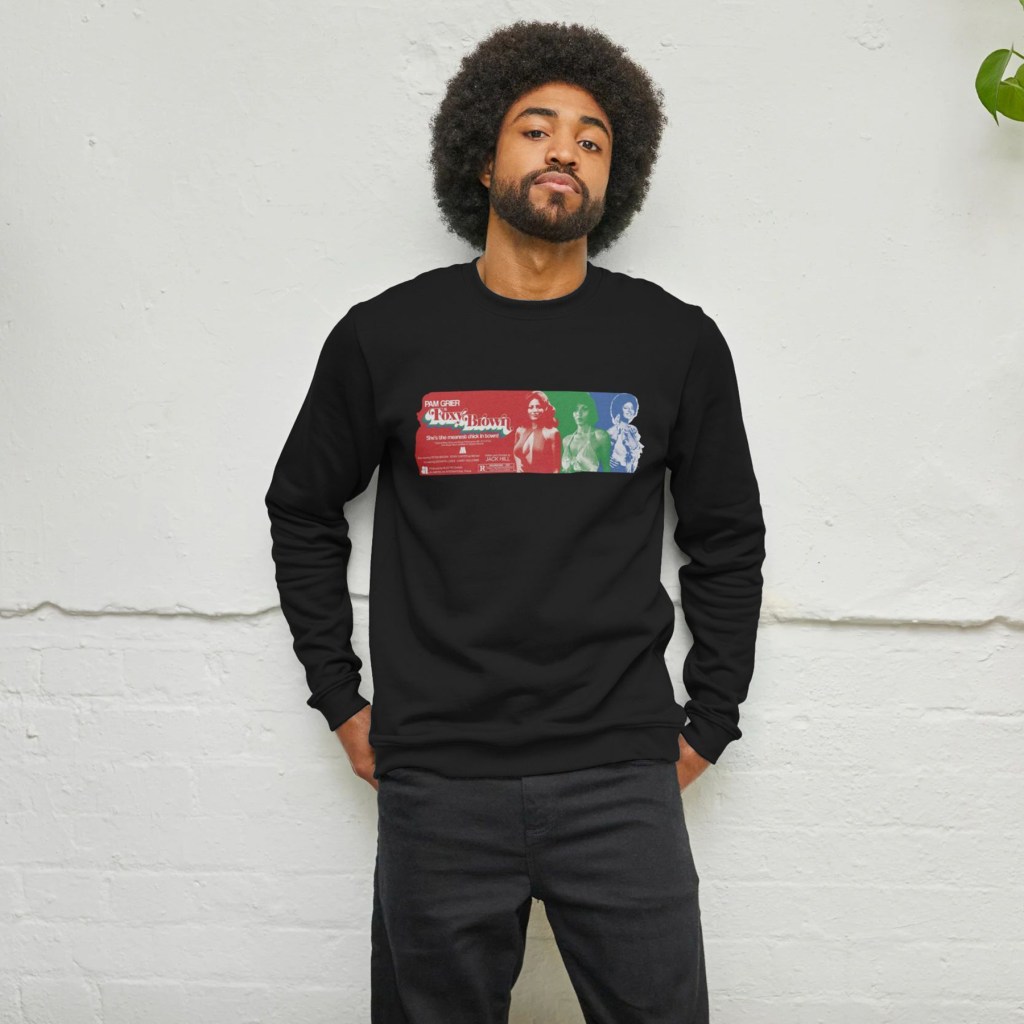
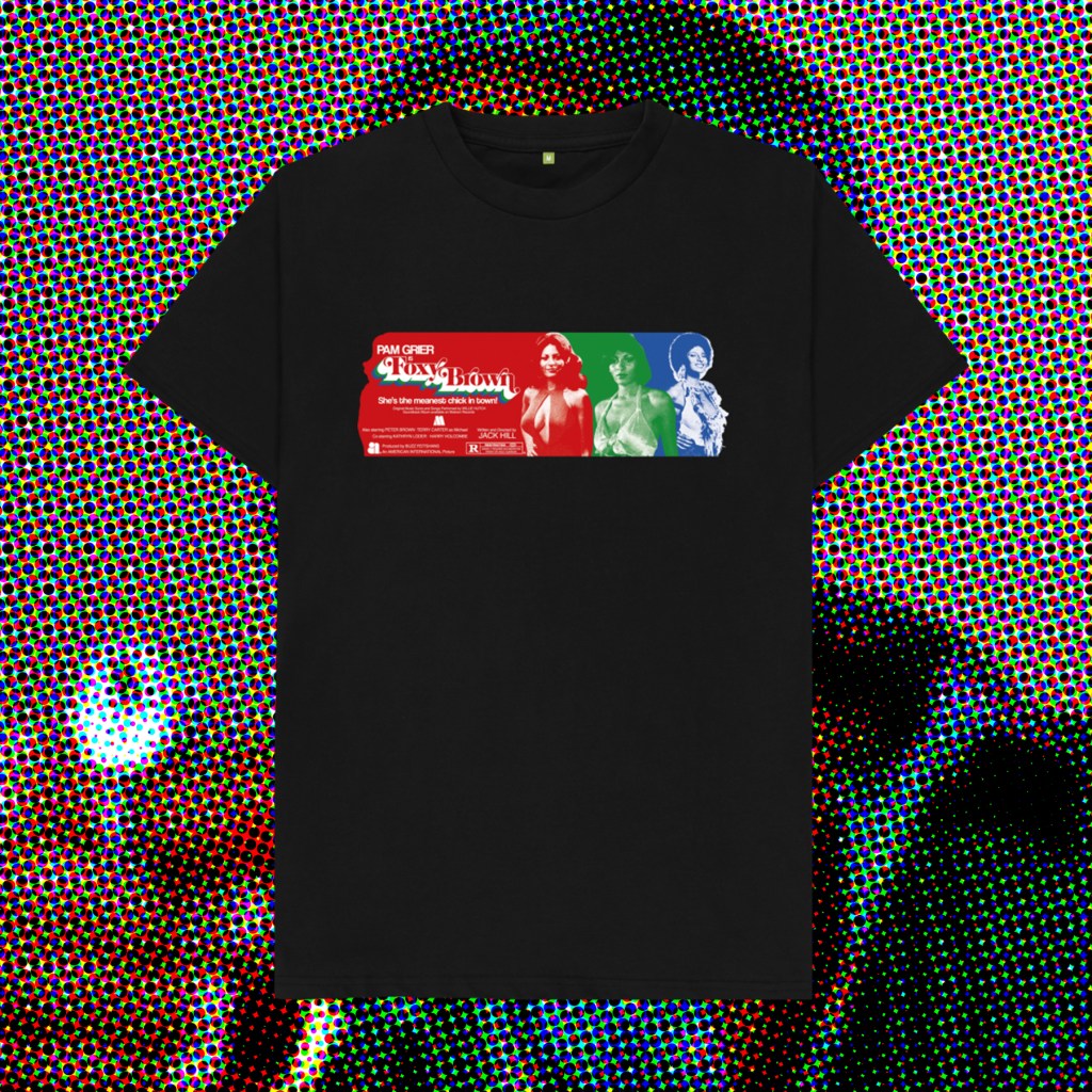
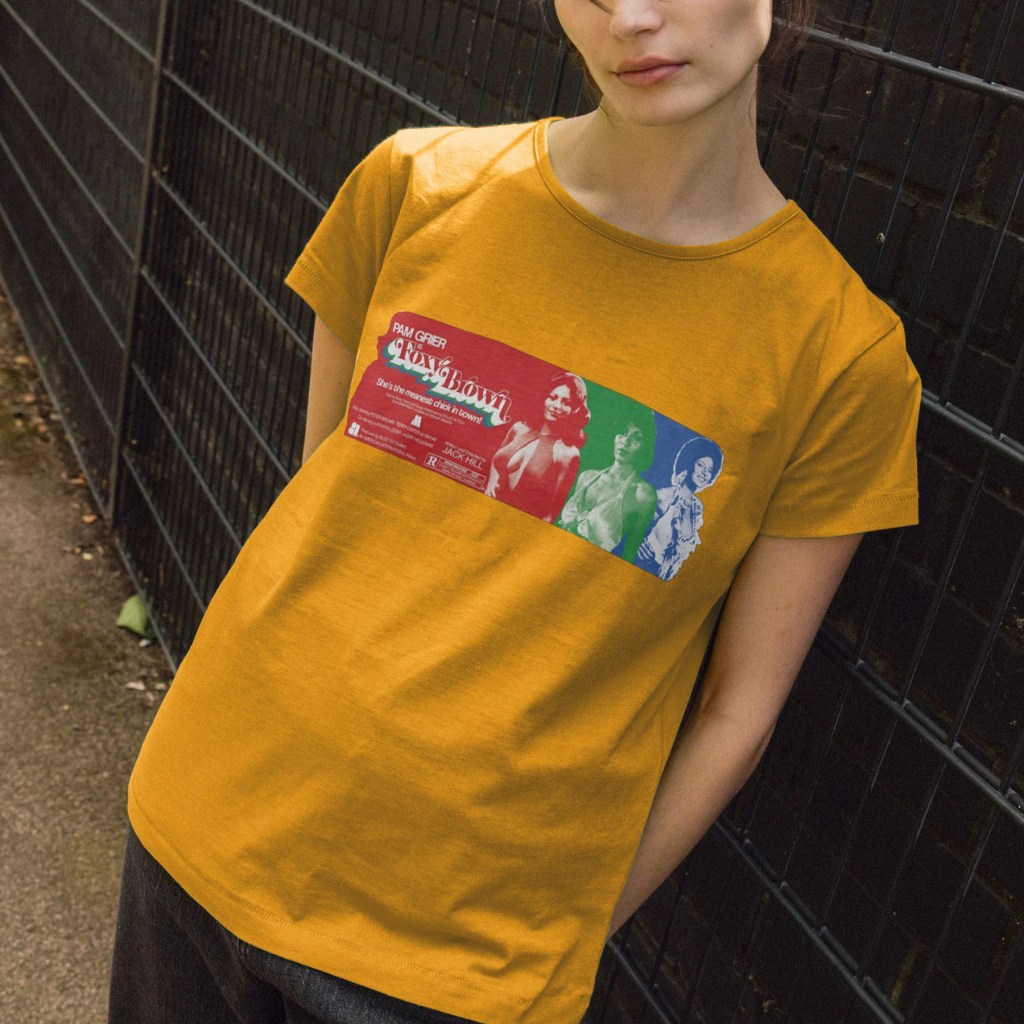
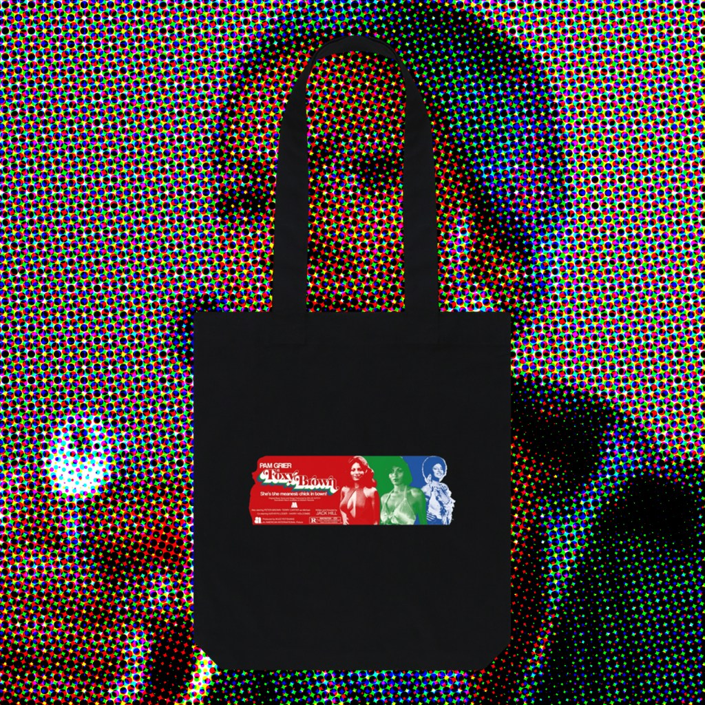
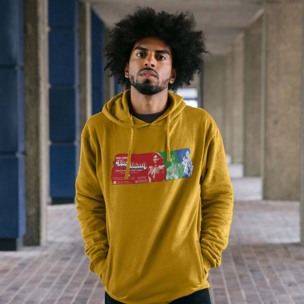
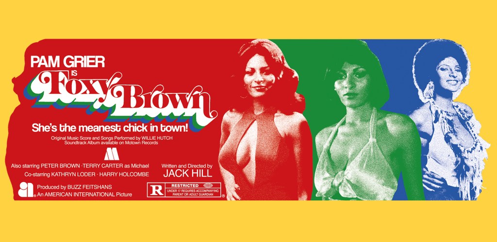
Foxy Brown‘s excellent, psychadelic opening credits inspired this colourful celebration of Pam Grier’s imcredible costumes throughout the film, again going undercover as a sexed-up and powerful woman who delves into the murky world of white drug dealers and pimps to exact brutal revenge.
Once I’d found reference pictures that covered the range of looks she sports throughout the runtime, and discarded those that didn’t meet the minimum requirements for clarity, these three images pretty much picked themselves. I’d originally envisioned full body images, like those scene in the credits dance sequence, but the majority were waist-up portraits, so that dictated the form. I wanted to have overlapping, colour coded stripes that would end with a single-colour image that would create a Grier-shaped end piece, before the next colour stripe took over. The credits scene involved 3 colours, so that’s what I wanted to do too – also, this meant I could play with the classic RGB 3 colour TV look, evoking the era, and using more than 3 images would have eradicated the long horizontal band that I wanted to form at least half, if not more, of the print.
Once I’d created my 3 images, I struggled with keeping the design as horizontal as I wanted. Shrinking the processed photographs meant losing clarity – some of this was intentional, to create a riso print starkness, but I still wanted the images to be legible and distinct. I also wanted the shirt to have a band of colour, rather than the chunkier, more maximalist designs I have created so far, so there was much push-and-pull in deciding how wide vs how tall to make the full shape. When the layout was finalised, I felt I had the balance roughly where I wanted it, but this taller band of red felt like wasted space. So, I pulled elements again from the release poster, bolstered others with typed text (the tagline is in a very nice font called Coolvetica), and used the image of Pam as a layer mask to create that end shape on the left, with the hair flick and insouciant hand-on-hip pose.
Hopefully these will serve as adequate tributes to, truly, one of the coolest screen presences I’ve belatedly discovered.