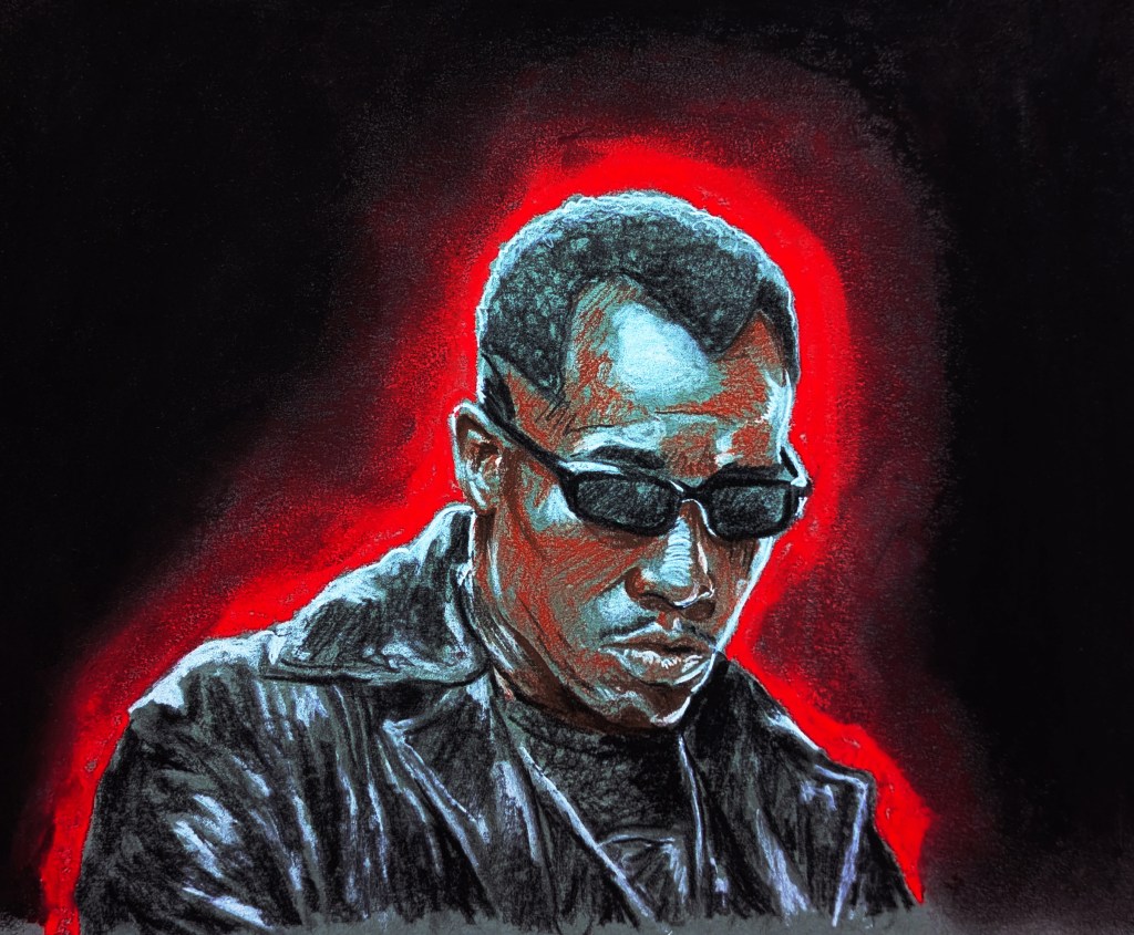
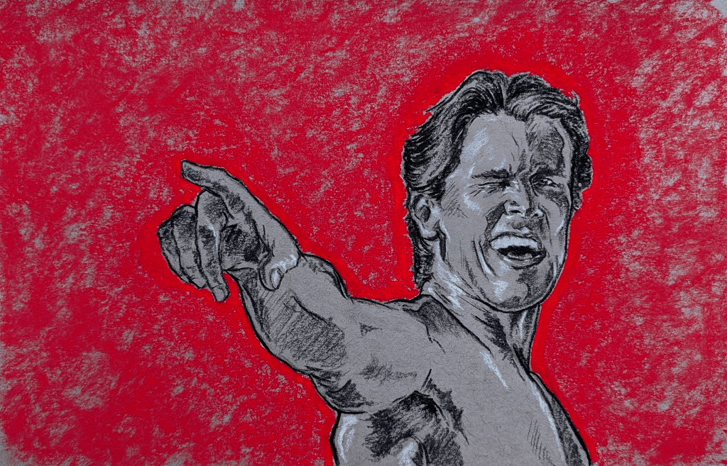
An experiment, my 2nd ever oil painting after an introductory class. I used only 4 paints, the Zorn palette (Cadmium Red, Black, Yellow Ochre and Titanium White), on the figure. Using an acrylic wash to create a cool, light midtone, I used quick, thin layers of paint to try and suggest the subtle differences between the skin tones in a minimal, pale colour scheme. The background was a mixture of rich blue mixed only with black and white, laid on thicker to help offset the more hesitant strokes on the main subject.
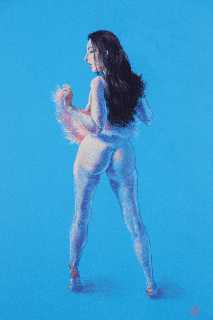
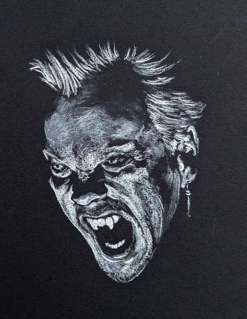
2025, pastel pencil on blue pastel paper, 15″ x 10″
The reference image I found for this sketch had a fantastic interplay of bright, pale key light, and a vibrant blue fill light against a blue background. I wanted to use the density of the pastel across the upper left, through the face and shoulder, to illustrate the more intense light, and let the background show through more sporadic, messy, reflected light in the lower part. On the shadow/key side, a darker blue pencil was used, with a purple pencil to handle the warmer, subsurface scattering as the colder colours meet the pale pinks of the direct light. The flash of pink of the outfit made for a bold focal point to ensure the drawing didn’t end up too cold overall, to establish the hints of pink and pale reds in the skin tones.
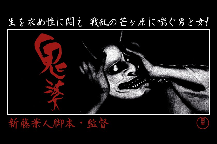
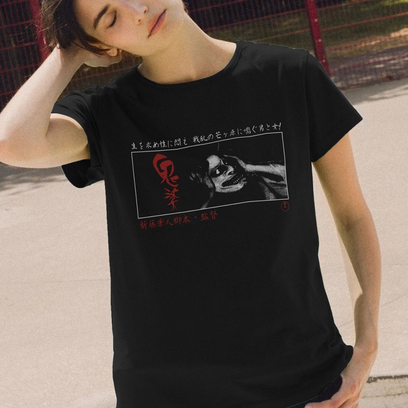
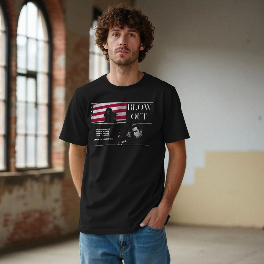
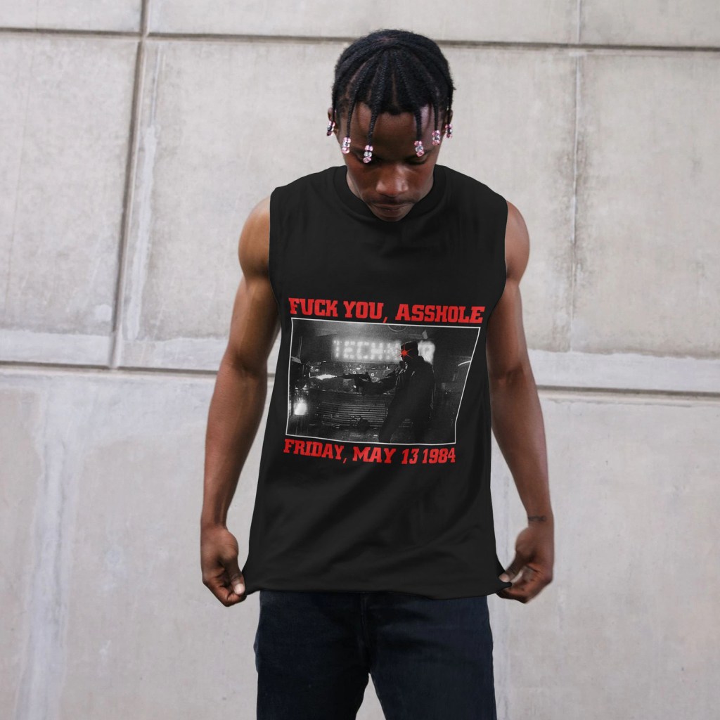
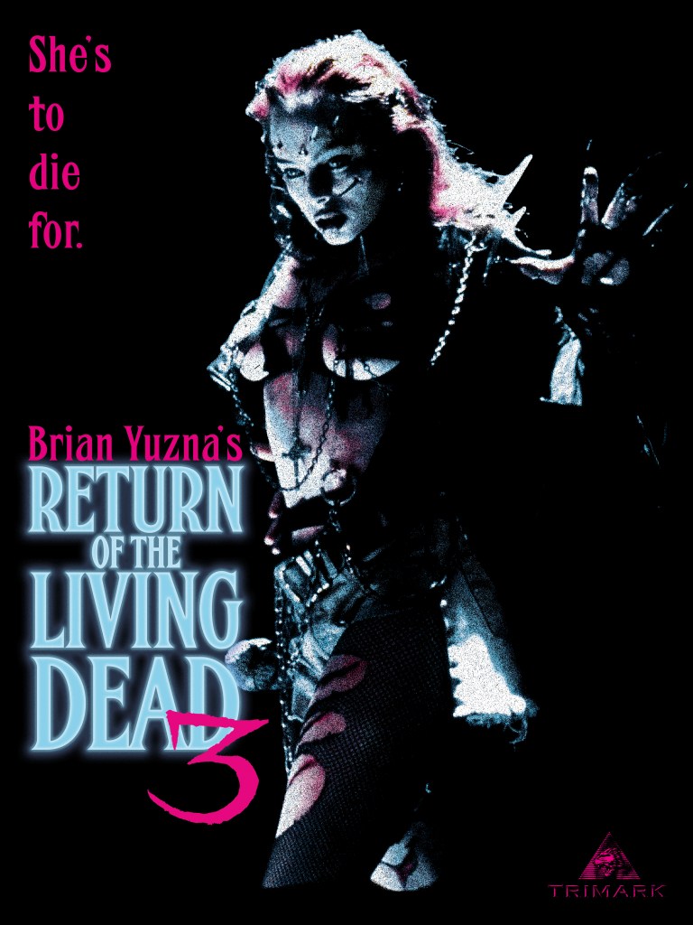
Dan O’Bannon’s anarchic 1985 debut feature may be one of the absolute highlighs of the zombie subgenre – funny, poignant, cynical, and gruesome. The first sequel, directed in 1988 by Ken Wiederhorn, fell flat, despite recycling a number of cast members from the original film in recast roles. Prolific producer/director Brian Yuzna’s third installment succeeds in crafting a weird new spin on the tale of the troublesome 2-4-5 Trioxin gas – an angsty, doomed romantic drama that sees the rebellious teen son of a ranking American military official sneak into his father’s secretive base with his punky girlfriend to witness their experiments on with the zombification agent.
When his beloved Julie dies in a sickening motorcycle accident, he commits the fatal error of reanimating her – complete with an insatiable new hunger for human brains. As they run afoul of a group of local thugs, Julie develops a sick fascination with physical pain – eventually transforming herself into a sadomasichistic human weapon studded with twisted metal and broken glass.
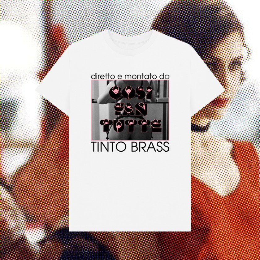
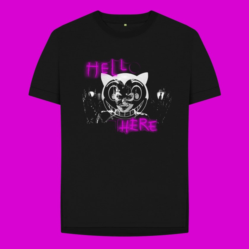
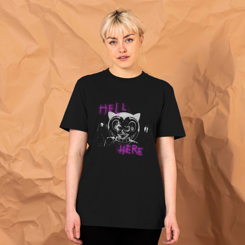
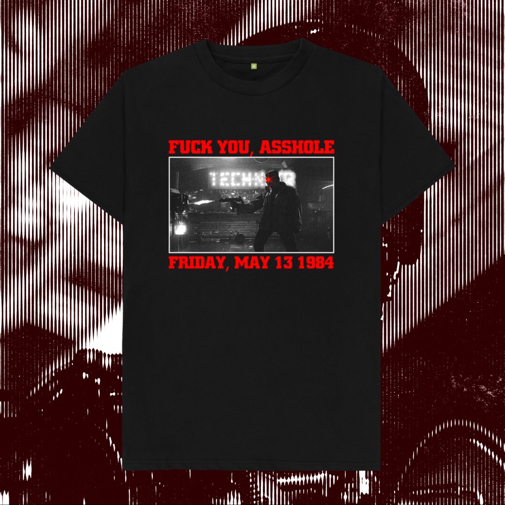
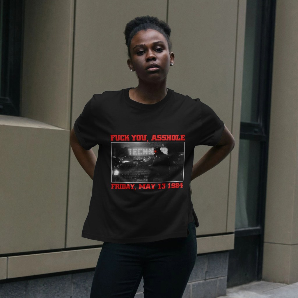
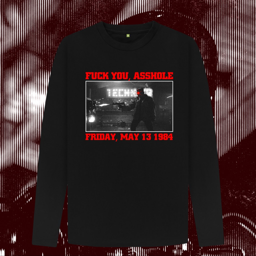
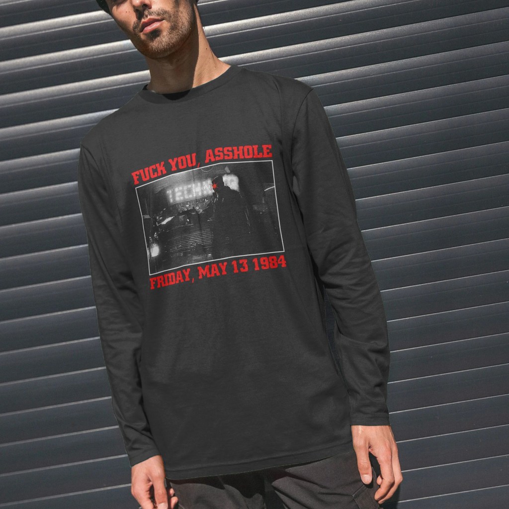
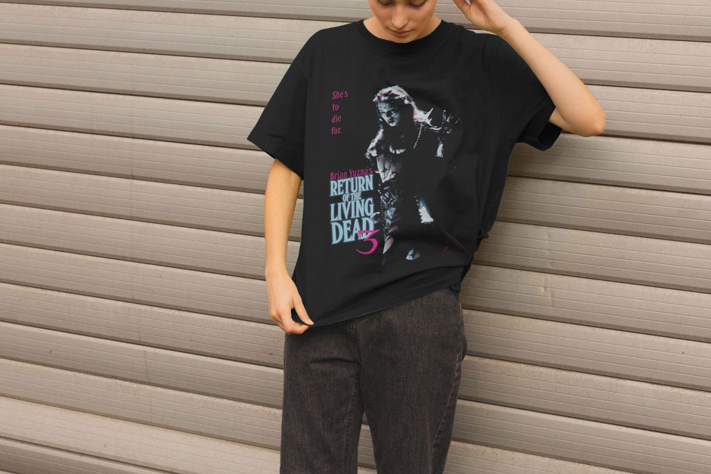
I’ve kept this design very simple, focussing (understandably) on the striking image of Melinda Clarke’s Julie in full, fucked up battle mode. The colour scheme came from two sources – first the video box/release poster, which yielded the maroon and yellow. I wanted to keep these designs as close as possible to realistic screen print as possible – 2 colour, in this case. The exact shade of maroon comes from the colour of the shirts available in my Teemill store. The title font and tagline font are inspired by, but not slavish recreations of, that found on the title card in the film and on the poster. The exception is the numerical 3 – that’s a direct image trace. The alternative version pulls a pale blue and pink scheme from the movie’s title card itself. Again, the idea was to run as close as possible to screen printing techniques, so those two colours, plus white, are the only colours used.